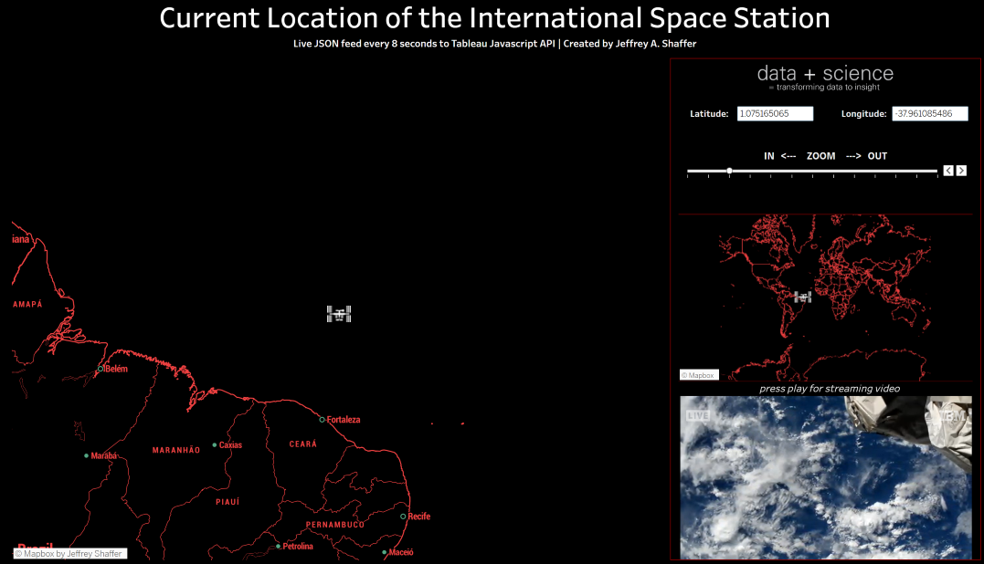
Fixing and updating my Tableau visualization from 2016 tracking the current location of the International Space Station every 8 seconds. Uses live JSON feed passing the latitude and longitude into Tableau as parameters with the Tableau Javascript API.
More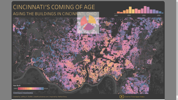
This is a demonstration of how to embed your Tableau Public visualizations into HTML, but usig ChatGPT to do it. And just for fun, I show you how you can create your own custom animated loading spinner, including a spinning pie chart.
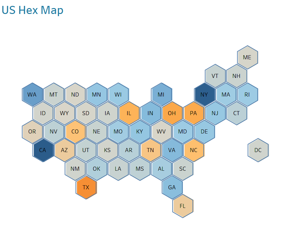
A tile map is one of the visualization I teach in my Tableau training workshops as it is fairly easy to make and it showcases a number of features in Tableau. As a map, it also has a number of benefits. For example, it avoids encoding values based on the size of land an area has. For U.S. maps, it also solves the placement issue of Alaska and Hawaii, and DC, without exlcuding them from the map. In this blog post, I will walk you through a method of quickly making a tile map, specifically a Hex Map, using Custom Geocoding in Tableau.
This topic came up relating to a recent discussion on Twitter, and idea posted by Sam Parsons. One of the most frequently used "tricks" in Tableau is to duplicate your pill to make a dual-axis chart. This is a very popular trick, because historically, it was the only way to get two different mark types on the same canvas.
One popular requests when creating maps in Tableau is the ability to be able to swap between a regular map view and a satellite view. Tableau offers six different map layers; Light, Normal, Dark, Street, Outdoors and Satellite. In this blog post I will outline how we can create a custom Mapbox map that will allow you to have the best of both worlds; a customized Mapbox map in any style, and a Satellite view, all in the same map.

Here comes the first Tableau Tip volume in 2021- Volume 21. In this short post, I will share seven tips focused on forecast function in Tableau.
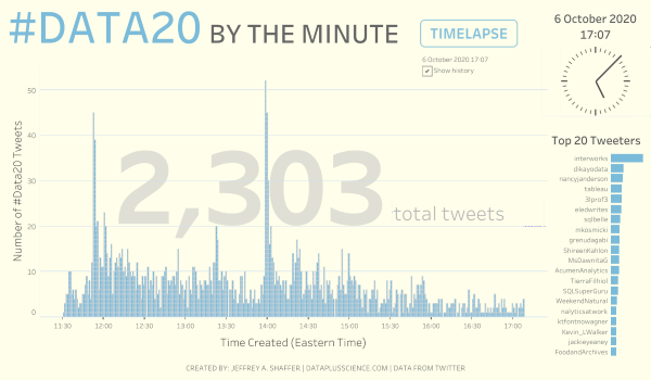
During #data20 this year, I published a viz called #DATA20 BY THE MINUTE where I visualized total of tweets with the #data20 hashtag, counted by minute. In order to this, I need to set up R codes that collect data from Twitter. This would be a fun topic to play with so I came up with this blog postwhere I show you the 'how-to'.
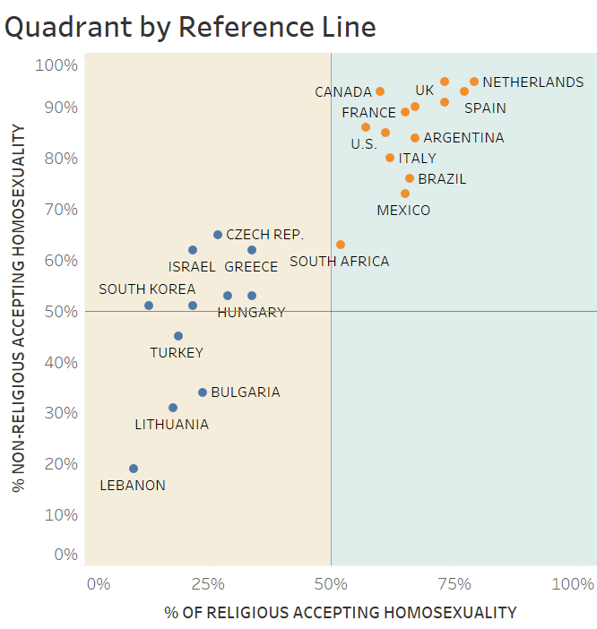
If you are a Tableau or data visualization enthusiast, then you have certainly come across the four quadrant chart. A quadrant chart is simply a scatter plot that is divided into four equal squares, hence the name quadrant. Like a scatter plot, the quadrant chart plots one measure on the X-axis and another on the Y-axis. By dividing into quadrants, the chart makes it easier for readers to understand which characteristics the data points are strongly (or poorly) associated with.
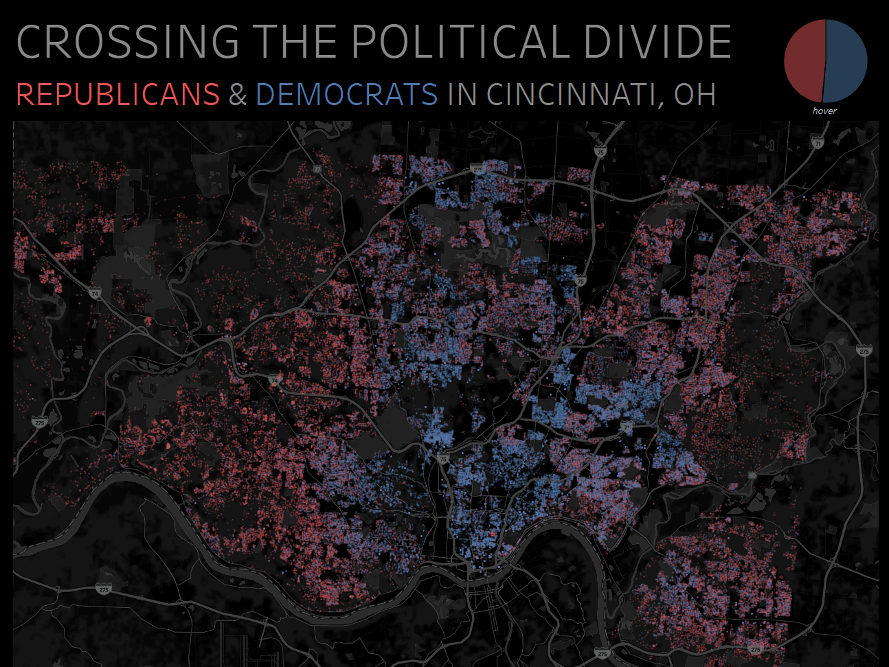
This visualization shows the registered political party for Hamilton County residents (Cincinnati, Ohio) using data from the 2020 voting and property records. Download a high resolution here.

This is a special edition of Tableau Tips Volume to mark the end of this very strange year. If you've been following along this year then you already know that I have published a total of 194 daily Tableau tips since March. I am planning on sharing more tips in 2021, but for now, here is the 20th installment of Tableau Tips featuring 12 tips from 2020 that I think you'll find useful.
More
Here is the 19th installment of my Tableau Tips series. The name came from a comment on my Tableau Tips tweet, referring it as a hidden gem. This volume will feature those tips that are hard to notice, yet very useful- just like precious gems.
More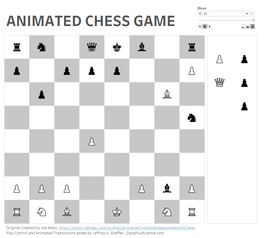
Animated Chess Game in Tableau. An updated classic, originally by Tableau Grand-Zen-Master Joe Mako in version 8. I restructured the data to add play control & animated transitions.

One of the new features in Tableau 2020.4 is the ability to layer multiple shapefiles on top of each other. This will be super handy for maps, but we can also leverage this feature to layer multiple mark types on the canvas outside of maps. One popular method to layer mark types is by using a dual axis. However, we are limited to two marks in that case. In this blog post I will outline how you can use this feature to layer marks for more than just maps.
More
Here is the 18th installment of Tableau tips. This volume compiled and features tips that are brief yet encourage people to work with Tableau in a smart way.
More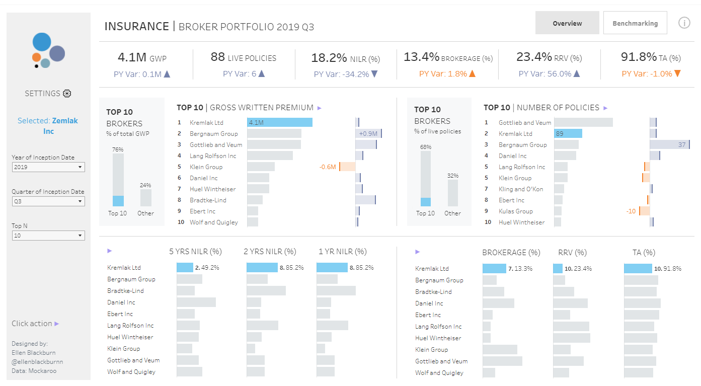
My friend Andy Kriebel has a website Data Viz Done Right where he talks about data visualization best practice by showing examples he has found on the internet. I thought I would do a similar post focusing on dashboards. Ellen Blackburn recently posted this insurance dashboard. This is really well done. In fact, it incorporates so many of the things I teach in my data visualization classes and workshops and discussed in The Big Book of Dashboards. So here is a short write up discussing some of these things.
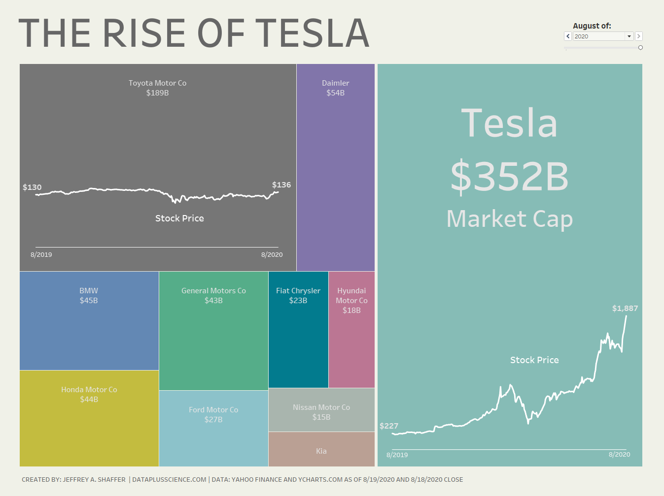
This visualization shows the market cap and stock of Tesla vs. the other major auto companies from 8/2019 to 8/2020.
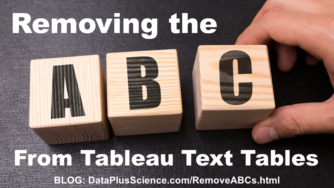
When creating text tables in Tableau without measures, one of the most common questions that comes up is how to remove the ABCs that show up in the text table. By default, Tableau will use the "Abc" placeholders to express any values that could be potentially displayed. For example, if you only use dimensions and/or discrete values in a text table, the empty column will automatically fill "Abc" as a placeholder. You may find yourself needing only dimension and discrete values without measures and therefore wanting to remove these "Abc" placeholders. In this blog post, I have tried to write up a comprehensive list of solutions. I will outline the traditional ways I've seen people use to remove the placeholders and offer what I feel are the three best solutions.
More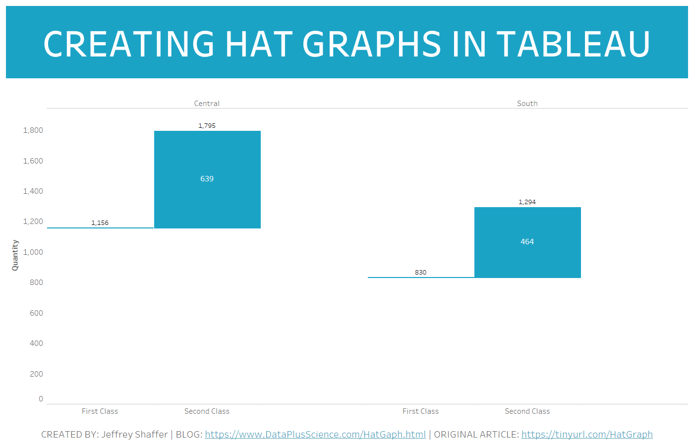
Back in August 2019, Jessia K. Witt wrote an article entitled Introducing Hat Graphs. The hat graph was created as an alternative to paired bar charts. In this article, she discusses their potential usefullness and the results of five empirical studies. The hat graphs in the article were made with R. In this blog post, I will demonstrate how to create hat graphs in Tableau.
More
Here is the 17th installment of Tableau tips. This volume specifically focuses on tips related to editing data source, data view, analytics in Tableau.
More
Here is the 16th installment of Tableau tips where I explore quick tips that enhance productivity in Tableau.
More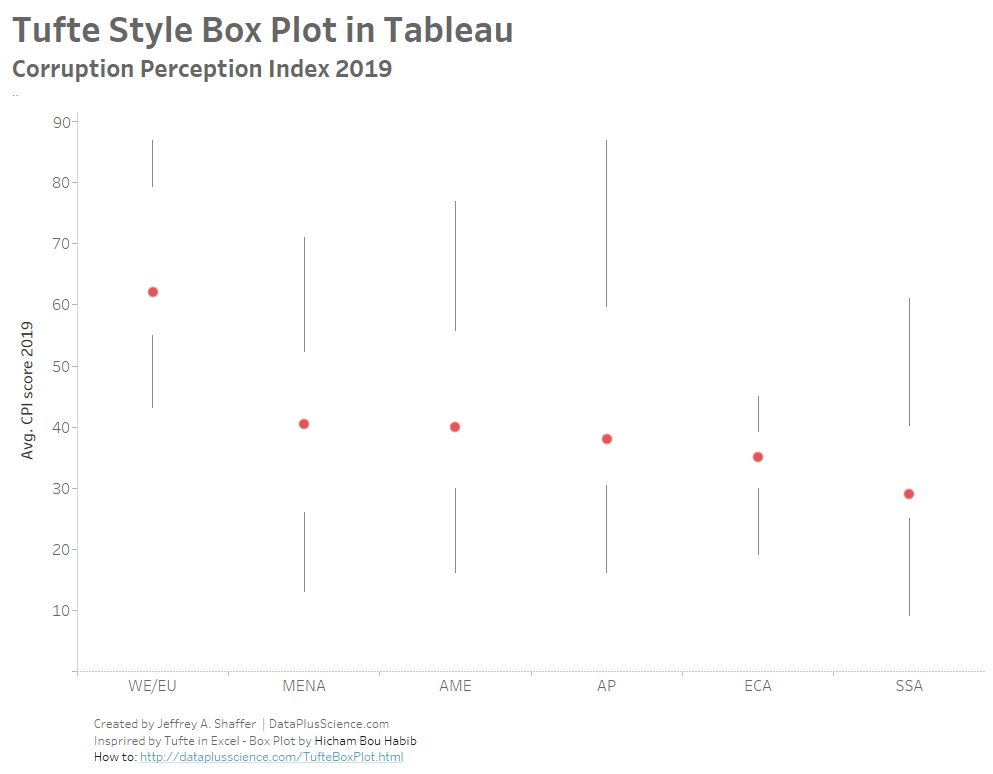
A few weeks back Hicham Bou Habib wrote a great blog post Tufte in EXCEL - The Box Plot outlining his 72-step process for creating a Tufte Style Box Plot in Excel along with a template. He also tweeted about it and after I saw it, I decided to recreate this stlye in Tableau and I will outline the steps in this blog post.
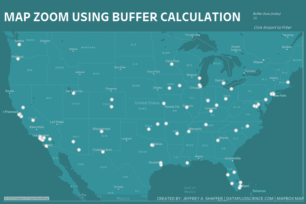
Last year I wrote a blog post Map Zoom with Radial Distance and Increasing Mark Size in Tableau. This technique is used to create a custom map zoom, by plotting a circle around a given point at a custom distance. This blog post will outline a very similar technique, however, we will use the new Buffer function in Tableau 2020.1 in a calculation rather than plotting a circle using 360 points.
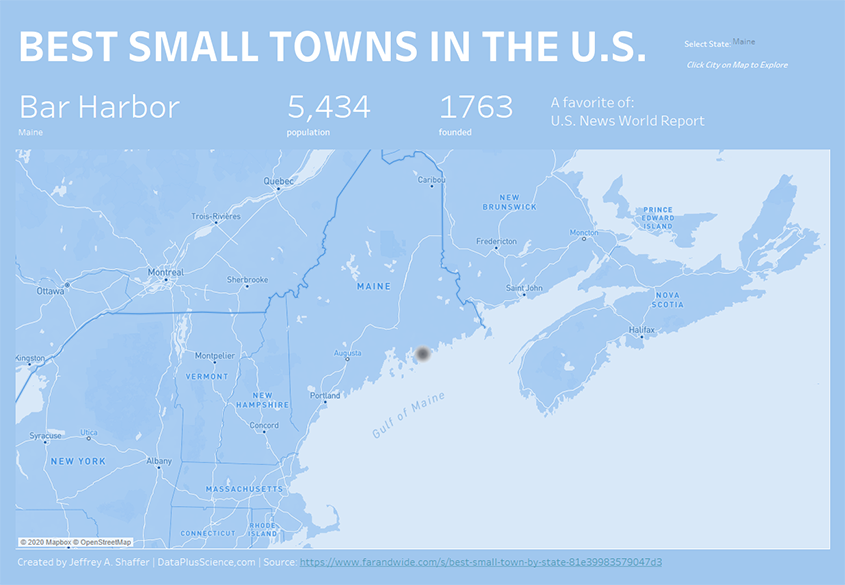
An interactive map showing the best small towns in the United States according to several sources.
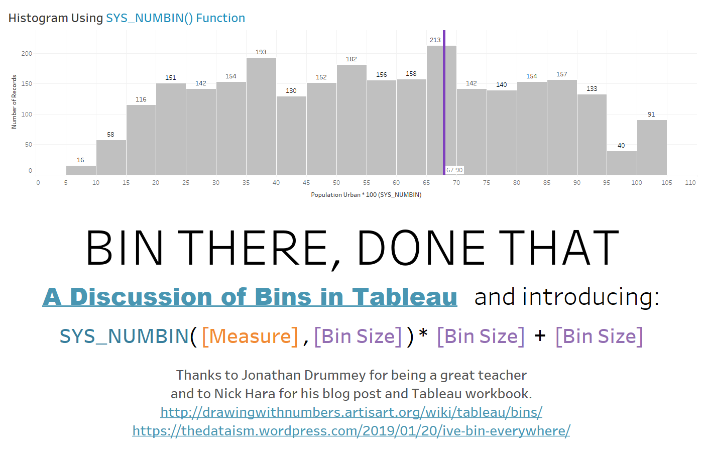
Creating bins in Tableau seems pretty straight forward, right-click on a Measure and select Create -> Bin and you're done. However, there are some restrictions and pitfalls that are very important to understand. In this post, I will explain these and offer a few solutions, including a hidden function in Tableau that I think you'll find very handy.
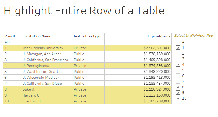
This post started as a question from one of my students at the University of Cincinnati. He wrote, "I am required to colour the entire row in a text table instead of just the measure values so that the user can easily spot the different entities (or institutional groups in this case). Is there a way to colour code the entire row so that the user can easily distinguish the different institutions?". When dealing with tables, things that are simple in tools like Excel can be much more difficult in Tableau. In Excel, you can highlight any row you want and with a simple click you can set a highlight color for the entire row. You will see that to do this in Tableau requires some creative solutions. I will present five different solutions in this post, but each of these solutions has its pros and cons.
One of the more complicated topics in Tableau is Data Densification. I think the concepts are much more difficult than the actual implementation in Tableau, because in many cases it is very easy to turn on data densificaiton. As with many things in Tableau, we build on the works of others, so before I start I want to acknowledge two people who pioneered these techniques early on and have been instrumental to me in my Tableau learning. The OZM (Original Zen Masters from the very first class of Tableau Zen Masters) Joe Mako and Jonathan Drummey. I have learned so much about Tableau from these two guys so a big thank you to both of them.
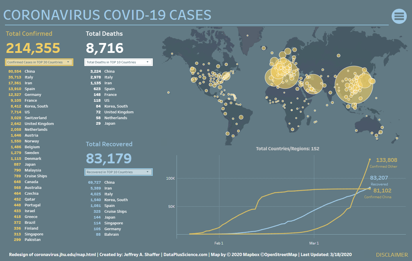
This visualization offers a redesign of the John Hopkins COVID Case tracker visualization.
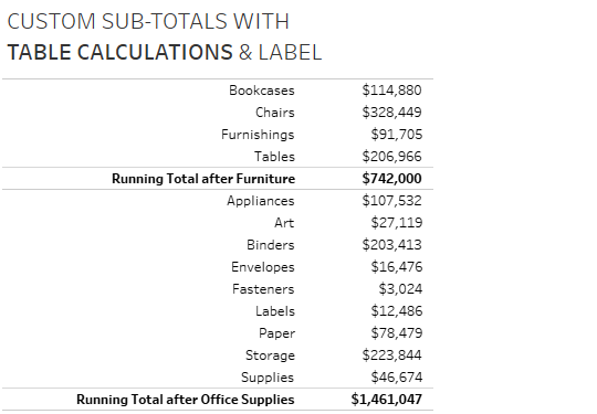
This past weekend Tableau Zen Master Klaus Schulte published a great blog post showing four different ways of Adding Custom Sub-Totals in Tableau. In this blog post, he demonstrates how to do this with data densification and table calculations. I posted my own solution later that evening, which I will describe below, but I wanted to discuss the journey to get to the solution.

One of the common issues that comes up in our "Building World-class Business Dashboards" workshops is how to gain user adoption and change culture. For example, a recent question was around color, specifically, how to steer the organization away from using the standard red and green colors in the traffic light colors. One of the ways to introduce change is to do it slowly, over a period of time. I call this "The 6 month Blues".

Last week Mona Chalabi posted a chart First Time Home Buyers Average Age. Below is Mona's chart. This chart spread quickly through the data visualization community. So what is the issue here? The primary issue is that the data is being encoded with height, in this case the height of the house is representing the average age of the firt time home buyer. The y-axis starts at 30 years old. As a result, the height of the house in 2008 appears to be double the size of the house in 2007, and 2017 is more than three times as tall. It doesn't take someone two or three times longer to buy a house, so there is a disconnect between the actual data and the data that is being plotted. The graph is actually plotting "How much older than 30 is the average age of a first time home buyer."

Yesterday, Steve Wexler posted a new blog post DON’T center, right-align, or justify text on a dashboard. Steve makes a case that only left-aligned text should be used on a dashboard. While Steve states in his blog post, "Or at least have a very good reason for doing so.", he doesn't include many examples of this. I felt compelled to write this blog post to offer some additional examples where centering, right-aligning or fully justifying text does not interfere with the interpretion of the data, and even an instance or two where it's critical that we SHOULD do this.
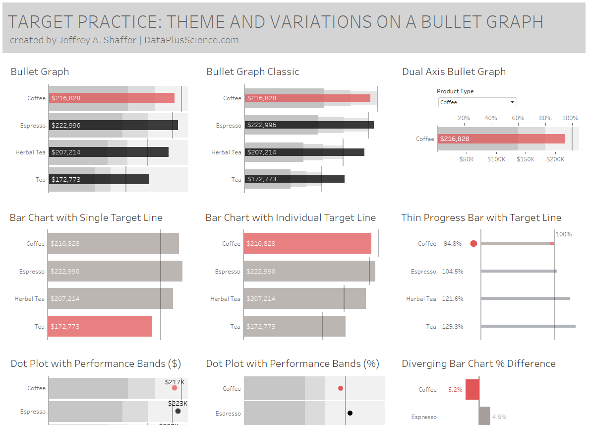
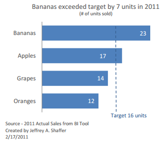
Back in January, I published Bar Hopping: Theme and Variations on a Bar Chart. The second installement was Line Dancing: Theme and Variations on a Line Chart in collaboration with Andy Cotgreave. In this installment, I show variations of the Bullet Graph, where we have actual values compared to target values.
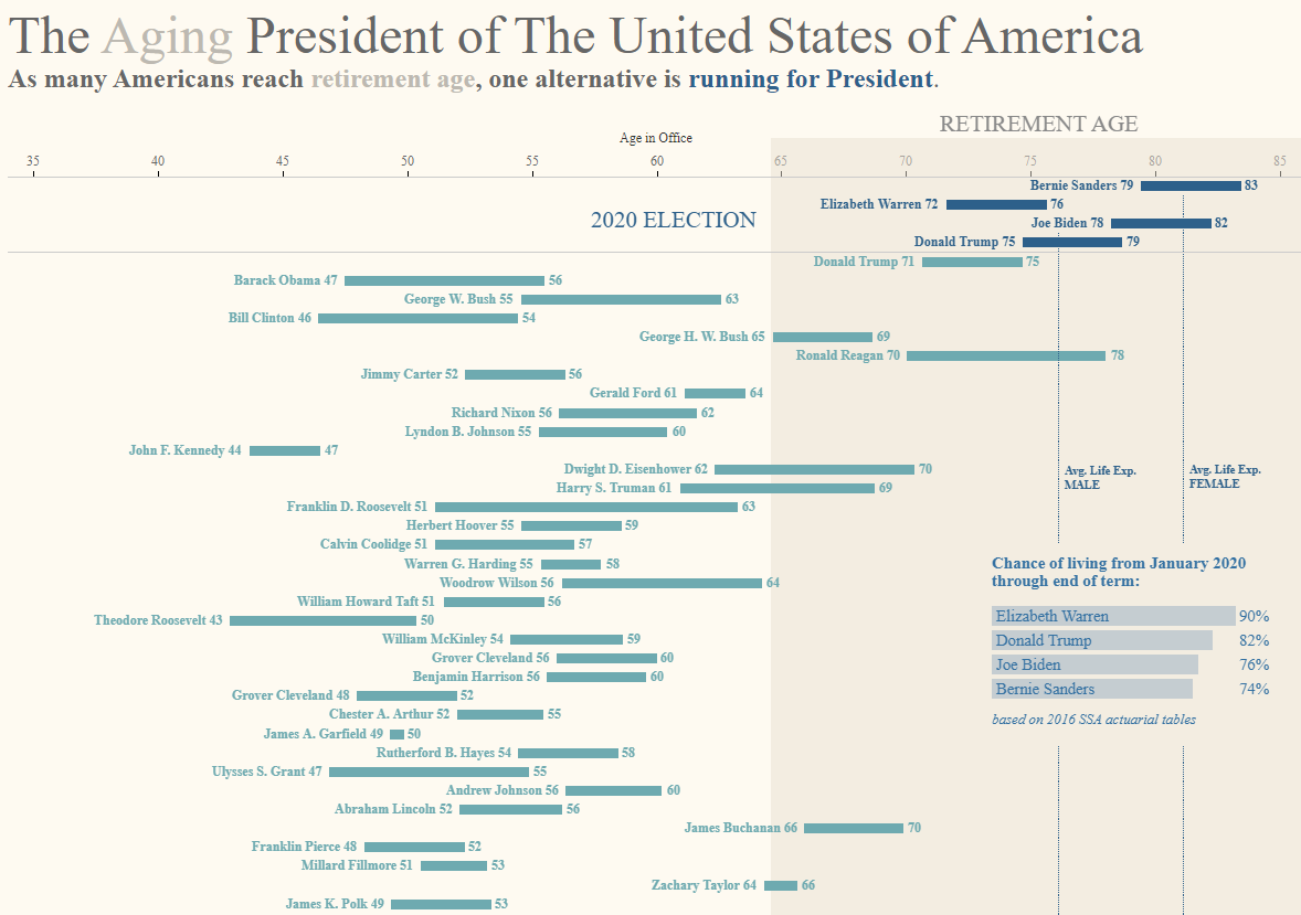
A visualization of the age of the presidents of The United States of America in office.
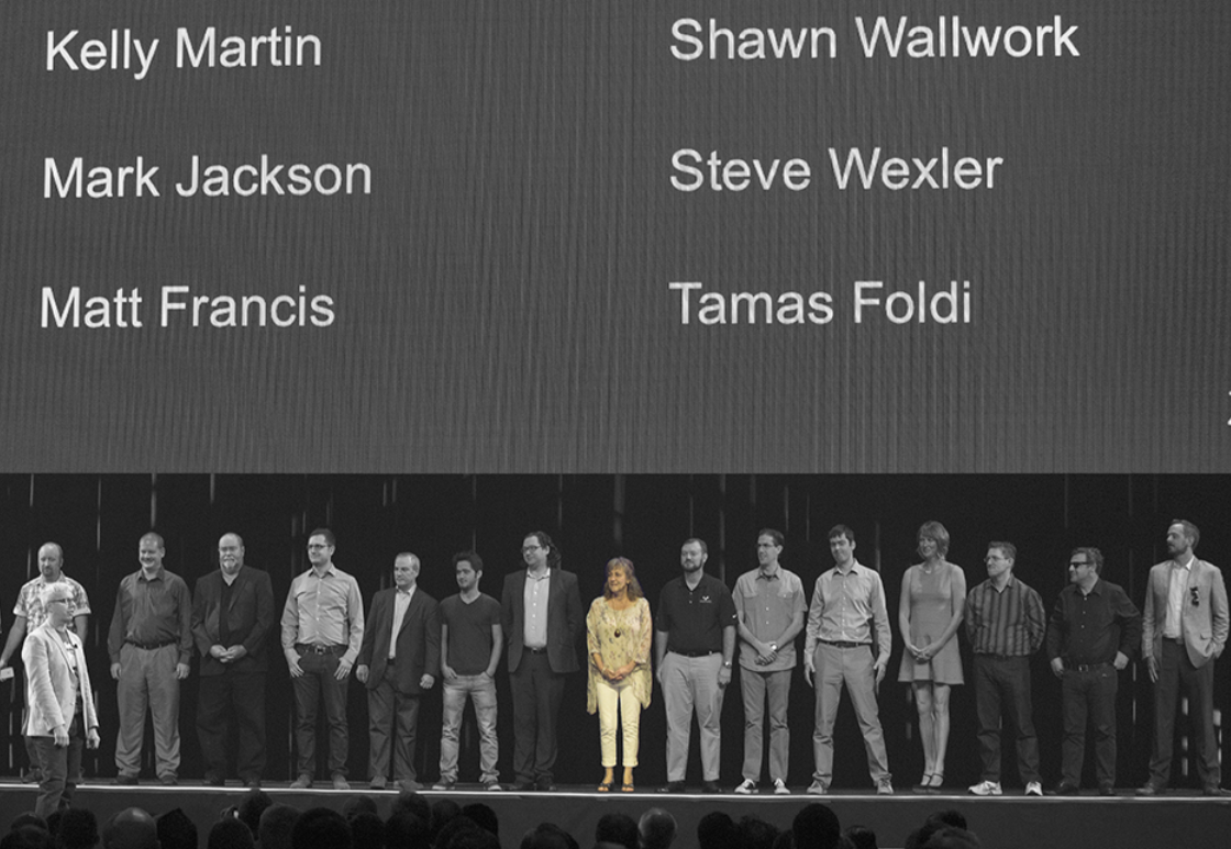
This past Monday we lost a beautiful soul when Kelly Martin passed away. She had been battling cancer for a long time and this past Moonday she passed away in her home. For those who are new to the Tableau community or the broader data visualization community in the last few years, you may not have had the opportunity to meet her. Today, we stand on the shoulders of giants, and I think it's important to recognize the leaders that have come before us. For me, Kelly was one of those people.
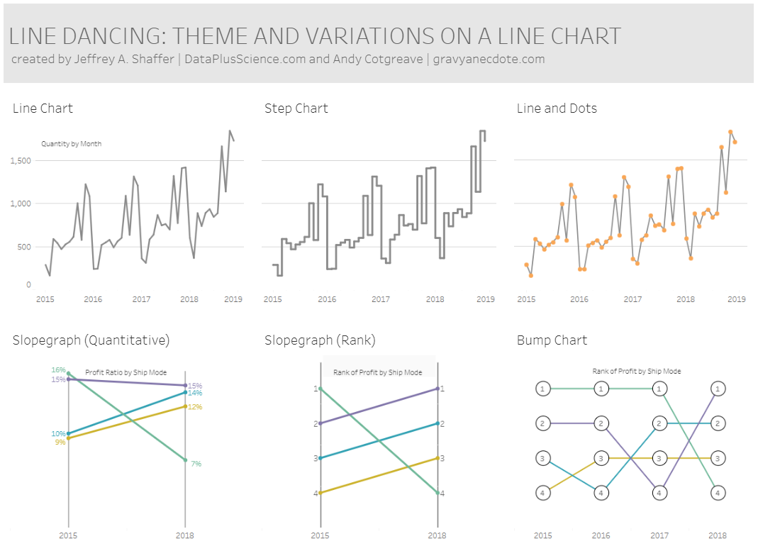
Back in January, I published Bar Hopping: Theme and Variations on a Bar Chart. This was a very popular visualization, and I so I started working on a Line Chart variation. Meanwhile, Andy Cotgreave had the same idea and so we decided to collaborate on this one. The variations include other chart types, which are variations of form. For example, the slopegraph, area chart, small multiples, and parallel coordinates. However, there are also variations of style, for example, a line chart with dots.
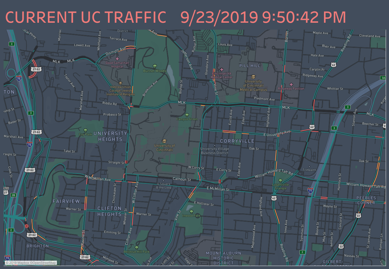
A visualization of real-time traffic around the University of Cincinnati, in Cincinnati, Ohio. Built using Mapbox map.
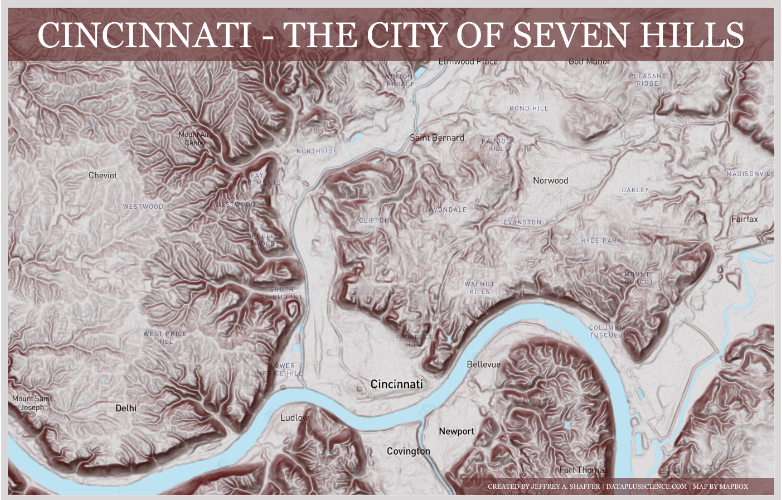
A visualization of the hills in Cincinnati, Ohio. Built using Mapbox map.
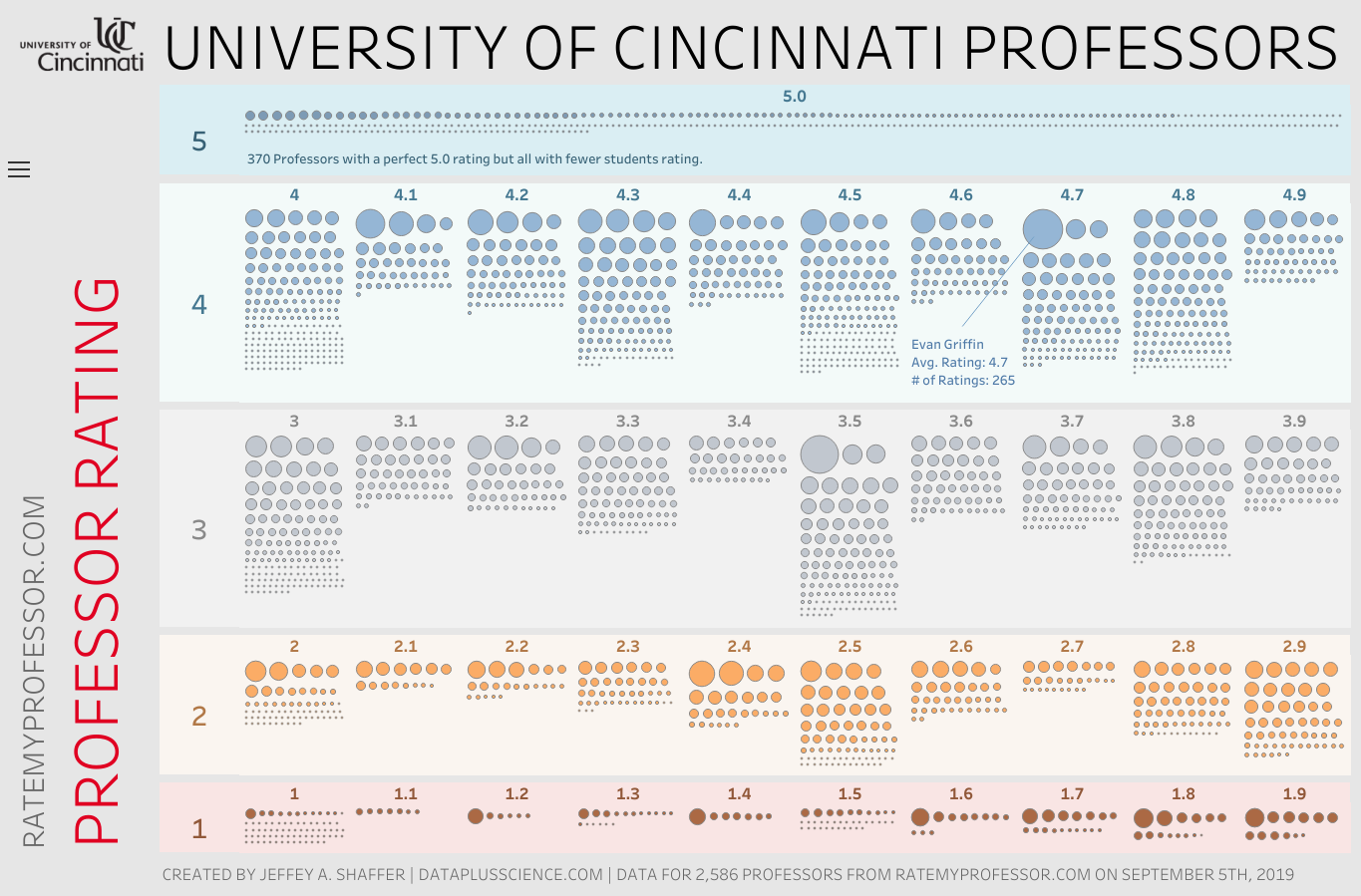
A visualization of the ratings of 2,586 professors at the University of Cincinnati using the ratings from RateMyProfessor.com on September, 5, 2019.

I have been teaching data visualization at the University of Cincinnati for almost 8 years now. I have taught 33 classes, with 3 more this semester and nearly 1,700 students (not counting the students from this semester). The profile of the students, which will be important to understand for the topic of this post, is mostly graduate students pursuing Master of Science in Business Analytics or Master of Science in Information Technology, but there are also other degrees and majors sprinkled in, including MBA, Finance, Marketing, Arts Administration, Engineering and even Graphic Design (the last 3 being outside of the business college). There are also students pursuing a certificate in Business Analytics. Many of these students have some work experience as well. This is typically a few years of experience, possibly as a consultant, or intern or they may be pursuing a degree or certificate while they work full-time.
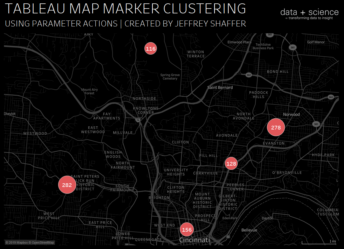
Last month I posted on how to create a map zoom with a radial distance circle and increasing mark size. In this blog post, I will demonstrate how to do marker clustering in Tableau using parameter actions. When plotting hundreds or thousands of points on a map, the map can get very cluttered. One technique that can be useful is clustering the points into one marker. The size of the marker can indicate the number of points in that area.
Font Awesome is a great collection of icons that are widely used in web development and other projects. The free version of the Font Awesome Icons is available for anyone to use. I loaded and organized all of the Font Awesome Free Icons into a Tableau workbook. Click the download button to download a zip file of all of these icons as PNG and SVG images. I have also included a CSV file with a list of all of the icons.
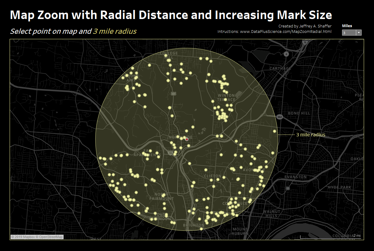
Back in October 2018, I posted this map highlighter on Twitter. A month later, Sarah Battersby posted this on Twitter and suggested adding a radial function to it. In this blog post, I will demonstrate how to do this and more. Specifically, how to create a map that will zoom in, filter and show a radial distance, control the radial distance, format the radial distance and the points and increase the mark size as it zooms in. This combines several techniques from many different people as well as a few tips and tricks.
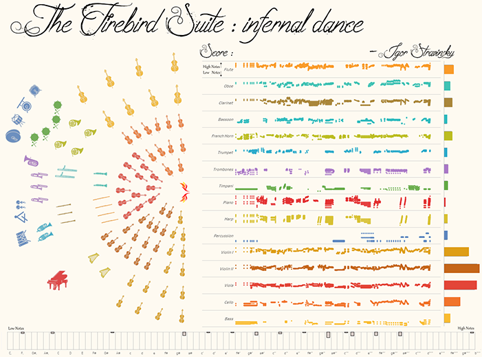
Dinushki De Livera's visualization of the Infernal Dance from Stravinsky's Firebird Suite
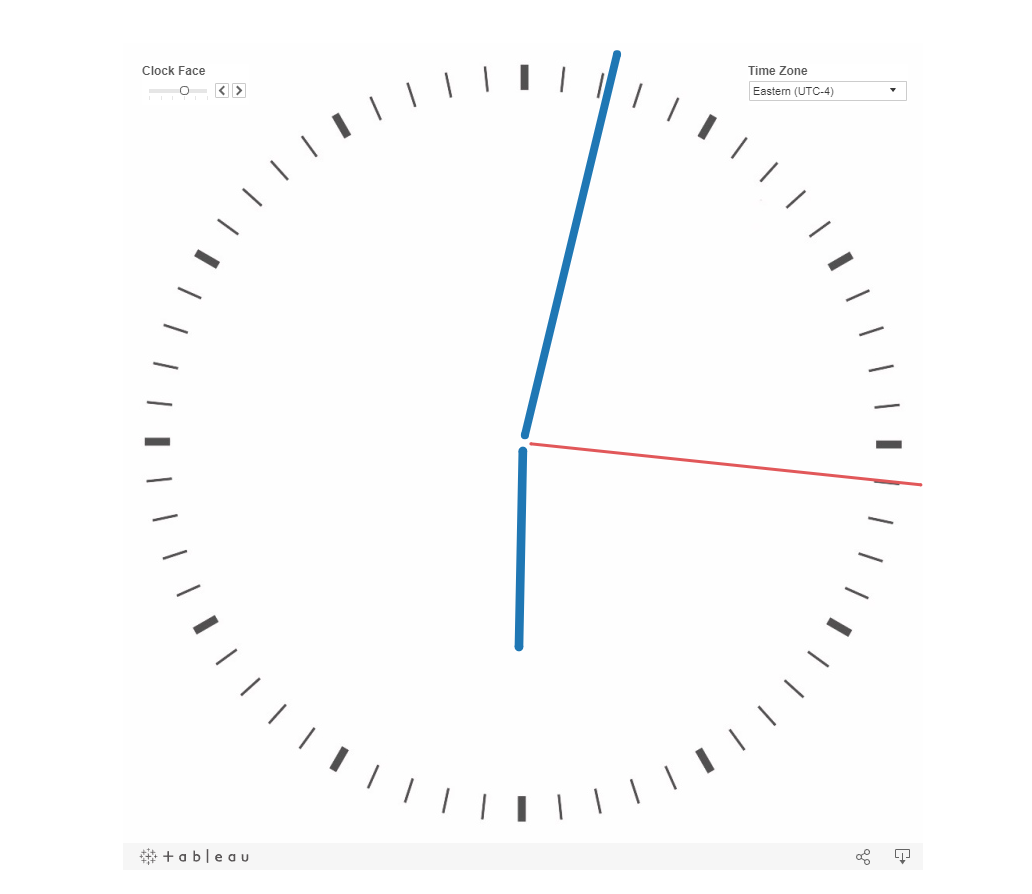
A working clock built in Tableau with time zones and different clock faces.
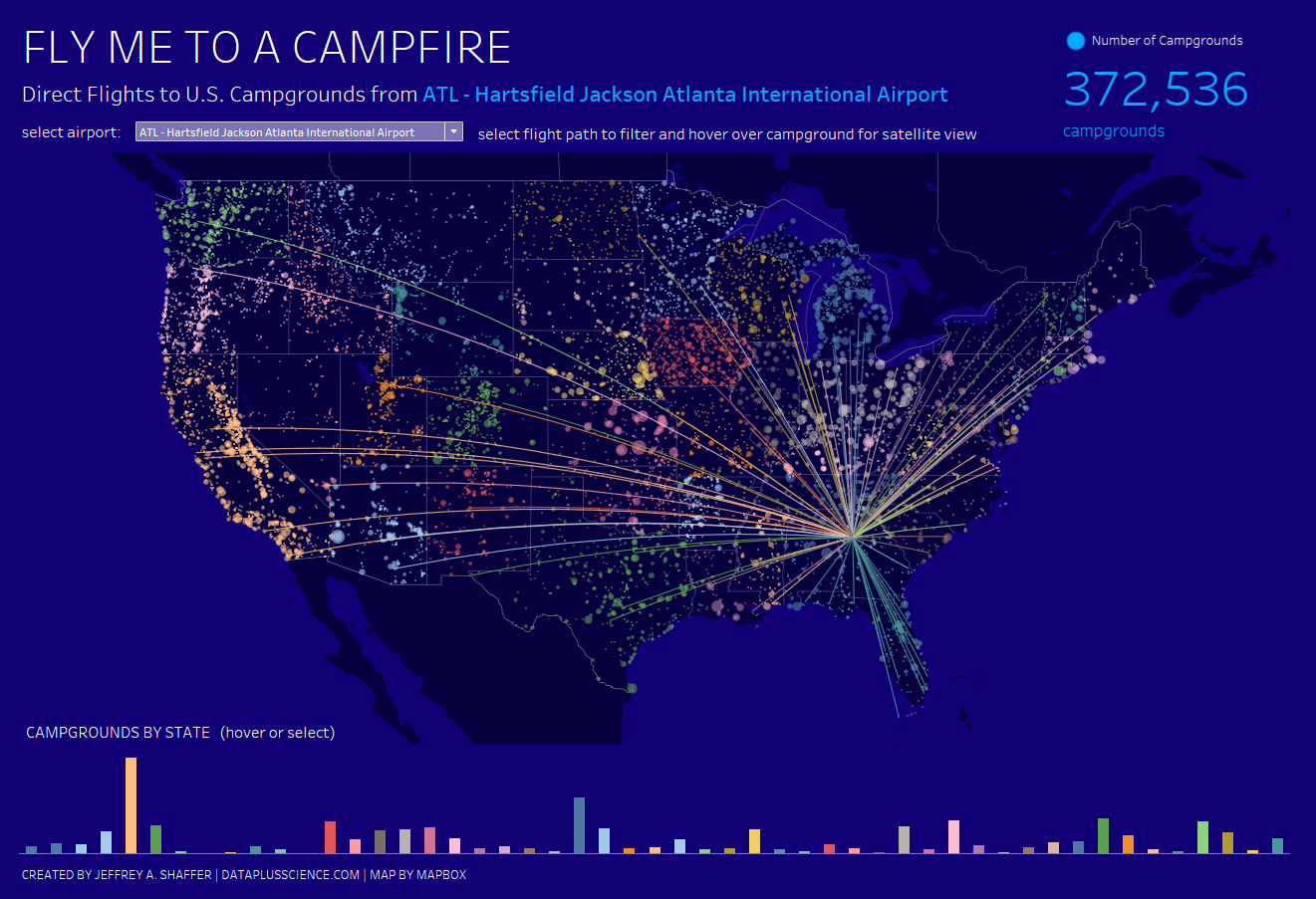
A visualization of Direct Flights from Major Cities to U.S. Campgrounds. #VOTD

Last week Salesforce announced that it will be acquiring Tableau Software. On the morning of the announcement, my phone was blowing up with messages and calls from people all over the world, asking me my thoughts. Back in 2/2016, I wrote a blog post on Tableau Stock and Technology Trends. In that post, I described my use of Tableau and also disclosed that I was a shareholder, buying Tableau stock at various points in time. In this post, I write an open letter to Salesforce about their acquisition.
More
With the release of Tableau 2019.2, there are now new map styles and map layers available in Tableau. This allows the us to create a number of new maps in Tableau without embedding Google maps or other mapping tool like Mapbox. In addition, the mapping layers are now vector maps. In this post I will examine a few of these and explore some of the additional options and formatting that are now available.
More
Here is the 15th installment of Tableau tips where I explore quick tips that I find very useful.
More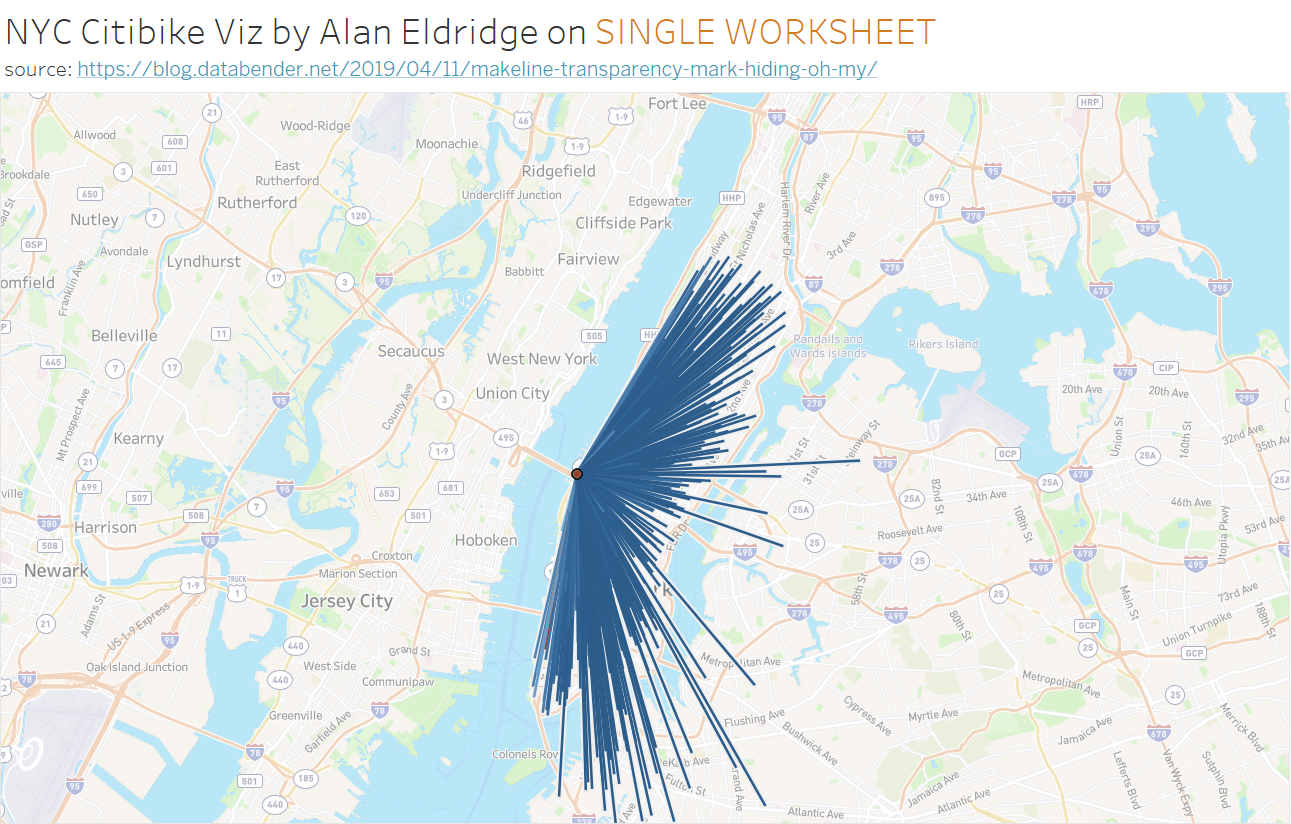
In this blog post, I want to demonstrate one of the amazing new features that is now available in Tableau 2019.2 (currently beta). I am very excited about this because it will make mapping paths so much easier an more efficient, but it will also give us flexibility for some new things. The new functions are MAKELINE() and MAKEPATH().
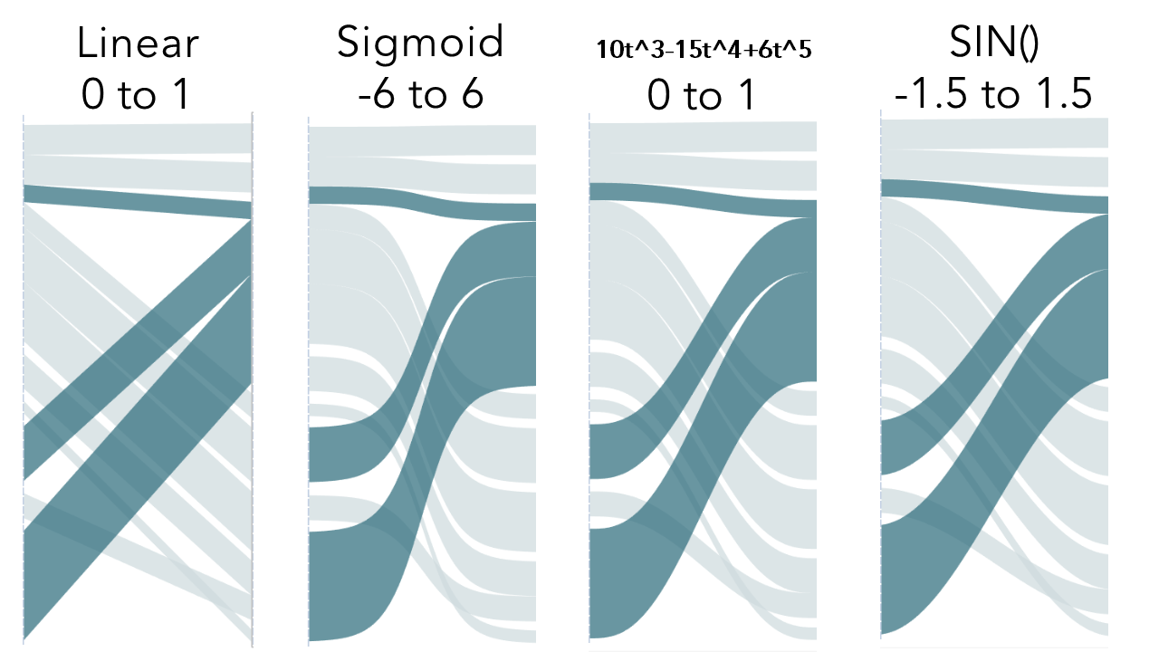
It’s hard to believe it’s been 5 years since I wrote this blog post on creating a Sankey-Style Slopegraph in Tableau and I outlined how to create an S-shaped curve using the Sigmoid function in this blog post. For those not familiar, here’s a brief Tableau history on this topic. So what’s the problem? The issue is the shape of the line in the Sankey diagrams. When using the sigmoid function, the flow diagrams start out showing the size correctly, but as they curve, the function narrows the line.
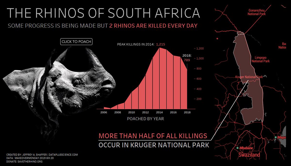
A visualizations of Rhino poaching in South Africa for Makeover Monday (2019 wk20).
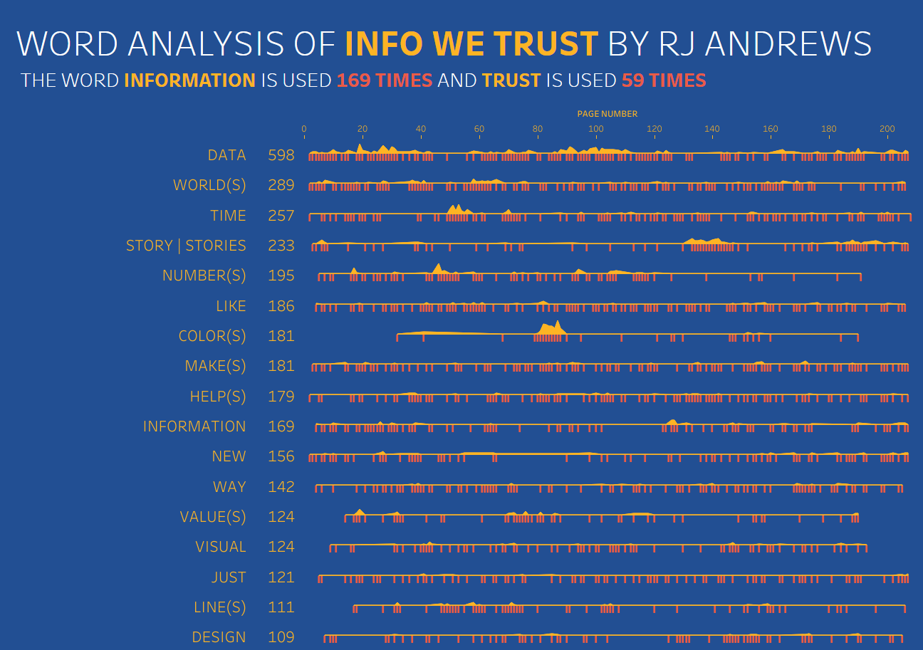
A visualizations on Word Analysis of the book Info We Trust for Makeover Monday (2019 wk16).
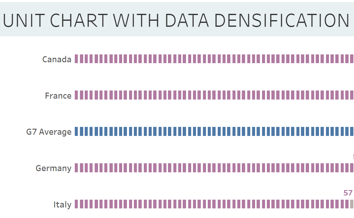
Rodrigo Calloni posted a question on the Tableau forums last week asking how to recreate this chart in Tableau. Mahfooj Khan offered a great solution for this, creating a join to another sheet to add the additional marks needed for this unit chart. The question came up again on the Viz Review for MakeoverMonday hosted by Eva Murray and Sarah Barlett. In this post, I will offer an alternative solution using data densification. This is not a new technique. I learned this technique from Joe Mako. In fact, back in 2015, Joe was kind enough to do a screen share with me. He quickly mocked up some data, unioned it up using Custom SQL and created a few fields in Tableau. In a matter of minutes he had created a unit chart with a parameter to adjust the unit size. Then he walked me through how it all worked. For anyone who's had the pleasure of Joe walking you through something like this in Tableau, you will understand when I say, it was truly impressive to watch him work through this.
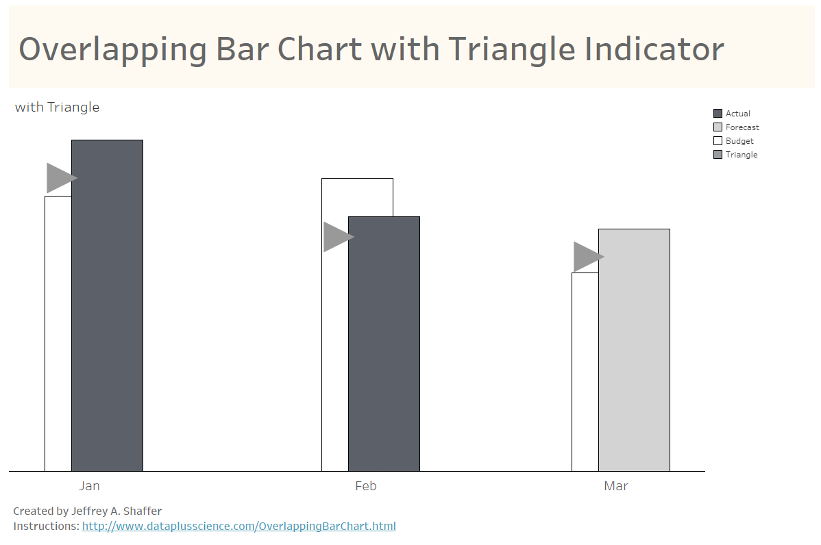
There continues to be strong interest in my recent visualization, Bar Hopping: Theme and Variations on a Bar Chart. This week on LinkedIn, Steve Adams saw the post and asked about building another variation of a bar chart in Tableau. He was struggling with trying to reproduce overlapping bars. Normally, I would suggest we avoid these types of visualizations. Overlapping bars can make the comparisons harder to see and a bar with a target line would be a much better choice. However, this visualization is apparently a requirement to be compliant with the International Business Communication Standards (IBCS), so it is necessary for Steve to be able to reproduce this in Tableau.
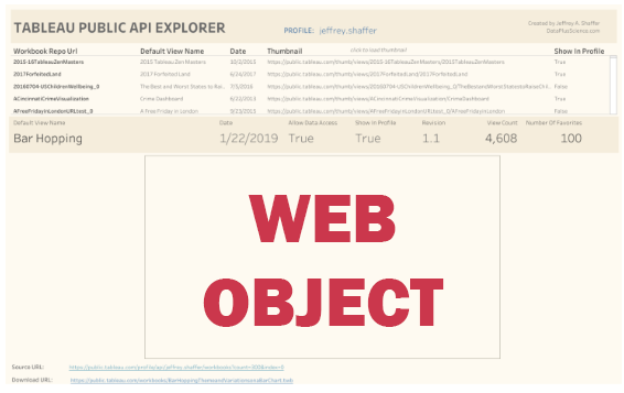
This is a quick tip to show you how you can deal with web objects on a Tableau Public visualization. It can be frustrating to build a viz and then upload it to Tableau Public, only to see lots of blank spaces on your visualizations in your gallery. It would be great if Tableau Public had a feature where you could upload your own thumbnail, similar to YouTube. However, that's not the case. The thumbnail is automatically generated when the visualization is saved up to Tableau Public. So here's a quick tip for dealing with this.
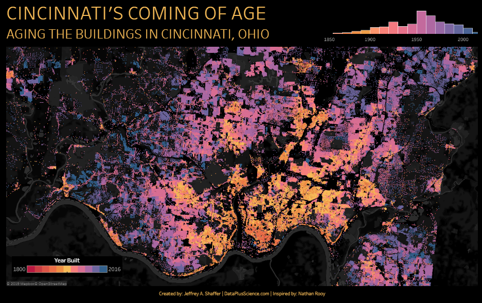
A visualizations of the aging buildings in Cincinnati, Ohio. Inspired by Nathan Rooy. #VOTD #VOTW
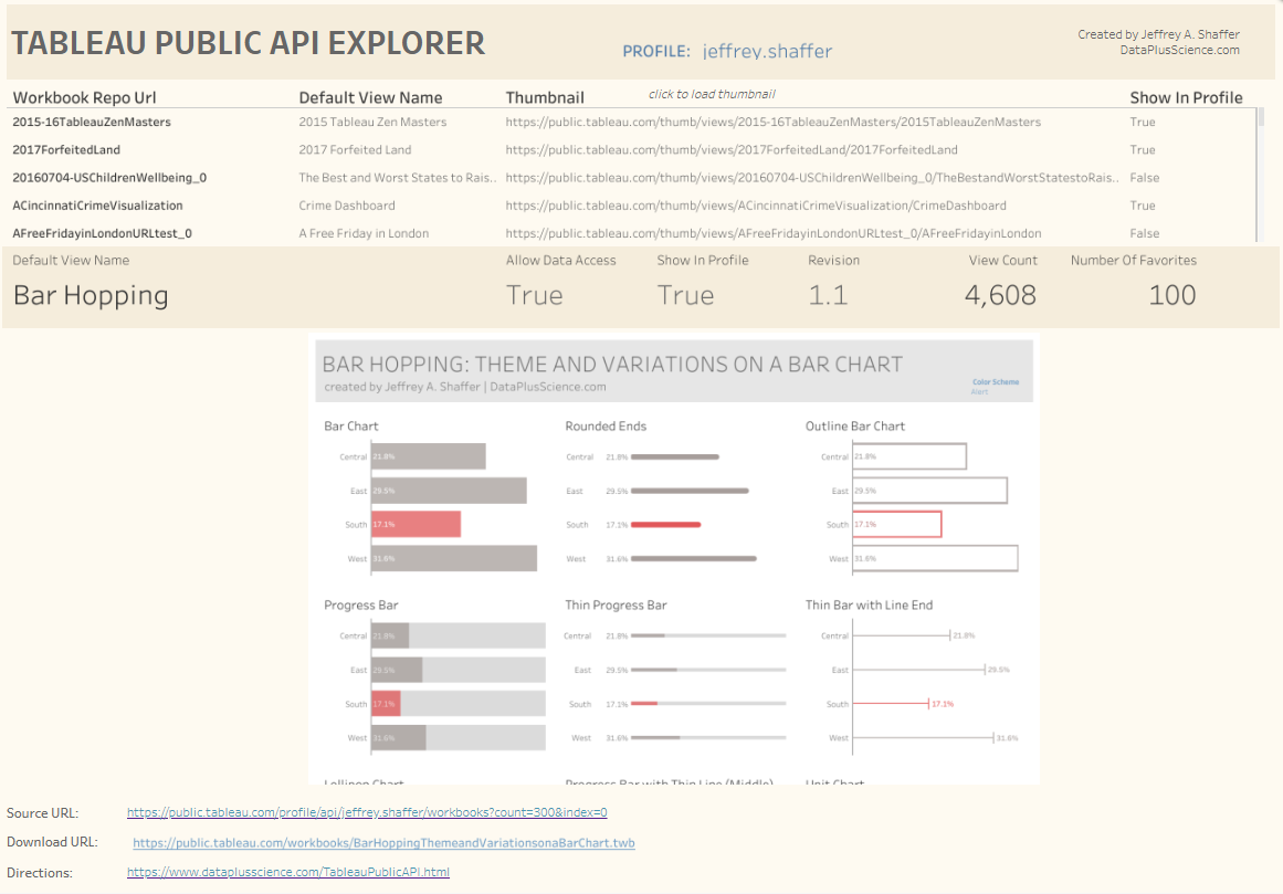
In this blog post I will outline how you can get quick and easy statistics on any Tableau Public Profile using the Tableau Public API, and how to batch download Tableau workbooks from a Tableau Public Profile page. There are already some good blog posts on this topic and a terrific community resource called The Cerebro Project that was built and is maintained by Josh Tapley. However, it's pretty easy to pull your data, or anyone's data, using the Tableau Public API in just a few steps.
I recently upgraded to Tableau 2019.1 and that reminded me of a blog post that I've been meaning to write for a very long time. When upgrading to a major release in Tableau, the list of recent files dissappears and the saved color palettes disappear. For Windows users, we can fix this with a few very simple steps. Note however, this requires modifying the registry, and it's best to note Micorsoft's warning about this. "Changes made to the Windows registry happen immediately, no backup is created automatically. Do not edit the Windows registry unless you are confident about doing so." That said, the steps are really very simple.
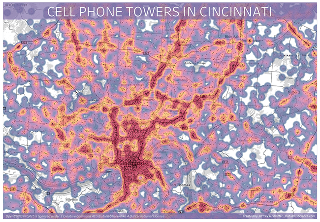
A visualizations of the cell phone coverage in the Cincinnati area.
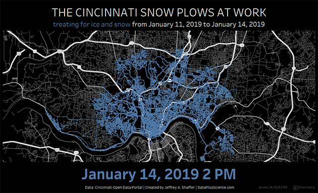
Treating for ice and snow from January 11, 2019 to January 14, 2019. Data from Cincinnati Open Data Portal.
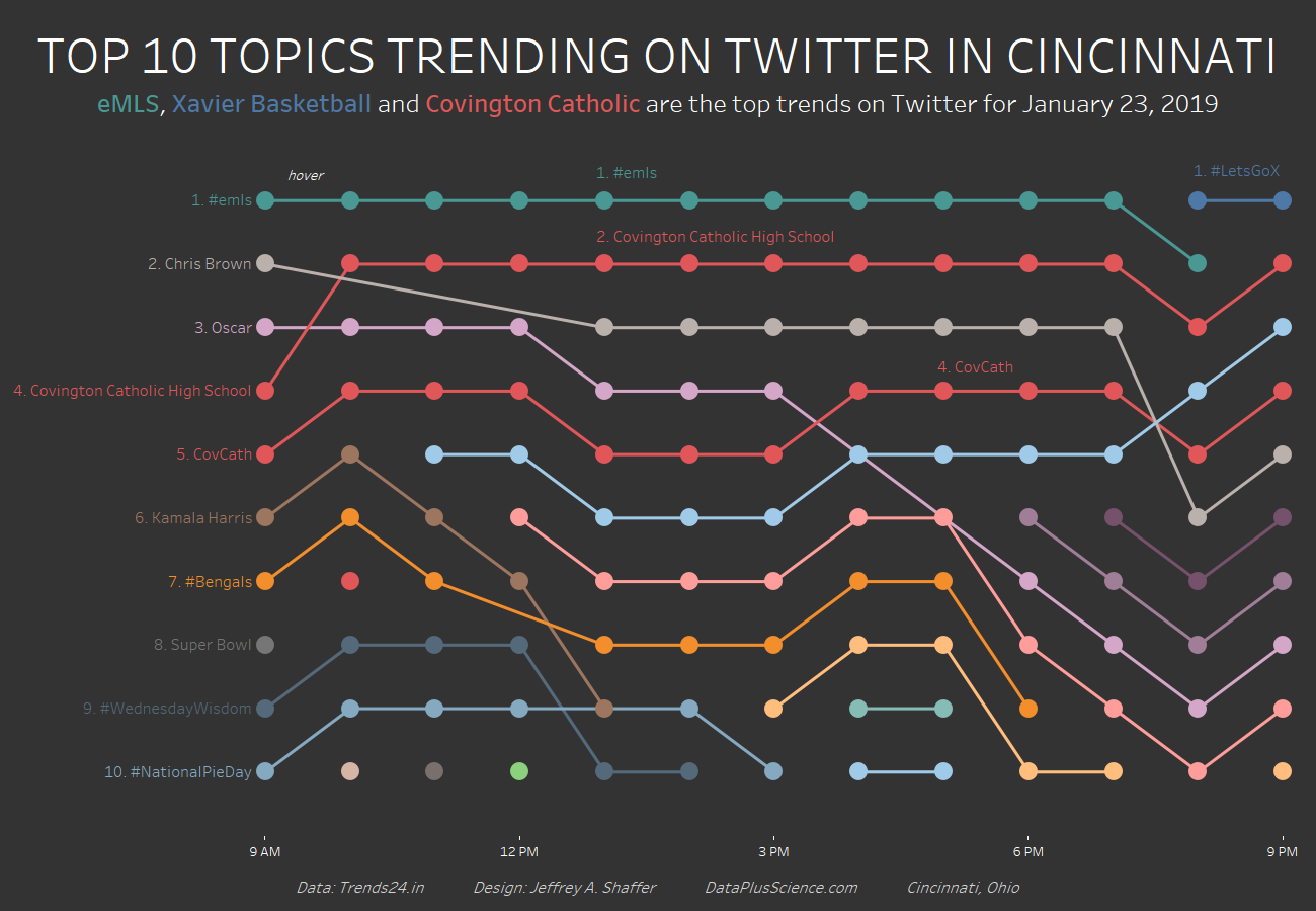
A visualization of the top 10 trends on Twitter in Cincinnati, Ohio for January 23, 2019 including eMLS, Xavier Basketball and Covington Catholic.
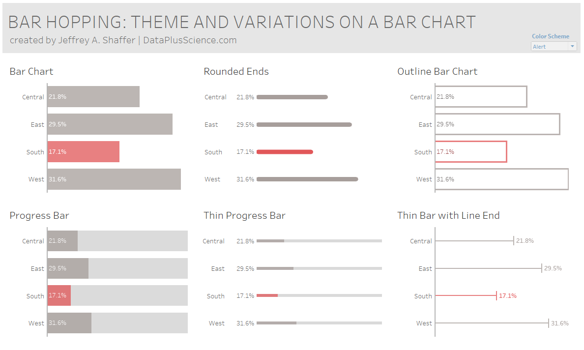
If you've spent time visualizing data then you have likely heard the phrase, "bar charts are boring". We know from research that bar charts can be very effective for encoding data for precise quantitative comparisons, but often times clients, customers or stakeholders ask for "something different". Others have argued that it's the data that is boring, not the chart. While I agree with that premise, I decided to explore some variations on the design of a simple bar chart to demonstrate that all bar chart design does not have to look the same.
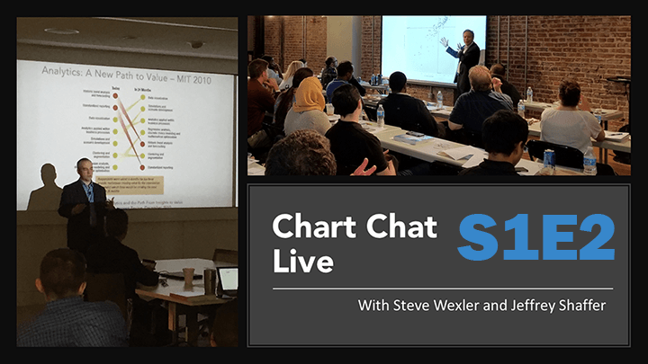
Thank you to everyone that joined our second Chart Chat live webinar. If you were not able to join us for our latest episode of Chart Chat, then check out the video on YouTube, download the slides and read a recap of the webinar.
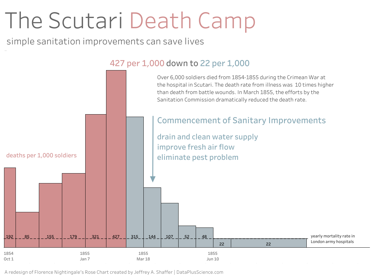
Last month, Steve Wexler and I did our first Chart Chat episode where I showed a redesign of the famous Florence Nightingale Rose Chart. The original diagram was published in Contribution to the Sanitary History of the British Army (1859). It was recently recreated in Tableau by Satoshi Ganeko and featured as the Tableau Viz of the Day yesterday. My original redesign was created in Adobe Illustrator, but in this blog post I will outline the steps to create it in Tableau, but first a little background about the Rose Diagram and this redesign.

A discussion and redesign of the London Buses Safety Dashboard from MakeoverMonday 2018 Week 51.

Thank you to everyone that joined our first Chart Chat live webinar. If you were not able to join us for our first episode of Chart Chat, then check out the video on YouTube, download the slides and read a recap of the webinar. Be sure to check out Jeff's redesign of Florence Nightingale's Rose Chart.
In Tableau Tips Volume 13 (Tip #2) I showed a zoom in feature on a map. In that example I used a small map on a Dashboard canvas and set the tooltip using a larger map with labels. This creates a zoom feature on the map, keeping the map small on the dashboard, but zooming in on hover. In this example, I will show a zoom feature on a scatterplot to zoom in on dots that are very close to each other or on top of each other. This is done using Bins.
The z-order is the order of overlapping two-dimensional objects, for example, circles plotted on top of each other in a scatter plot. In Tableau, we don't explicitly define a z-order in that way. Instead, the view is defined by the marks that are being used. This can be confusing, and some times frustrating, when plotting marks on top of each. If a larger mark is plotted on top of a smaller mark, then it becomes impossible to hover or select the smaller mark. This affects tooltips, hover actions, or selecting a mark to highlight or filter. In this post I will outline how to control the z-order. Here are three examples.
If you are not one of the 100 followers of Katarzyna "Kasia" Gasiewska on Twitter then you will be missing out on some great visualizations that are sure to pop up on her Tableau Public profile. Her very first post on Twitter was her recent Iron Viz entry Water, Water Everywhere and when she posted a new viz last week, it caught my eye immediately. The viz was DID YOU SRSLY NAME ME THAT? and it was the Tableau Viz of the Day last Friday. When I saw the image of the viz I was immediately drawn too it, but before I even clicked the link, I noticed her Tweet about the "way-too-long initial loading time". As soon as I clicked on her viz I felt her pain.
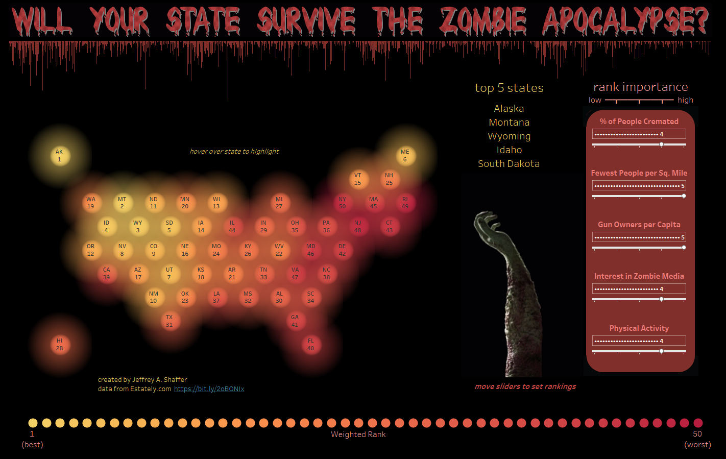
A visualization ranking states by various criteria in case of a zombie apocalypse using data from Estately.com.

I have been teaching Data Visualization at the University of Cincinnati (U.C.) since 2012 and from the very beginning I have been using Tableau as part of the course. Over the years this has developed into more of the curriculum, as students have asked for more Tableau training as part of the class. Last year I developed a data visualization course template for Tableau and included Tableau training and tutorials are part of that course as well. Besides being a leader in the visualization space, Tableau offers a great program for teachers and students, the Tableau for Teaching program. In this blog post I will outline this program and how to set up Tableau (for free) in a classroom environment.
More
Here is the 14th installment of Tableau tips where I explore Dashboard design, the new grid options in Tableau and various other Tableau tips to help you when designing your dashboards.
More
Tableau has the ability to import and plot a number of spatial file types. This includes shapefiles (polygon, line and points), GeoJSON and KML files. This is very handy and makes it very easy to import and create a map. In fact, once imported into Tableau a simple double-click of the Geometry pill will plot the spatial file on a map. It's really that easy. However, due to the structure of some of these files, you may wish to convert your files to a different format. Let's walk through an example.
More
In a recent blog post by entitled Is this better than a Jitterplot? Could be, Steve explores alternate ways to visualize a jitterplot (a dot plot with random jitter to separate the dots). In this post, I show how you can create a box plot separated from the unit histogram.
More
I was reading a recent blog post The Spawning of the Tadpole Chart by Mark Edwards. Mark's post outlines pros and cons for various style of this chart, but asked on this Twitter thread how to make the lines stop at the outer edge of the circles instead of going into the center of the circle. I've seen this come up before and I've attempted several different approaches for this over the years, so I thought I would share a few of those attempts and a simple solution that works well for creating these Tadpole charts and other charts in Tableau with open circle marks.
More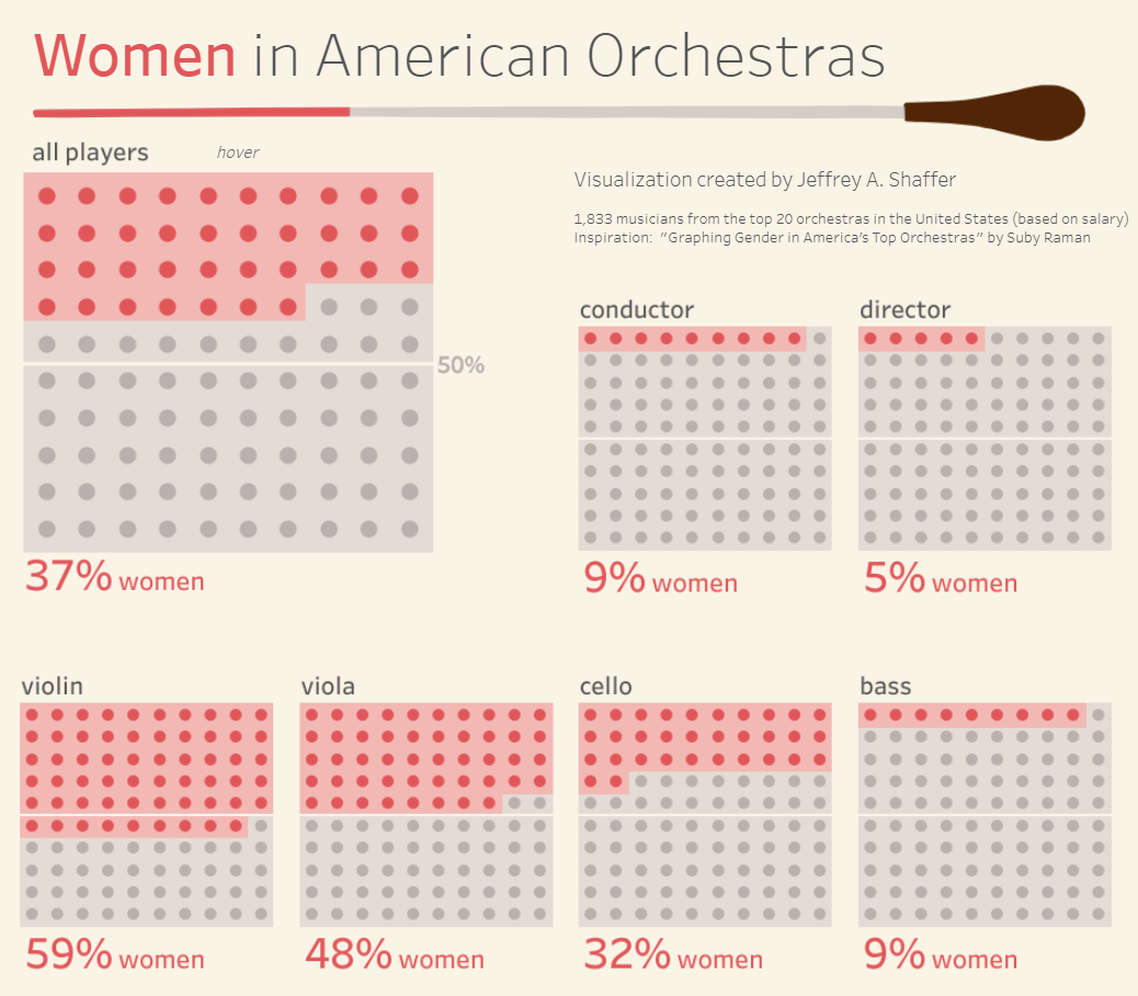
A visualization showing the percentage of women in the top 20 American Orchestras by section of the orchestra.
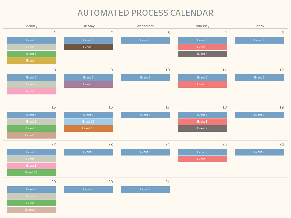
This blog post is based on a recent visualization we created at the office. The goal was to visualize a list of automated tasks that occur periodically throughout a month. Some of these tasks happen daily, some weekly, bi-monthly and monthly. There are 14 total processes that trigger at different times during the month. We wanted a way to visualize this, in a calendar form, rather than just a list in Excel. Most calendar views in Tableau visualize some sort of Measure. or example, this tutorial by Kevin Taylor demonstrates how to create a calendar with a Measure and check out this video by Data Science Central. However, in my scenario, I do not have any measures. I simply want to visualize a list of discrete events on the calendar as text. I will outline two methods to do this.
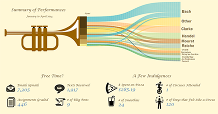
In the last few years, there has been a lot of discussion about women in the field of analytics. For example, many people have talked about the number of women speakers at conferences or the number of women participating in various events and competitions. As I thought about this, I thought about the parallels between the trumpet world (actually the brass world in general) and the field of data and analytics (and the broader STEM fields). My trumpet professor at the University of Cincinnati College-Conservatory of Music was Marie Speziale. This remarkable woman was a pioneer, paving the way for countless others. I wanted to get her perspective and she was gracious enough to allow me to interview her for several hours back in January and February. What follows is a long conversation, but it is a conversation that I think is very important.
More
It was just about a year ago that Steve Wexler and I wrote about a very similar topic. Back in January 2017, we wrote about the analysis that was done in a great many of the Makeover Monday visualizations on the Australian Gender Pay Gap. You can read more about that here. Yesterday, I saw a number of trending notifications for Barclays that caught my attention and I wondered what was going on. When I searched Barclays, I quickly started to see Tweets and news articles such as the ones below. Just like the Australian gender pay data that I wrote about last year, these headlines are comparing averages. At least Bloomberg and CNBC used the word "average". And buried in some of these articles is the important point.
More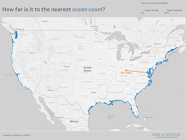
Brooke asked on Twitter if there was a way to find the nearest ocean coast for a given point on a map. I mocked up a solution for this and posted it on Twitter. In this tutorial, I will walk through the steps of my mock up.
More
What is music? What is art? What is an automobile? There is a time and place for carefully drafted definitions. For example, when drafting legal contracts it is very important to have defined terms so that all parties to the contract have a clear understanding and avoid confusion. In the opening pages of The Big Book of Dashboards, we defined the term dashboard: “A dashboard is a visual display of data used to monitor conditions and/or facilitate understanding.” We spent a good bit of time debating this definition. We all recognize this is a broad definition, but we came to the conclusion that business dashboards, their uses, and designs, are so broad that it’s not possible to create a narrow definition.
More
Tableau 10.5 was released yesterday and we now have viz in tooltips. I wrote a blog post in October 10 Tips for Viz in Tooltips. There has been lots of buzz about the new release. I am especially excited to have new features like Viz in Tooltips, because it usually opens the door to many more things, often far beyond what the developers at Tableau planned for a given feature. Last night I opened Tableau 10.5 and began exploring the new Viz in Tooltips feature again, so I thought I would write up another post with another 10 tips on using Viz in Tooltips.

In this post I will outline how to generate a batch of PDFs using Tableau Server (or Tableau Public) by passing parameters into the URL. Let's say you have a Tableau dashboard or report and you would like to filter it and generate a PDF for each value in the filter (or parameter). For example, one PDF generated per state, region, store number or salesperson. Here's the general outline.

Now Available in Tableau 10.5 Beta! Back in July 2014, I wrote a blog post Tooltip Canvas in Tableau - A Mockup for Chart Functionality within Tooltips based on an idea I added to the Tableau Ideas forum back in April 2013. The basic idea was adding the capabiluity of having a visualization inside of a tooltip. This functionality was demonstrated on stage at the Devs on Stage at the 2015 Tableau Conference. After that conference, I watched beta after beta to see if this functionality had been added. The functionality was mentioned again at the 2016 Tableau Conference, but it wasn't until earlier this year that I saw the feature in an Alpha release. This was very exciting. I was able to work with that Alpha release and try out different features and I knew that the beta release wouldn't be too far behind. Well that day has come. Viz in Tooltips has now been released as part of Tableau 10.5 beta.
Tableau just release version 10.4 and with came some great new features. Dashboard spacing will be so much easier with the ability to control padding and collabortation with discussions around visualizations has been added to Tableau Server. One of these new features added in 10.2 was the ability to connect directly to spatial files, but this was limited to polygons and points. Now with 10.4, you can connect directly to spatial files that are lines and the Tableau community has been having lots of fun with this.
This is a guest post by Peter Fakan showing how to swtich map shapefiles using parameters and calculated fields.

Linking to Tableau visualizations through a URL can be very useful. This includes links to download Tableau Public workbooks, create PDFs or PNG images and even download sheets as CSV files. Here are updated URLs to download the various file formats.
Bar charts are great tools for visualizing precise quantitative comparisons, but in certain instances they can be problematic. Fo example, if the difference in the data is very small then other chart types are often better, for example a dot plot. To further complicate things, let's image that the scale of the things being compared are all very different. A common example is stock price.

Shapes can be useful in Tableau and they also allow us to be creative with our visualizations. Here are 10 tips for using Shapes in Tableau.
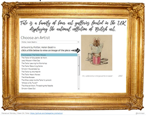
This post offers a solution for embedding URL images in Tableau Public. This past week's Makeover Monday featured a data set of Artwork from the Tate Collection. A number of people in the Tableau community tried linking the images from a public website gallery to their Tableau Public visualization. These visualizations worked well in Tableau Desktop, but when published on Tableau Public they didn't work correctly. When linking to a URL, Tableau Public requires the URL to be HTTPS, which wasn't possible without downloading and hosting all of the images.
More
Yesterday, Stephen Few published his quarterly newsletter and discussed issues around jittering dot plots. He proposed a new chart type or new version of jitter (whichever you prefer). He referred to this chart as a Wheat Plot or stripogram. Steve Wexler and I traded several emails with Stephen Few about this chart prior to the newsletter and Steve Wexler created several variations. In this post I will outline how I built the Wheat Plot in Tableau.

Tableau 10.3 was released on Thursday and I've been waiting to publish the 10th volume of Tableau Tips. With this 10th volume of tips published, I've now posted 100 Tableau tips. This volume of tips will cover features that have been released in the most recent version of Tableau 10.X.

I frequently get asked, "do you have any suggestions or resources on how I can learn Tableau?" or sometimes a variation of that question, "how can I get better at Tableau?". I typically respond with a number of resources, so I thought I would put my thoughts together in a post.
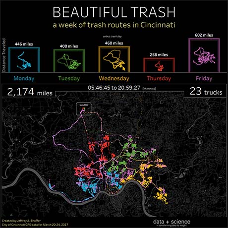
A visualization showing a week of trash routes in Cincinnati using data from the City of Cincinnati's Open Data Portal.
Last week was a very exciting week. The Big Book of Dashboards was officially available in the U.S. and copies ordered months earlier started to arrive. Images of people holding the book were popping up on Twitter, LinkedIn and Facebook and notifications of shipping and social media were going crazy. It was great to have a copy in hand and to see the final result of a very long and involved process.
More
Earlier this month I wrote a blog post about Using Treemaps to Visualize Data where I explain how and when a treemap can be useful in data visualization. Last week Andy Kriebel posted a Workout Wednesday challenge to Highlight a Treemap, which demonstrates three different techniques to highlight a segment in a treemap. This post will demonstrate how you can change the level of detail that the treemap uses and even use different levels of detail within the nodes of the treemap.
More
This installment of Tableau Tips focuses on tips used in creating a recent Makeover Monday visualization.
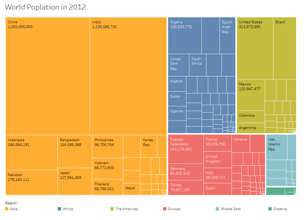
In a recent blog post here by my friend Andy Kriebel, Andy talks about Makeover Monday and discusses his views on treemaps and bubble charts. A few people asked questions on Twitter about when these could be used. A few people, including Andy, responded "never". I decided to write this post to offer some background and a few scenarios where I think these charts work, specifically the treemap.
More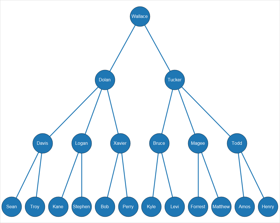
In this guest post, Josh demonstrates how to determine the organizational structure and create a hierarchy diagram in Tableau with nothing more than a list of employees and their manager.
More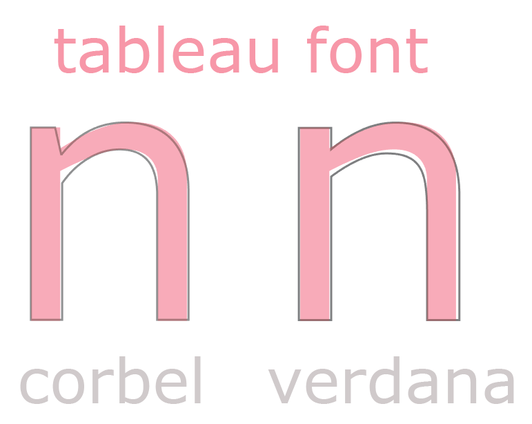
With the release of Tableau 10, Tableau introduced a new font family, the Tableau font. This includes Tableau Regular, Light, Book, Medium, Semi-Bold and Bold. Tableau created an all-new look for the Tableau 10 interface and with it came new color palettes and the new Tableau Font family. Tableau worked with Tobias Frere-Jones to develop this new font.
More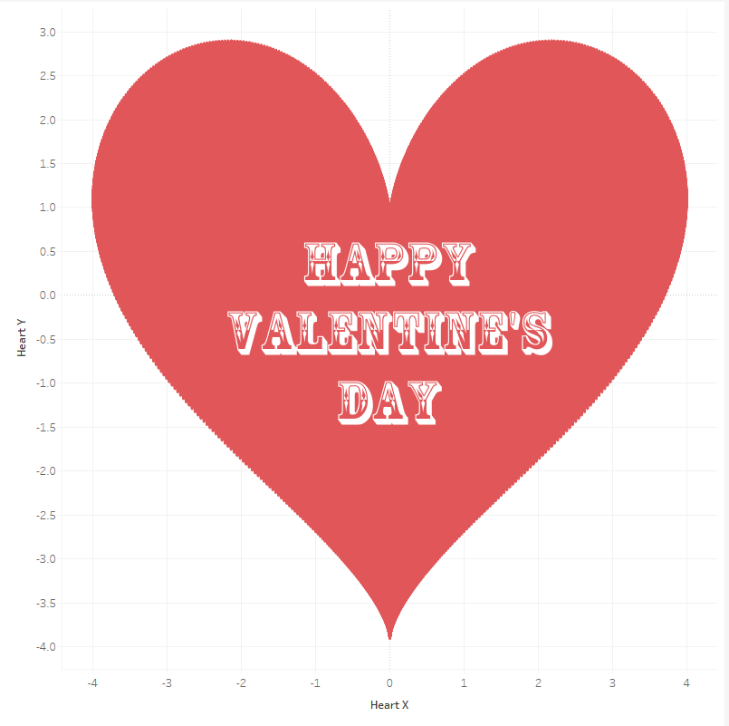
Last year I presented a Think Data Thursday with Noah Salvaterra and Chris DeMartini called "I didn't know that was Tablossible". In that presentation, I did a short demonstration of how to build a heart in Tableau. Since Valentine's day is tomorrow, I thought I would post instructions on how I built the heart, and other shapes, in Tableau.
More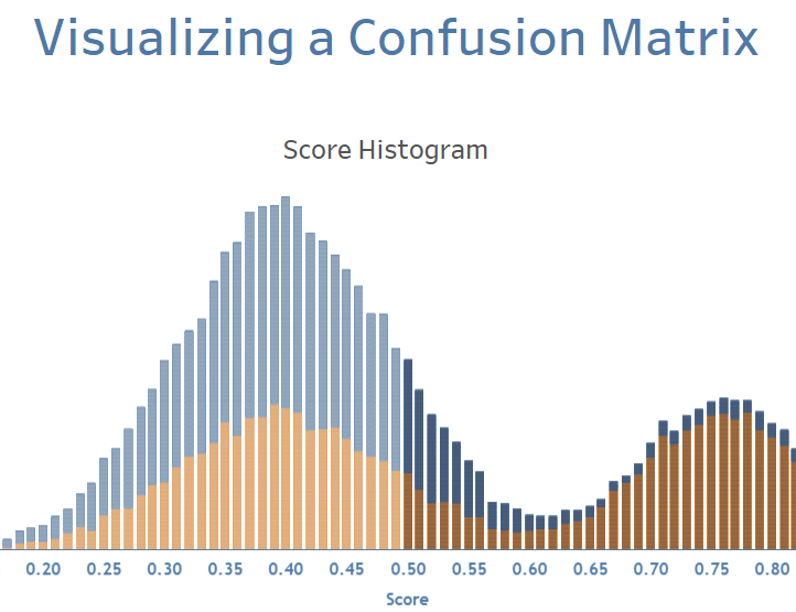
This post is about types of analysis that aim to model a Boolean outcome using a continuous score and a cut-off point. Modeled scores can be converted to Boolean values based on a set cut-off point, i.e. above the cut-off point and below the cut-off point. For instance, where modeled probabilities as an output of a Logistic Regression, SVM, and/or Deep Learning algorithms are continuous scores.
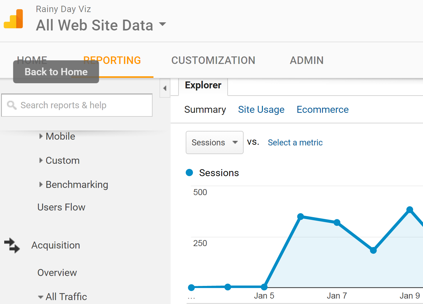
When publishing a visualization on Tableau Public, I'd like to know things like views of the viz over time rather than just the cumulative total, the geographic distribution of these viewers and maybe device information (mobile vs. desktop) so that I can design accordingly. These are the exact same things tracked on websites. I use Google Analytics to do this for my websites and they have a great platform to track all of these things. Tableau even has a native data connections so you can connect your Google Analytics account instantly to Tableau for a deeper analysis. So why not leverage this platform for your Tableau Public visualizations too?

In working on the Big Book of Dashboards with Steve Wexler and Andy Cotgreave, I had the need to have high resolution graphics for the book for two dozen dashboards and various other images. My end goal was to get the best image for print that I could create, preferably a vector graphic. The source in most of these cases was a Tableau workbook. I've been meaning to post these methods in case others have this need. The learnings here come from countless hours of work, so hopefully what I share with you can help you if the need arises.

The Makeover Monday project, started by Andy Kriebel and Andy Cotgreave, is now one of the biggest community projects in data visualization. By the end of 2016 there were over 3,000 submissions and 2017 began with record-breaking numbers, with over 100 makeovers in the first week. We are big fans of this project and it’s because of the project’s tremendous success and our love and respect for the two Andys (and now Eva Murray) that we feel compelled to write this post.

It's been a fantastic and very busy year. A big thanks to all the readers of this blog. It's hard to believe that the year is over, but looking back is always fun. Here's a few highlights for 2016.
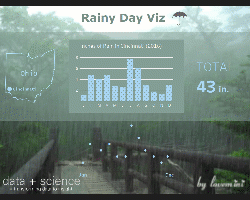
This installment of Tableau Tips focuses on tips used in creating a Rainy Day Viz.

This installment of Tableau Tips focuses on tips for creating reference lines, average lines, constant lines and trend lines in Tableau.
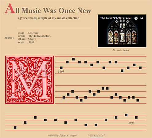
A visualization showing a very small sample of my music collection, done in the style of Gregorian Chant Notation.

This installment of Tableau Tips focuses on tips for creating different map styles in Tableau.
A step by step for building bar charts and stacked bar charts on a map in Tableau.

A step by step for recreating a Pew Research Center chart in Tableau.

This is the fifth installment of Tableau Tips, offering a few simple tips and tricks in Tableau.

A few weeks ago I created a viz that tracks the position of the International Space Station using a live JSON feed and the Tableau Javascript API. In this post, I will walk through the steps in building this visualization. This requires a bit of coding, HTML, Javascript and AJAX, but the code is very short and very straight forward. Below is an outline of the code, a description of how it works and it's set up so you can just copy and paste.
More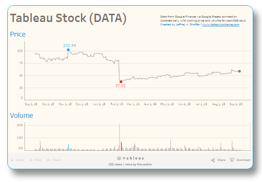
Last year I blogged about Using HTML Style Object Properties with Embedded Tableau Visualizations. I used this technique to style a Tableau viz in various forms; round containers, borders, shadows, oval shapes, rotation and even making tiny versions of the viz. There's nothing new about these stlying features, but as part of Tableau 10, you might have noticed that the embed code has been changed a bit and all of this is even easier.
More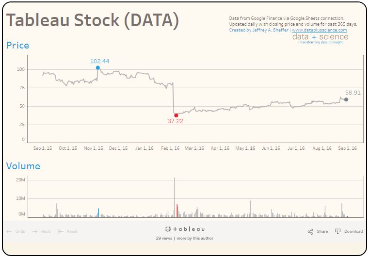
A few weeks ago I posted instructions on Connecting Google Sheets with Tableau 10. This technique connects data from Google Sheets to Tableau and updates it daily. In the previous post I imported data into Googe Sheets using the IMPORTHTML function and returned data from a table. In this example, I am going to use a built-in function in Google Sheets for historical financial data which comes from Google Finance. The build instructions are very similar.
More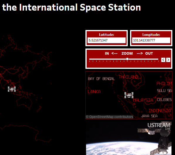
A Tableau visualization reading the current location of the International Space Station every 8 seconds. Uses live JSON feed passing the latitude and longitude into Tableau as parameters with the Tableau Javascript API. Allow scripts to run in browser for live video feed.
More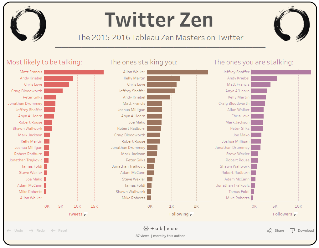
Tableau 10 was released yesterday and there are loads of great new features. I love the new Tableau fonts, the cross-database joins and the new clustering capabilities, but one of the most exciting new features is the way it connects to Google Sheets. This is very exciting for a number of reasons.
More
The fourth installment of 10 simple tips in Tableau featuring Unicode characters.
More
Speed tips: the third installment of 10 simple tips in Tableau with instructions and animated GIFs.
More
There's been a lot of recent posts and debates within the data visualization community lately and one of the recurring themes is innovation, or as some have claimed a lack of innovation in the field. I'm not going to enter that debate at the moment, but instead talk about the process of innovation. People use this word quite frequently. Listen around you and I think you'll be surprised at how often people talk about it. But how do you actually do it? How do you innovate?
More
Last week I posted a new Tableau conversion tool here for converting Tableau files from one version of Tableau to a previous version of Tableau, for example, converting a Tableau 9.3 file back to 9.2 or a Tableau 10 beta file back to Tableau 9.3. A big thank you to the Tableau community for all of the emails and tweets. Clearly this is something the community has been looking for and I hope it's helpful. I wanted to follow up with another post to explain how the conversion is done, provide further details about the tool itself and give a disclaimer. So here it goes.
More
I have been converting Tableau files from one version to another version quite frequently. From students at the University of Cincinnati, people at the office and working on the Big Book of Dashboards with various people from around the world, I've had to convert all sorts of Tableau files. I find that more often than not, it's just a single version of Tableau. For example, someone is on 9.2 when the current release is 9.3, but sometimes it's a few releases off.
More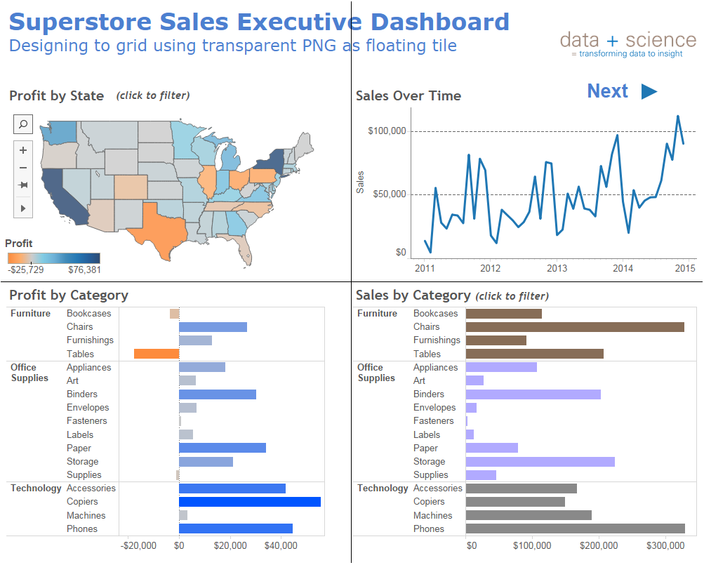
One of the major concepts when studying graphic design is designing to a grid. The concept involves designing a page layout in way that connects it with an imaginary grid. Designers often show this grid when they are designing. For example, using Adobe InDesign they can make a grid appear under "Grid and Guides" in the "View" menu (and CTRL + semicolon to toggle) . Here are a few short videos that explain this concept and how it can be used in design.
More
This post offers a solution for the error message in Tableau Desktop when embedding Google maps. The error that shows is "The Google Maps Embed API must be used in an iframe". Embedded web pages and URL actions in Tableau are really powerful tools. As an example, I've been embedding Google Maps in Tableau for a really long time, both for Tableau Public work as well as in my corporate environment. In fact, one of my first Tableau Public visualizations was visualizing Crime in Cincinnati, which I submitted to the very first Tableau IronViz contest back in 2011 and later updated in 2013. This viz featured an interactive crime map using Google Maps.
More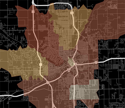
In a previous post I examined a way to create Minimalistic Maps in Tableau without using Mapbox. In short, by unchecking the "base" in Map Layers you are able to change the water color using the formatting options. However, I was recently working on a visualization and wanted to do the opposite. I wanted to use the base layer along with the streets and highways. In other words, I wanted to change the color of the land and didn't care about the water color. Here's an example of a map I created in Tableau.
More
This is a second in a series of posts about some of the well-known “data-viz rules." The field of data visualization offers many tools to help visualize data. We should leverage these tools to find trends and patterns in the data that we would not see with numbers in a table. There is nothing worse than opening a report in an Excel spreadsheet and seeing pages and pages of columns that provide little or no insight into the data.
More
This is a first in a series of posts about some of the well-known “data-viz rules." We hear these rules, but the details behind them are often not examined in depth or overlooked completely. I wanted to examine a few of them to better understand and how they should be applied. For the first in the series, I examined the issue of using red and green together.
More
The second installment of 10 simple tips in Tableau with instructions and animated GIFs.
More
My friend and data visualization colleague Jon Schwabish wrote an interesting post today about Disclosure Rules for the Data Visualization Community. I actually fall into every category Jon describes, so I thought I would write a quick post about my thoughts on this subject and provide you with my "disclosure".
More
Bridget Cogley recently wrote about creating "Beautiful Minimalistic Maps" in Tableau. She outlines a really great technique for creating a simple map with custom colors using Mapbox styled maps and then removing the map layers to leave the map color and design. I love Mapbox and the integration with Tableau makes it even easier to bring custom map designs into Tableau. However, when I saw Bridget's post, my first thought was, why use Mapbox for that. Why not do this right in Tableau? So here's some quick instructions for creating a very similar result in Tableau without using Mapbox.
More
I've done lots of speaking engagements, teaching data visualization at the University of Cincinnati, workshops and presentations, but last night was a first for me. I sat down for 2 hours with a group of 8 teenagers who are homeschooled, 7 boys and 1 girl. I am friends with one of the families and they asked me to come present. The age range was 12-17 and we met at my friend's house. Everyone brought laptops with Tableau Public preloaded and we jumped right in to the world of data visualization.
More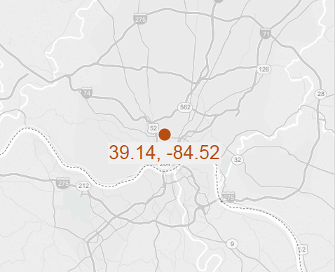
This past week, I had several people ask me about finding the center point for a group of points on a map using Tableau without R. There are several methods for finding a geo midpoint. One of the methods that is described uses the averages of the latitude and longitude. This method assumes a flat earth. It gives a close approximation of points when they are within a close distance of each other (ex. 250 miles).
More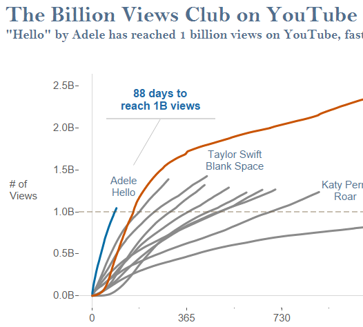
Tableau Viz of the Day - A Tableau visualization showing the top YouTube videos of all-time. Adele's video "Hello" has hit one billion views faster than any other video in the history of YouTube, in a record 88 days. #VOTD
More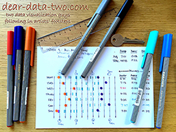
39 weeks complete, 1,726 image files, 68 blog posts, 50 Tableau workbooks, 4.3 gigs of data on two Dropbox folders and countless hours of time spent. It’s the Dear Data Two project by Andy Kriebel and Jeffrey Shaffer.
More

reveal.js is a presentation framework for creating presentations in a browser. It's free and offers some really nice features that we will cover in this tutorial. Some of the key features include:
More
How to create voice recognition and voice response for your Tableau visualizations. First thing is to understand the basics of the Tableau Javascript API. If you are not at all familiar with it, there is a Tableau Javascript Tutorial by Tableau Software to help get you started. This will walk you through the code step by step.
More
I've spent the last few days working with my daughter on her science project for next month's science fair. She is experimenting with different types of forced patina on copper pipes. Part of the experiment is measuring time. She's recorded time for the various methods and so we opened her laptop and started playing with the data on Tableau Public.
More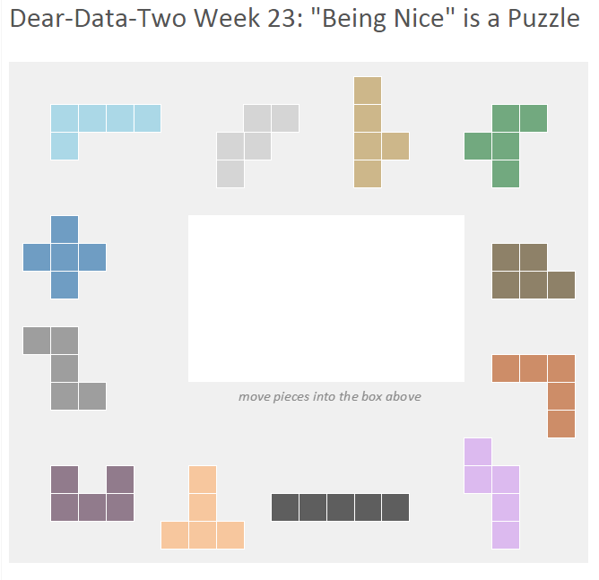
Andy Kriebel and I are now in week 37 of our Dear-Data-Two project. Back in week 23 of the project, the topic was "Being Nice". I had some difficulty figuring out the data for that week. I was really puzzled by the topic, what data I was going to use and how to visualize it.
More
A little over a year ago, Jeff sent me a link to “BallCode” created by Peter Gilks visualizing the 2013-2014 NBA Regular Season. I immediately thought, "this Viz is fantastic" and within a few weeks of discovering it, I had developed a similar-style “BarCode” chart tracking vital performance metrics for work. This “BarCode” chart solution, also known as a "win-loss" chart, is more or less a score sheet for success or failure of certain work initiatives. I found this was a great method for visualizing a certain metric on an executive dashboard.
More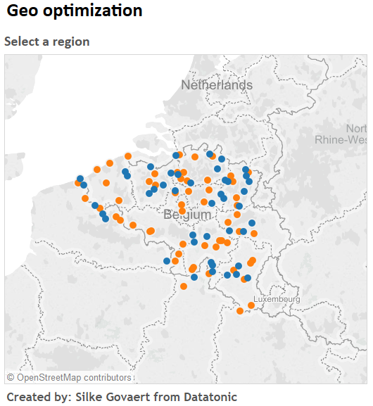
Last year I did a blog post on Dynamic Geo-Optimization in Tableau Using Integration with R with a sample video and a description of how this might work. The original R code is from R-Bloggers posted here. Last month, Silke Govaert from Datatonic, emailed me. She had implemented this in Tableau and we discussed doing an instructional post to supplement my original post.
More
In part 1 of this series, I discussed the basics of the Gender package in R. In part 2, I demonstrated how to leverage parallel processing to speed up the processing of names. For example, if you need to determine the gender for a list of 10,000 names. In this post I am going to discuss how to use the Tableau integration with R to run gender on a list of names, with and without parallel processing.
More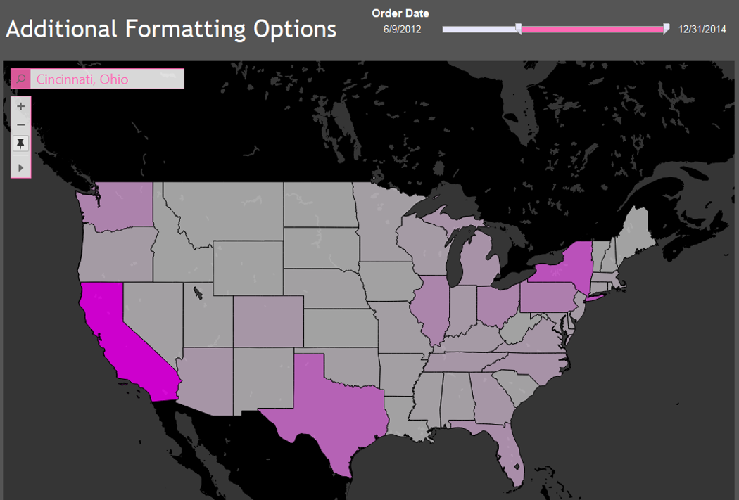
My guess is that anyone using Tableau and custom colors in the preference file has always suspected that there are more settings available. And in fact, that is the case. As an example, notice the color of the slider control and the map controls.
More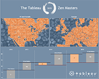
Explore a visualization of the Tableau Zen Masters featuring a custom zen-rock Mapbox map in Tableau.
More
I posted about the gender package in R and gave a few code examples to get started in part 1 here. If you tried this, then you probably realized very quickly that the processing time is very slow. It's a handy package, but if processing thousands or even tens of thousands of names then it would take a very long time. So this post will outline parallel processing (in Windows). By using the power of all of the processors it will cut the time down, especially if using 8 cores at once, which is what I will demonstrate.
More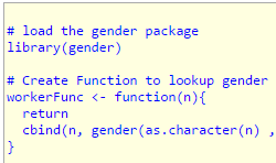
There is a package in R called gender and it can be used to determine the gender of a first name. The package is very easy to use and is really powerful. I am planning a few posts related to this package, so I wanted to begin the series of posts with some basic R code to get things started. Below is the basic setup.
More
Earlier today, someone was reading my blog post about embedding YouTube videos in Tableau and this person emailed me because he was having trouble getting the videos to embed correctly. Using the previous instructions that I posted here, it only work in Safari, but not in other browsers. Long story short, the URL that used to work no longer work like they used to. I won't bore everyone with the details about why. Instead, I will post an updated URL that should work. We need to get the video ID in the same manner as the last time.
More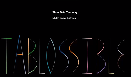
"I didn't know that was Tablossible" Presented by Noah Salvaterra, Chris DeMartini and Jeffrey Shaffer.
More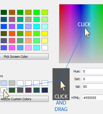
The new color tools in Tableau 9 are great. I really like the new color picker tool, it comes in very handy. This week I was working with some colors and I was frustrated. I've seen posts and comments from people about using the custom color palettes and the fact that when the workbook is closed that the custom colors are lost.
More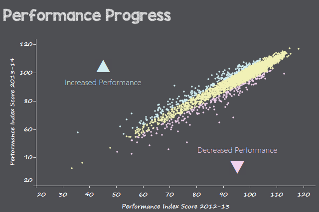
The results are in from the 2015 War of Tableau User Groups (TUG), here, and the Cincinnati TUG won! If you haven't seen the collection of final visualizations, you can see all of them here. I thought it might be interesting to walk through our process and some of the challenges.
More
Last month I posted instructions on Using HTML Style Object Properties with Embedded Tableau Visualizations. In this post, I use the same technique, but I put one container on top of another container.
More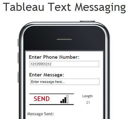
This month is "Action Month" at Tableau, so here is a little Tableau viz that uses a URL action to send text messages directly from Tableau. In this viz I use 3 parameters. One for the phone number, one for the message and one for the API Key needed to send messages. I then combine the 3 parameters together into a URL with a dashboard action.
More
I recently presented at the Analytics Summit at the University of Cincinnati Center for Business Analytics. As part of my presentation, I mentioned the human appeal of round edges in design. This can be seen in the design of our smart phones, tablets, furniture and in many architectural elements. This got me thinking about Tableau Public visualizations and how they are styled when they are embedded in web pages.
More
A one stop shop of Tableau resources and links covering graphing, color, calculations, mapping, importing/export data, level of detail calculations, training videos, Javascript API, sounds and videos, toolips, Tableau Server and other miscellaneous tips, tricks and tutorials.
More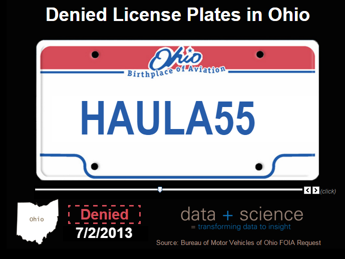
A visualization of the denied licensed plates in Ohio from data obtained through a Freedom of Information Act request.
More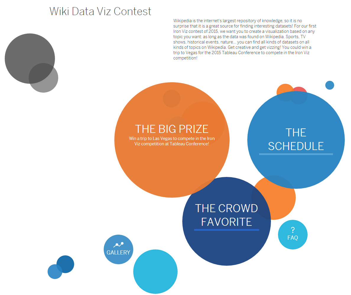
Tomorrow is the deadline to submit the entries to the Tableau Wiki Data Viz contest here. I have compiled a list of entries that I have seen so far. Some of these have excellent posts as well on how they built the visualization. Overall there are some really great entries, so I wanted to post this compilation for my students at the University of Cincinnati to use as inspiration for their upcoming projects in our data visualization class. I've added the author's Twitter account so you can follow them if you aren't already.
More
The prototype viz that I posted here a few days ago has created lots of excitement. I've had a number of people email and message me about it, so I thought I would post a part 2. In this example, I showcase one of my all-time favorite Tableau visualizations, When birds and planes collide, by Tableau Zen Master Kelly Martin. I've always loved her visualization, so I thought this would be a great opportunity to showcase her viz with the added feature of voice recognition using the Tableau Javascipt API, annyang.js and responsivevoice.js.
More
This past week I had the privilege of attending the Tapestry conference in Athens, Georgia. This was a terrific event and a chance for me to catch up with many wonderful people in the data visualization and Tableau community. The agenda was packed with three keynote speakers and five short stories. As part of the afternoon session, there was a "Demo Showcase and Poster Session" where people highlighted projects they have been working on.
More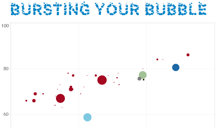
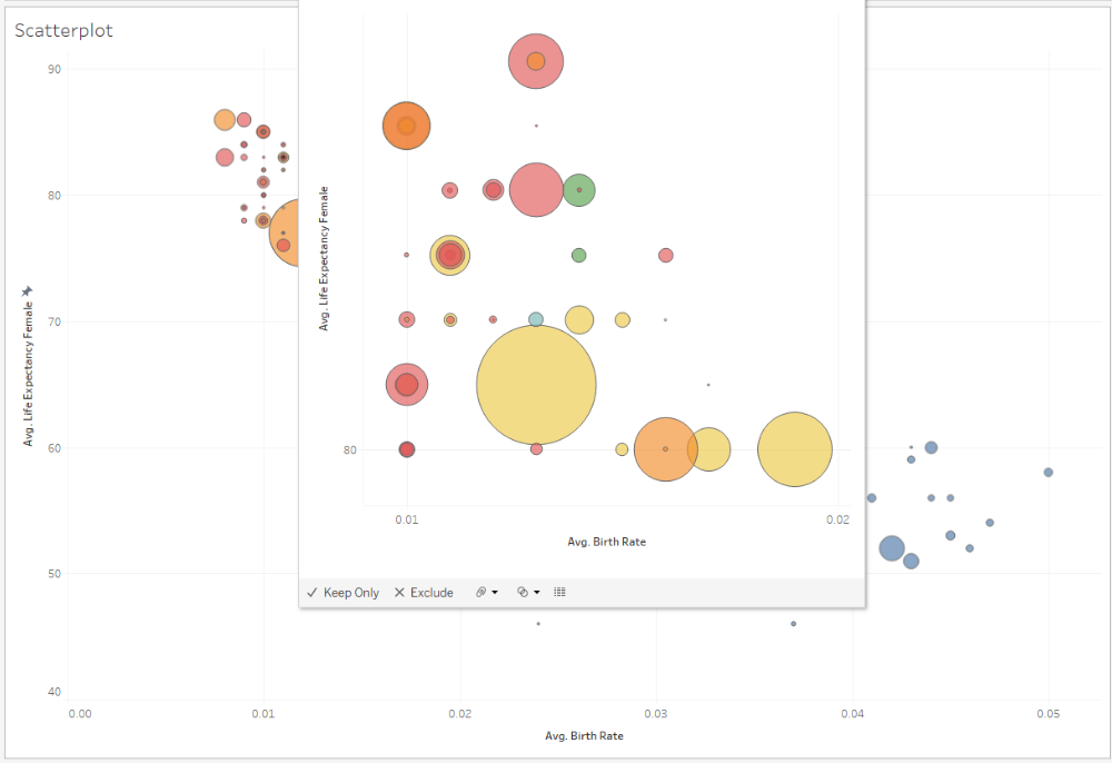
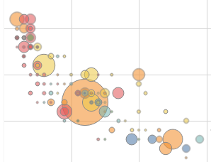
Back in June 2013, I recreated Hans Rosling's famous Gapminder visualization from his TED talk. My Tableau visualization is posted here as well as Moritz Stefaner's Remixing Rosling, which I also recreated in Tableau here. Unfortunately, there are no "play" controls on Tableau Public, so I also posted a YouTube video demonstrating the play movement in the visualization here. A few months later, Mec Analytics posted a comment on YouTube asking, "If I want to split the bubble into smaller bubbles representing nations, how can I do that?" What this person is asking refers to a point in Hans Rosling's presentation, here, where he bursts the bubbles into Countries.
More
"These aren't the Droids You're Looking For". Just like Obi Wan Kenobi's Jedi mind trick hand wave in Star Wars, we can wave our hand and transition through slides in reveal.js including slides with Tableau workbooks. A few days ago, I posted about combining Tableau with reveal.js featuring Mark Jackson's Tableau Public visualization on Urbanizing China. This post outlines the same presentation methods, but I've now added gesture.js. Gesture utilizes the webcam as a sensor for gestures to control the slide presentation. This technology is not perfect, but it does work once you get the hang of the gestures.
More
Yesterday, I posted about combining Tableau with deck.js. Today, I am going to post about combining Tableau with reveal.js. Both offer a nice interface and an easy way to embed Tableau visualizations right into HTML. Both allow for a seamless slide transitions and since the Tableau workbooks load upfront there is less time for each workbook or tab to load. Reveal.js was created by Nakim El Hattab. It's a very powerful platform written in JavaScript that has all sorts of formatting options, controls, themes, etc. I used Nakim's presentation template to demonstrate how Tableau could be embedded into reveal.js.
More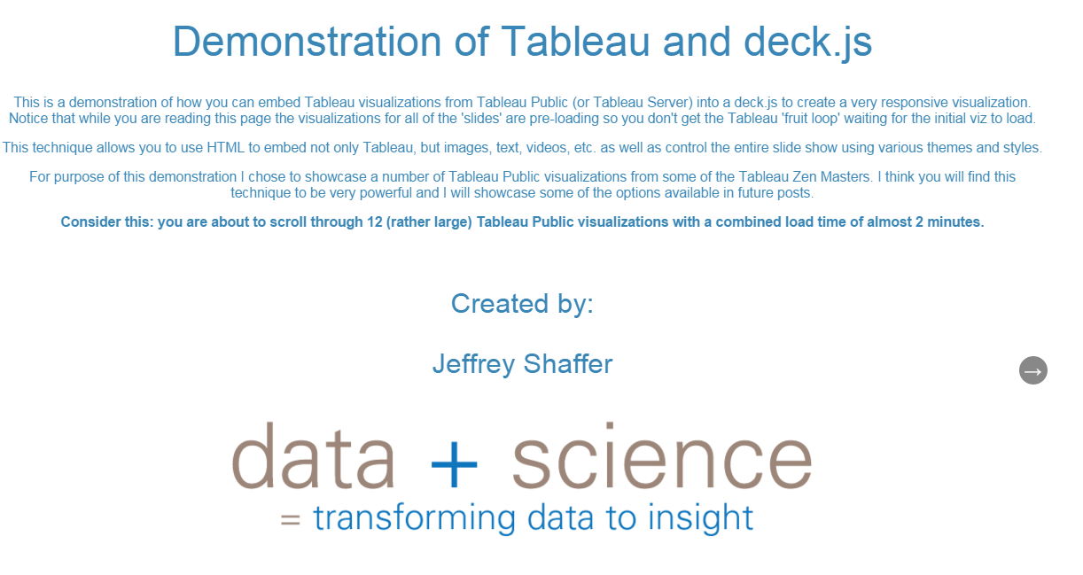
Last semester, some students in the data visualization class at the University of Cincinnati presented their final projects. Their final project was mostly done in Tableau, but one of their charts was a sankey diagram and they made the choice to do this one in D3 instead of Tableau. They had a number of options to put this together, but they chose to use deck.js to put it into a single presentation. This was very well done and worked great. I had some additional ideas on how this could be used with Tableau and I filed it away to come back to in the future.
More
Tableau now offers new map controls that have already gone live with Tableau Public and will soon be released with Tableau 9.0. There are a number of new features in the new map controls. For example, there is a search button that will allow the user to type in the name of a city or state, and the map will automatically re-center on that area. There are also new selection tools. The Rectangular Selection tool is still an option, but there is a new Radial Selection tool and a Lasso Selection tool. As a result, there are also some new keyboard shortcuts for these.
More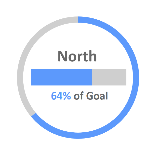
Back in November, Ryan Sleeper, the 2013 Tableau Iron Viz Champion, published a blog post here on how to make donut charts in Tableau. The following month, Andy Kriebel, data visualization expert and Tableau Zen Master, posted additional instructions here. Both Ryan and Andy would be the first of many data visualization guys to tell you, "Don't use pie charts and donut charts" in almost any situation. In fact, Andy does exactly that in another blog post from 2012 here. However, in this one particular case, they both argue that the donut chart works well. Their example is a very common use case. It involves a Key Performance Indicator or KPI. More specifically, they are measuring the performance of something against its goal in particular regions.
More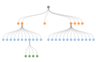
Back in November someone from Zurich, Switzerland, emailed me about using my sankey-style slopegraph technique in Tableau to emulate a chart in D3. The diagram is often referred to as a node-link tree diagram. To build this I utilized the same technique as outlined here. I posted an image on Twitter back in November here but the data used to build this was proprietary so I wasn't able to post the workbook. I anonymized the data and the Tableau workbook is now posted here.
More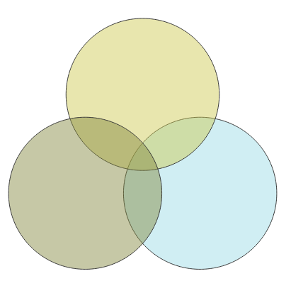
The Venn Diagram, sometimes referred to as a set diagram, was first introduced in 1880 by John Venn (more information here). Unfortunately, these chart types are not great visualization tools for comparing quantitative data. My first response to my student suggested alternative approaches to the visualization, but I got the sense from him that a strict client request was driving the desire for this chart type and changing the visualization design wasn't an option. I outlined an approach for him and then put my draft workbook in an archive folder. Since it's not a chart type that I considered very useful I wasn't really motivated to solve this problem and it sat idle.
More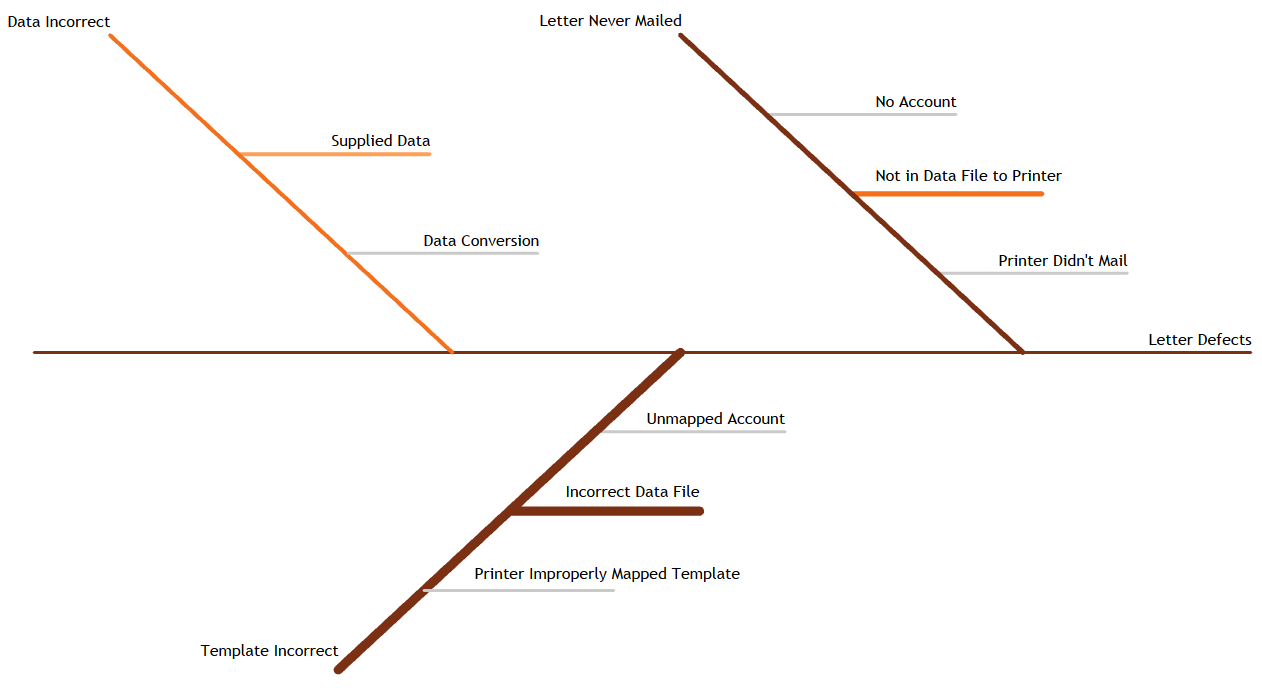
At the end of 1949, an associate professor from the University of Tokyo named Kaoru Ishikawa joined the Japanese Union of Scientists and Engineers (JUSE) to help develop and enact quality improvements in Japan’s industrial sector. Ishikawa was brought on due to his great skill of mobilizing large groups of people toward a common goal. In conjunction with JUSE, he would ultimately create Ishikawa diagrams to help determine root causes in events. Ishikawa diagrams help show the relationship between causes and effects for a specific event. These diagrams also help analyze root causes and define failure modes while often being used in manufacturing, marketing, and service industries.
More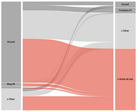
As I was working on building a Sankey Diagram with Tableau, I found the excellent articles by Jeffrey Shaffer from Data + Science for developing a methodology to build a Sankey in Tableau. Starting with Jeff's method, I wanted to add some interactivity on my diagram and minimize the data preparation. I just wanted to be able to build my viz using the model provided by Jeff and a dataset with Step 1, Step 2 and Step 3 along with 1 indicator (size) and use dates to perform filtering. I didn't want to use SQL or an Excel Macro to prepare the data.
More
In the field of data visualization, why do we care so much about visual perception? Does it really matter when creating charts and graphs? The answer is a resounding yes; it does matter, and hopefully this one very simple example will demonstrate why it matters. Below are two chart legends taken from data visualizations done in Tableau.
More
I often see references and discussions around "data science" and "data scientists," and every time I do, I start to ponder the topic and think about writing a post around it. I was reminded again this week because my daughter was telling a woman that I know that I was a "data scientist" and she was trying to explain to that person what I do. She's eight years old, so it was really precious listening to her describe this to someone (She also has a small microscope that she loves to use and tells me that she wants to be a scientist when she grows up). There have been a number of blog posts that I've read that specifically draw me to this topic, after all, my website is called data + science.
More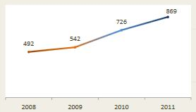
I have lived in my house for 12 years, and every Halloween I get inundated with trick-or-treaters. Year after year it's like Willy Wonka's Chocolate Factory at my house, with candy flying out the door. Now being a data guy, what do I do? Well that's simple, I count them. A friend and I keep meticulous count of the trick-or-treaters in 30 minute intervals, and I've been tracking this data year by year. After a number of years of recording these numbers, I decided to use it as a data set for data visualization training. I've used this data set in the data visualization course at the University of Cincinnati, training at KPMG in their Advisory University and Global Analytics training as well as other data visualization workshops and corporate training.
More
I want to start this post by complimenting Tableau as being what I believe to be the best data visualization and BI platform on the market today. I am a huge supporter, a long-time Tableau Public user, a corporate user, an academic user, and a shareholder of the company. I teach Data Visualization at the University of Cincinnati, and we use Tableau extensively in class. I have introduced nearly five hundred students to Tableau in the last few years, with some students going on to have careers in data visualization. I also demonstrate Tableau in my corporate training work and various presentations on data visualization, data mining, and data science. I often tell people that Microsoft Excel will do everything it can to make your chart terrible and break rules by default while Tableau will do what it can to suggest things that are best practice. I could write extensively on this topic, but the focus of this post is to examine and discuss Tableau's publication of "Visual Analysis Best Practices".
More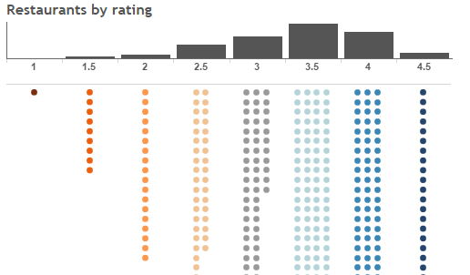
Let me begin by saying, wow! Participating in the 2014 Tableau IronViz competition was an incredible experience. The Tableau conference was amazing, and I was able to meet so many friends in person whom I only knew from social media platforms. The IronViz stadium was equally amazing. Five large screens, 1,000 people watching at full-capacity for the room, and two amazing vizzers to compete against (and really nice guys too!). Lights, music, smoke, and blazingly fast viz action. I've included a commentary below if anyone is interested, but you're probably more interested in seeing my viz, so here it is (or at least what it would have been with my lost 3 minutes back - details below). Be sure to move the mouse around the roulette wheel!
More
The use of jitter is a great technique in dot plots, box plots with dots, and scatter plots. Jitter is a random value (or for our purposes pseudo-random) that is assigned to the dots to separate them so that they aren't plotted directly on top of each other. Tableau doesn't offer a check box, a built-in function, or a parameter to apply jitter, and there is no Tableau function to generate a random number. This is a common question from students in my data visualization class ("how to do jitter in Tableau"), and I was reminded of it recently when looking at a viz by Jon Boeckenstedt.
More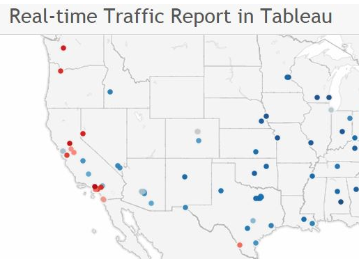
Back in June, I started playing with embedding traffic maps in Tableau. Many of the websites simply don't work. For example, embedding Google or Yahoo maps with a traffic layer as a URL in a Tableau Web Page doesn't work in the same manner as a regular map, Bird's Eye view or Street View.
More
Tooltips are a great tool for adding detailed elements to a visualization for a reader without cluttering a dashboard. Tableau has functionality to insert fields, calculations and many formatting options in the tooltips. Last year I posted a new idea to the Tableau Community. The idea is to allow more chart functionalities with the tooltips. Ideally, it would be a new canvas, where charts, maps, images, URLS, etc. could all be used on the canvas. I mocked up a dashboard with a sample of what a tooltip might look like.
More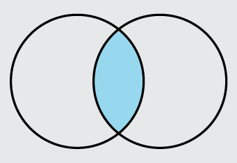
Sankey diagram are now even easier with Tableau 8.2. It's been a few months since my original post on building sankey diagrams in Tableau, but I continue to get regular emails with examples and questions. Today someone emailed me with an interesting question regarding building sankey diagrams in Tableau. By using the new and improved data connectivity it is possible to shape the data for the sankey diagram without needing to prepare it in Excel or SQL ahead of time.
More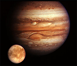
Tableau Viz of the Day - Tableau's theme for the month of July is "Storytelling", inspired by the new story points feature released in Tableau 8.2. So here is my first viz using this new feature. The topic is "Valhalla", which is the largest crater in the Solar System, located on Callisto which is one of the Galilean Moons of Jupiter. An interesting story, but there were a few challenges I had to overcome that I wanted to mention. #VOTD
More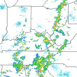
Here is an image of the weather radar in the midwest from WCPO Weather Radar and the same weather radar view from Tableau. We can build this in just a few clicks in Tableau. Before opening Tableau, copy this list of states (with header) into the clipboard (Highlight them and hit CTRL-C).
More
I continue to get regular emails about building sankey diagrams and sankey-style slopegraphs in Tableau based on the instructions that I posted here. I previously posted an Excel VBA for preparing data for Tableau here. A big thank you to Russell Spangler for creating this SQL code that basically does the same thing.
More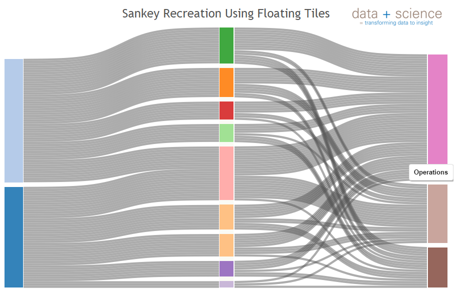
Yesterday someone posted a question on the Tableau Community page here regarding my approach to building sankey diagrams in Tableau. The person was asking if it was possible to create the following sankey diagram in Tableau. I used the method outlined in my previous posts with some slight adjustments for the gaps which I discuss on the Tableau Community post.
More
Quantified Self visualization using Tableau: "Music Major ~ Data Miner" (Winner - Tableau Quantified Self Viz Contest)
More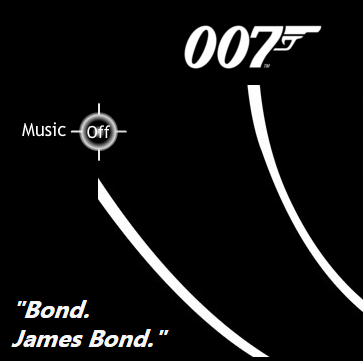
A Tableau visualization on the actors who have played James Bond. This viz utilizes a custom Flash object to play the music.
More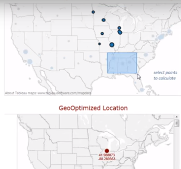
The video below demonstrates a work in progress. It's a dynamic geo-optimization in Tableau using integration with R. There is a post on r-bloggers here that outlines how this works as well as sample code that I modified and built on top off for this project. The top map in this visualization plots a quantity by location. Example, number of widgets in each factory. The algorithm uses the quantity as a weight in the calculation and calculates the optimal center location based on those quantities and their location.
More
There are a number of options when embedding YouTube videos into Tableau. I will demonstrate some of these options using a YouTube video of my recreation of Hans Rosling's Gapminder in Tableau. Note: See blog post here for updated instructions (9/23/2015).
More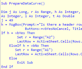
I have had a number of emails about building sankey diagrams and sankey-style slopegraphs in Tableau based on the instructions that I posted here. Even though it's fairly quick and easy to build in Tableau it does require putting the data into a certain format before importing into Tableau. I'm not one for repetitive tasks and so I decided to write a quick VBA Macro in Excel to prepare the data for immediate import into Tableau.
More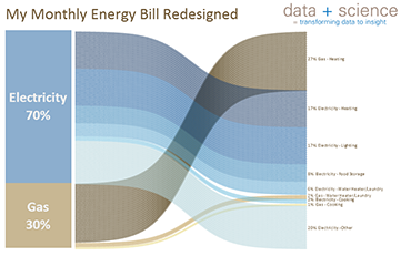
Every so often I login to my Duke Energy account to examine my monthly usage. Unfortunately I am greeted with poorly designed pie charts as the tool for making comparisons. I decided to do a redesign this afternoon. Here's the original chart from Duke Energy with my design notes.
More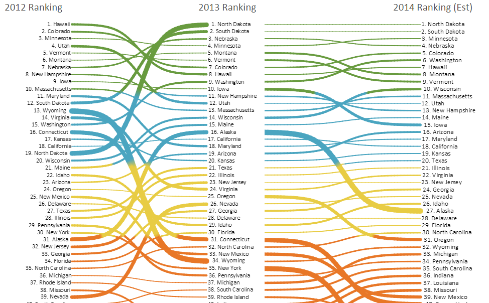
It seems the activity continues over my post showing the sankey-style slopegraph in Tableau here and the instructions on how to build it are here. What an amazing Tableau community out there. A number of people have already been playing with this and Tableau Zen Master Mark Jackson posted on Twitter a great use of this, showing the NCAA bracket ranking of Round 1 vs. Round 2. We started talking about adding Round 3 and we were brainstorming earlier this evening on how to do this.
More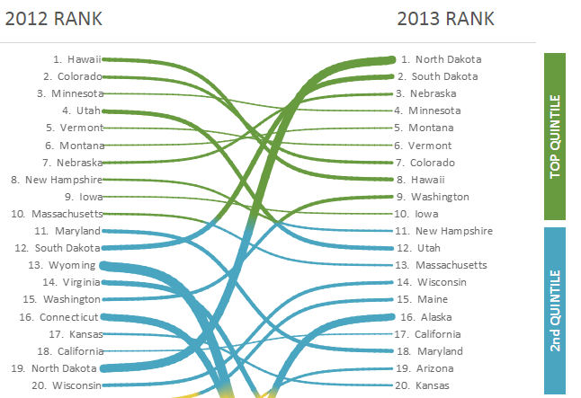
I received a number of pings about yesterday's post showing the sankey-style slopegraph in Tableau. Here are the basics of the recreation using calculations in Tableau to simplify the process even further.
More
Andy Kriebel found an interesting visualization and posted it on his Facebook page VizWiz. I decided to take a crack at recreating it in Tableau. This graph is a variation on a slope graph. Slope graphs are fairly straight forward in Tableau because it's a straight line from point a to point b and the size of the line is simple. The shape of the line in this visualization is a bit more difficult.
More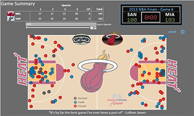
A Tableau visualization visualizing the critical game between the San Antonio Spurs and the Miami Heat in the Game 6 of the 2013 NBA Finals.
More
I need to start this post by stating that I am a big fan of Cole Nussbaumer's work at Storytellingwithdata.com. If you are not familiar with her data visualization blog then I would highly recommend that you follow her. Cole offers practical advice for designing great data visualizations and typically has wonderful redesign examples on her website. With that said, I would like to examine one of her redesigns that I came across today and offer an alternative approach.
More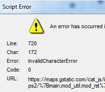
During the final project presentations of the last data visualization class at the University of Cincinnati there was a scripting error that kept popping up on the students visualizations in Tableau. The scripting error seemed to occur on certain websites which were linked via the dashboard actions. In the past few weeks I've noticed this error pop up on numerous visualizations and have searched for a solution to this problem. Tableau Support responded with this link to help resolve the issue and with some slight modifications this appears to have solved the problem.
More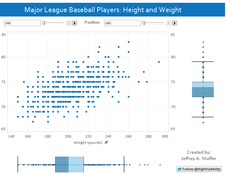
Here is another quick visualization that I put together to showcase the new Tableau 8.1 box plot feature. In this case I used a standard scatter plot to show the height and weight of the players in Major League Baseball. In addition to the scatter plot, I included a box plot at each axis to show the distribution of the height and weight separately. Using quick filters for both team and position it is easy to examine the distributions.
More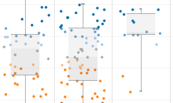
Tableau 8.1 was just released this morning. I previously posted some example of the new integration with R. However, the other really nice feature that is new in 8.1 is the new chart type, box plots. This feature is also available as additional context in the axis dialogue where reference lines and bands are set.
More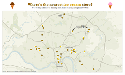
It's now day 2 playing with Tableau's integration with R and the questions for tonight: Do you have a list of addresses in Tableau and need to geocode them? Ever wish you had an easy way to geocode them directly from Tableau without using a geocoding service or website? Well now with Tableau 8.1 integration with R this is possible, at least in some instances.
More
On Wednesday, September 3rd, 2013, Daniel Tosh ended his show Tosh.O with a real-world brain teaser. Mathematically 8!, or 40,320, is the correct answer for the number of possible permutations of an 8 digit number using these 8 digits. However, with some understanding about the composition of credit card numbers it is possible to quickly narrow this down to a much more manageable list. As soon as I saw this on TV I immediately posted to Facebook: “I really hope he didn't use his actual credit card number because there aren't as many guesses as he probably thinks there are. I could script that pretty quick and narrow that right down.”
More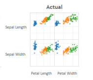
Earlier today, Tableau published a post here by Bora Beran titled Tableau 8.1 and R. He provided an excellent example of this integration using a very famous data set, a dataset of Iris flowers introduced by Sir Ronald Fisher. This dataset is often used in data mining classes and text books. In fact it was the very first assignment in Data Mining I at the University of Cincinnati. Bora's post shows off this exciting new feature that will soon be available in Tableau 8.1.
More
Simple and practical examples on how to clean up your charts.
More
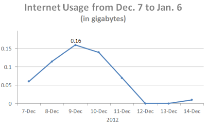
I recently read a blog post by Naomi Robbins from Forbes entitled Line Charts are Not Always the Best Way to Show Time Series. For those of you who are not familiar with Naomi Robbins you should add her to your reading list because she has some terrific posts regarding data visualization practices. This was an interesting post regarding her recent internet usage on a trip using a mifi for internet access.
More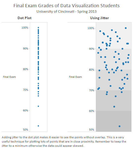
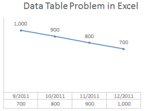
Data Tables are great tools for adding context to a chart or graph for data visualization. However, be careful when using these data tables and remember to always check your data!
More
The highlight for today is a refreshingly well done graph on the unemployment rate and median earnings when compared to education attained.
More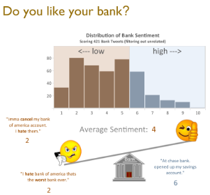
This data visualization is showing the consumer sentiment regarding banks using tweets from Twitter and consumer complaints in the Consumer Financial Protection Bureau's (CFPB) complaint database. The tweets used in this visualization were part of a dataset used to build a sentiment scoring algorithm. The manual tweets were used as the response variable and we built several models to predict a sentiment score (the final model is an SVM).
More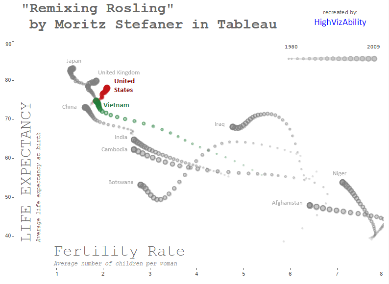
Recreating Moritz Stefaner's Remixing Rosling in Tableau.
More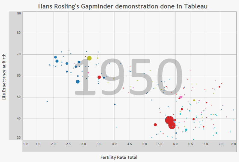
Recreating the famous Gapminder visualization by Hans Rosling in Tableau.
More
A Tableau visualization of the crime in Cincinnati featuring a droplet chart, Google satelitte and Streetview maps, a crime dashboard and a geo-optimization. Data provided by the Cincinnati Police.
More
Instructions on how to build the Crime Visualization in Tableauincluding the droplet chart, Google satelitte and Streetview maps.
More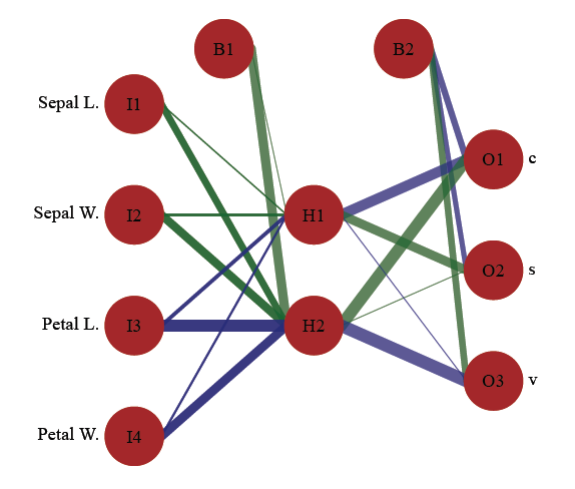
In this blog I present a function for plotting neural networks from the nnet package. This function allows the user to plot the network as a neural interpretation diagram, with the option to plot without colorcoding or shading of weights. The neuralnet package also offers a plot method for neural network objects and I encourage interested readers to check it out.
More
This is a screenshot of some geospatial analysis of the membership standing for the Cincinnati Zoo. Unfortunately, I can't share the visualization or the data, but this screenshot was part of the final results showing the stark differences in the neighborhoods of Cincinnati for the membership status.
More
This is a screenshot of redesign of a Tableau Public Visualization that visualized storms. In this redesign, I changed the play control to show each day, added the storm name and used a Blue Marble map layer from a WMS server.
More
This is a one page guide and visualization that I put together for the Cincinnati Area Board of Realtors. This was created to be a quick reference guide for real estate agents to help their clients understand what factors most affect their credit score.
More
A funny box and whiskers plot that I came up with and use in class to help the students understand how to read them and who is created for inventing them.
More