7/13/2020
How to Create a Tufte Style Box Plot in Tableau
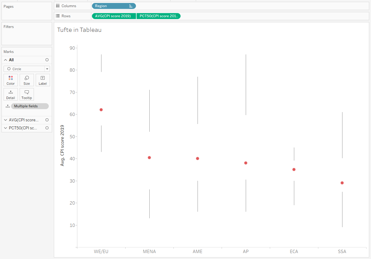
A few weeks back Hicham Bou Habib wrote a great blog post Tufte in EXCEL - The Box Plot outlining his 72-step process for creating a Tufte Style Box Plot in Excel along with a template. He also tweeted about it here and after I saw it, I decided to recreate this style in Tableau and I will outline the steps in this blog post.
For this blog post I am going to use this CSV file CPI2019.csv, which is the basic data that Hicham used in his example.
I'll start with a simple dot plot by Region of the average CPI score for 2019.
Load the CPI2019.csv dataset into Tableau.
Drag Region to the Columns.
Right-Click and drag CPI score 2019 to add it to Rows and select AVG(CPI Score 2019) when the Drop Field dialog box appears.
On the Marks Card change the dropdown box to Circle.
Right-Click and drag CPI score 2019 to add it to Rows after the AVG(CPI score 2019) pill and select MEDIAN(CPI Score 2019) when the Drop Field dialog box appears.
Drag Country to Details on the AVG(CPI Score 2019) Marks Card. This should not be on the ALL Marks Card or the MEDIAN(CPI Score 2019) Marks Card.
Select the Analytics Pane on the left-hand pane window and drag Box Plot onto the canvas. This will add a Box Plot to the top chart only and a format dialog box will appear.
Set the Whiskers extend to dropdown box to Maximum extent of the data.
Check the box Hide underlying marks (except outliers).
Select the Fill dropdown menu and set the Opacity to 0%.
Select the Borders dropdown menu and set the color to match the background color.
Select the Whiskers dropdown menu and set the whiskers to be a straight line with no cap (the first option on the top left corner).
Right-Click on MEDIAN(CPI Score 2019) on the Rows and select Dual Axis.
Right-Click on the Y-Axis or the secondary Y-Axis and select Syncronize Axis.
Right-Click on the secondary Y-Axis and uncheck Show Header.
On the AVG(CPI Score 2019) Marks Card, set the color and size of the dot to the desired color and size.
You should now have a Tufte Style Box Plot that looks something like this.

Below is a Tableau Public Visualization that you can download and explore.
