12/28/2018
A Redesign of Florence Nightingale's Rose Chart


Last month, Steve Wexler and I did our first Chart Chat episode and you can sign up for our second episode here. In our first episode, I showed a redesign of the famous Florence Nightingale Rose Chart. The original diagram was published in Contribution to the Sanitary History of the British Army (1859). It was recently recreated in Tableau by Satoshi Ganeko and featured as the Tableau Viz of the Day yesterday. My original redesign was created in Adobe Illustrator, but in this blog post I will outline the steps to create it in Tableau. First, a little background about the Rose Diagram and this redesign.


Short Background and the Redesign


Florence Nightingale's Rose Diagram has become one of the most famous data visualizations ever created. The story behind this diagram is fascinating. She grew up in a wealthy family, and the family and social expectation was that she would marry and have a family of her own. She, however, had other ideas. She had a "divine calling" as a teenager and wanted to be a nurse, an occupation that didn't really exist at the time. Nurses in those days were typically poor, uneducated, and not skilled in the medical profession as they are today. Her family discouraged her, but she was head strong and from 1851-1853 she trained as a nurse. During the Crimean War (1854-1856), there were newspaper reports of the terrible conditions in the English war camp hospitals, most notably the Scutari hospital in Turkey. The Secretary of War was a personal friend of the Nightingale family, and he agreed to dispatch her to organize and manage a group of female nurses. She arrived in November 1854 with 38 nurses. This is where the story gets interesting, and often clouded.

Florence Nightingale and her staff were not immediately welcomed by the doctors and other staff, however, over time, she was able to make substantial changes to hospital. She focused heavily on patient care. Cleaning bed sheets, washing patients, writing letters for soldiers, and providing healthier food. The death rate at the hospital declined and she and her nursing staff are often credited for this work. However, other historians have shown that it was the work of the Sanitation Commission that resulted in the dramatic decline in deaths.

When Florence Nightingale returned to England she began a rigorous study of these numbers, numbers that she herself collected at Scutari. She created the Rose Diagram as part of a text, Contribution to the Sanitary History of the British Army (1859), and later pamphlets that she distributed to influential people in an effort to improve the sanitation conditions in hospitals. Later she focused on the British Army in India where she showed that bad drainage, contaminated water, overcrowding and poor ventilation were causing high death rates. These were the same factors identified and fixed at Scutari by the Sanitation Commission. The final report on India showed that after making these changes the death rate dropped from 69 to 18 per 1,000 soldiers.

She was clearly a pioneer, not only in the area of nursing, but also in statistical analysis, and more specifically, in the presentation of the data. She was the first women member of the Royal Statistical Society and an honorary member of the American Statistical Association. Her diagram was ground breaking and clearly effective for its intended purpose at the time.

In Chapter 5 of Speaking of Graphics Dr. Paul Lewi writes (emphasis added):

"Nightingale invented her 'coxcombs' for the purpose of communication and for persuasion of people that were contemporary with the events that are described by it. She was lobbying for her hospital reform. The audience she had in mind was the health commission and the government of her time, rather than the historian and statistician of today. It is difficult, of course, for us now to apprehend the emotional impact created then by these diagrams that reminded people of senseless killing and death. This indicates that the quality of a diagram cannot be fully appreciated without also considering the historical, social and economical context from which it arose. As such, diagrams can be witting or unwitting testimonies from the past and one must ask for whom they were intended, for what purpose they were produced and under what circumstances they were used.


Dr. Lewi also created his own version, listed as Figure 5.4 below (Chapter 5 of Speaking of Graphics.


Hugh Small also has an excellent paper on this topic, Florence Nightingale’s Hockey Stick: The Real Message of her Rose Diagram.

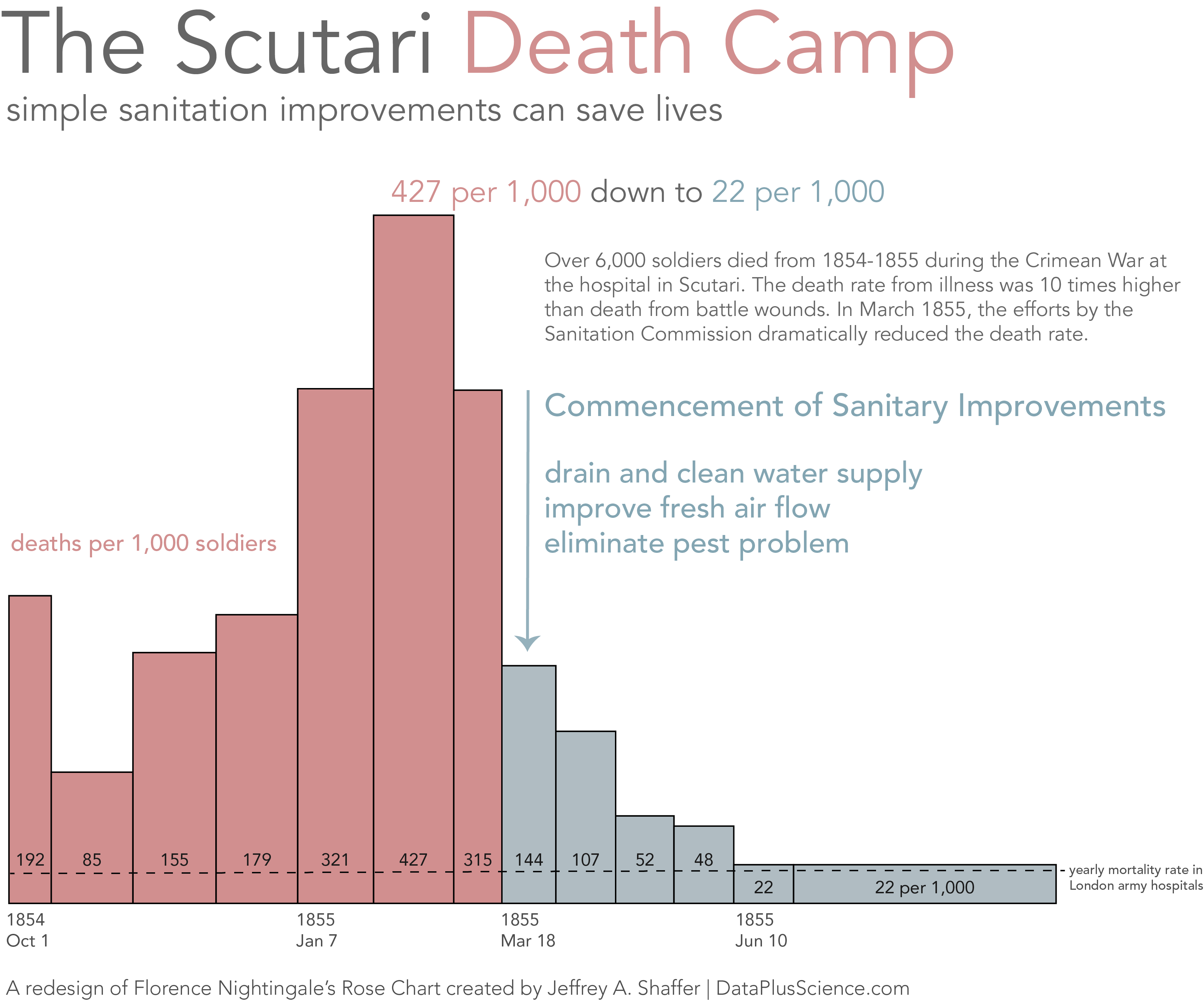
Dr. Paul Lewi and Hugh Small both discuss the history and her methodology in creating the diagram, and its circular form. Both authors also offer a bar chart redesign of the data. Would her diagram have been as effective in creating change if it were a bar chart? We will never know. However, I don't think it's a fair comparison to simply compare the original diagram to Dr. Lewi's diagram above. Instead, I decided to create my own redesign based on figure 5.4. Below is my redesign.


I think this redesign makes for a more appropriate comparison; something that will draw the reader's attention to the story about the improved sanitation measures saving lives. The title of "Scutari Death Camp" certainly grabs attention, along with the subtitle and annotation layer to detail the specific changes, and show when and how these changes saved lives.

Now let's look at how to build this in Tableau. If you like the Workout Wednesday challenges then stop reading now and take a shot at recreating this yourself. The data needed is available for download here. The data set is very simple and with a few calculations and annotations we can create this in Tableau.


Step 1: Create the Bar Chart


   Calculated field: Previous Value
   Formula: lookup(sum([Annual Mortality]),-1)

   Calculated field: Date Difference
   Formula: DATEDIFF('day', MIN([Date]), LOOKUP(MIN([Date]),-1))

   Double-click Previous Value or drag it to Rows.
   Right-click and drag Date to Columns and select DAY(Date) near the bottom of the list (Green pill date).
   Change the Mark Type to Bar in the drop down menu on the Marks Card.
   Drag Date Difference to Size.

There are a few options to create the color of the bars.

Option 1:
   Calculated field: Color
   Formula: [Date] >= #1855-04-01#
   Drag Color to Color.
   Right-click on Color on the Marks Card and change Color to an Attribute.

Option 2:
   Right-click and drag Date to Columns and select DAY(Date) near the bottom of the list (Green pill date).
   Double-click on the sequential color legend and change it to custom diverging with Stepped Color and 2 Steps. Use the start, end and middle dates to adjust the color of the dates as needed.

Note: the colors I picked are #d18f8f and #b0bcc2.


Step 2: Formatting


   Drag Previous Value on Label
   Click Label on the Marks Card and set the Vertical Alignment to the bottom
   Select the Analytics Tab and drag a Constant Line onto the Tableau Canvas on Previous Value and set it to 21.
   Right-click on the constant line and select Edit. Format the line to a dashed line and set the label to none.    Right-click on the Null Indicator and Hide Indicator.

The labels at the bottom of the bar certainly work, but I wanted to move the labels above the constant line for the values that are above the constant line and below the line if the values are lower than the constant line. There are a number of different methods for doing this, so I'll outline two simple options.

Option 1: Create a Spacer Field
This method is pretty straight forward. A calculation does a lookup based on the value (Alternatively a date or set) and returns null or a line break which adds the extra line space.

   Calculated field: Previous Value Label Space
   Formula:
   if lookup(sum([Annual Mortality]),-1) = 22 then null
   else
   '
    '
   end

   Drag Previous Value Label Space to Label and format the text sizes of the labels as desired.

Option 2: Drag each label above the line
   Click each label that you want to move. An arrow will appear and you can drag each label above the constant line.

Additional Formatting


Create a new dashboard and add the chart to the dashboard.
The title and subtitle are text boxes. The other text is annotated points and area.
The arrow is done with a blank annotation (an empty space) and then formatting the annotation line with a Line End as Arrow and the largest end size.
The x-axis is set to fixed date, from 9/30/1854 through 12/15/1855. The extra date range allows room for an annotation as the constant line label. Once this is set, right-click on the x-axis and y-axis and uncheck Show Header for both of them.
Add an annotation (right-click and Annotation point) with a Four Sided box with white shading and no lines. This will allow the two lines of text for the label. Size the box to cover the extra constant line past the end of the bars.

The last step of the formatting was the custom date format and spacing on the x-axis. To this, I created a new sheet, a set and another calculated field.

   Create a new worksheet
   Right-click on Date and Create Set.
   Choose the four dates that will show as a label (10/1/1954, 1/7/1955, 3/18/1955, 6/10/1955)
   Rename the new set Data Labels
   Create a new calculated field
   Calculated field: Date Label
   Formula:
   if [Date Labels] then
   str(DATEPART('year', [Date])) +
   '
   ' +
   str(left(DATENAME('month',[Date]), 3)) +
   ' ' +
   str(DATEPART('day', [Date]))
   else ' '
   end
Note: this formula uses the line break within quotes again, and the left 3 characters of the DATENAME function.

   Right-click and drag Date to Columns and select DAY(Date) near the bottom of the list (Green pill date).
   Drag Date Label to Label on the Marks Card
   Change the drop down menu on the Marks Card to Text
   Double-click on the x-axis and set it to the same fixed dates as the previous chart
   Right-click on the x-axis and uncheck Show Header
   Right-click on the chart title and Hide Title

You now have a custom date label and spacing for the x-axis. Place this new worksheet on a dashboard under the chart and size the objects as needed.

You can download my workbook from Tableau Public.


I hope you find this redesign and write up useful. If you have any questions feel free to email me at Jeff@DataPlusScience.com

Jeffrey A. Shaffer

Follow on Twitter @HighVizAbility