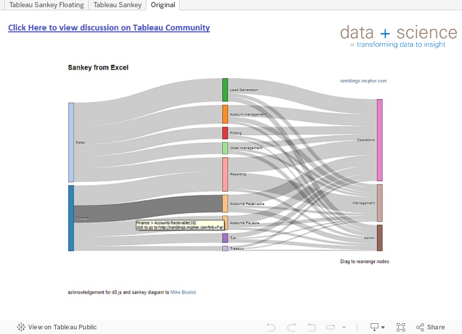
Yesterday someone posted a question on the Tableau Community page here regarding my approach to building sankey diagrams in Tableau. The person was asking if it was possible to create the following sankey diagram in Tableau.
I posted a lengthy response on how I would approach this problem, but I decided to recreate this example in Tableau to show that a traditional sankey is most certainly possible. Using the most rigorous of scientific methods to gather the data (a ruler on my screen estimating the width of the bars), I recreated the data for this visualization. I used the method outlined in my previous posts with some slight adjustments for the gaps which I discuss on the Tableau Community post.
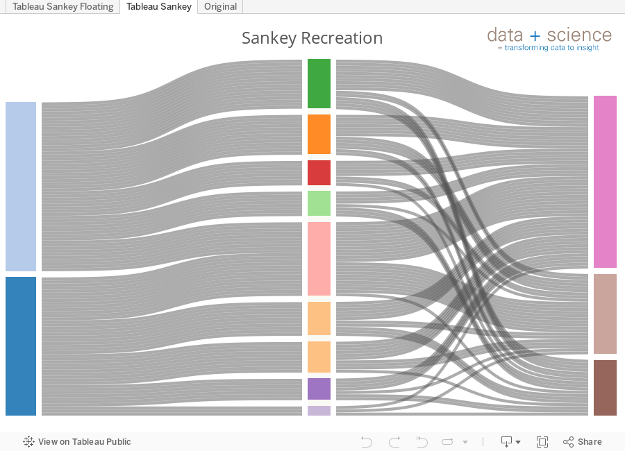
In my first approach I "Tiled" the sheets which makes it very easy to line up. However, I don't particularly like this approach because there is a large gap in between the tiles. This creates a Scintillation Effect very similar to a Hermann Grid that I would prefer to avoid (More information on the Hermann Grid and the Scintillation Effect here).
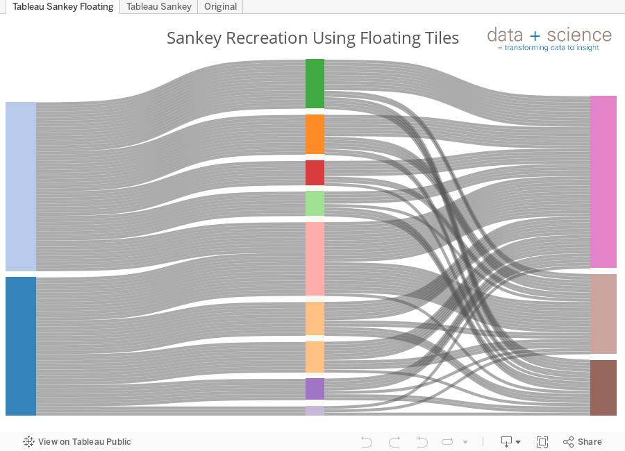
By using floating tiles and closing the gap this is easy to solve and looks more like the original visualization.
As before, the hardest part is creating and shaping the data. The excel file I used for this visualization is available here. The tabs walk through my approach to the data in the various steps before importing into Tableau. Once the data was ready to shape I simply used the Excel Macro that I posted last month here. This created the shaped data that was immediately ready to import into Tableau.
I hope you find this additional example helpful. As always, if you have any questions feel free to email me at Jeff@DataPlusScience.com