5/13/2019
Sankey Diagrams: Why I Used the Sigmoid Function and Why You Probably Shouldn’t
It’s hard to believe it’s been 5 years since I wrote this blog post on creating a Sankey-Style Slopegraph in Tableau and I outlined how to create an S-shaped curve using the Sigmoid function in this blog post. For those not familiar, here’s a brief Tableau history on this topic.
- Jeffrey Shaffer (3/2014 - 7/2014) - using Sigmoid function
https://www.dataplusscience.com/RecreationinTableau.html
https://www.dataplusscience.com/RecreationinTableau2.html
https://www.dataplusscience.com/RedesignEnergyBill.html
https://www.dataplusscience.com/FinanceSankey.html
https://www.dataplusscience.com/SankeyinTableau82.html
- Olivier Catherin
(11/2014) - using Polygons
https://community.tableau.com/thread/154623
https://www.dataplusscience.com/SankeyPolygon.html
- Chris Love (3/2015) - using Data Densification
https://www.theinformationlab.co.uk/2015/03/04/sankey-charts-in-tableau/
- Alexander Mou (12/2016)
http://vizdiff.blogspot.com/2016/12/creating-sigmoid-with-2-rows-of-data.html
http://vizdiff.blogspot.com/2016/12/creating-sankey-chart-made-bit-easier.html
- Chris DeMartini (1/2018)
http://www.datablick.com/blog/2018/1/12/upgrade-your-tableau-sankey-diagram
- Ian Baldwin (3/2018)
https://www.theinformationlab.co.uk/2018/03/09/build-sankey-diagram-tableau-without-data-prep-beforehand/
- Ken Flerlage (4/2018)
http://www.kenflerlage.com/2018/04/sankey-template.html
- Tableau Extension by Merlijn Buit and Tjalling Tolle at InfoTopics (7/2018)
https://appsfortableau.com/extensions/create-sankey-diagrams-in-tableau/
- Ken Flerlage (4/2019)
https://www.kenflerlage.com/2019/04/more-sankey-templates.html
The original chart that I recreated was really a slopegraph that had curvy S-shaped lines, not a Sankey diagram. I used the Sigmoid function to create these lines, which worked really, really well for this. However, the redesign of my Energy Bill and the Finance Sankey are not slopegraphs. They are Sankey diagrams (or more accurately, alluvial diagrams). I used the same function, the sigmoid function, to generate those lines. And nearly everyone that followed, creating all these additional techniques and templates, has leveraged the sigmoid function.

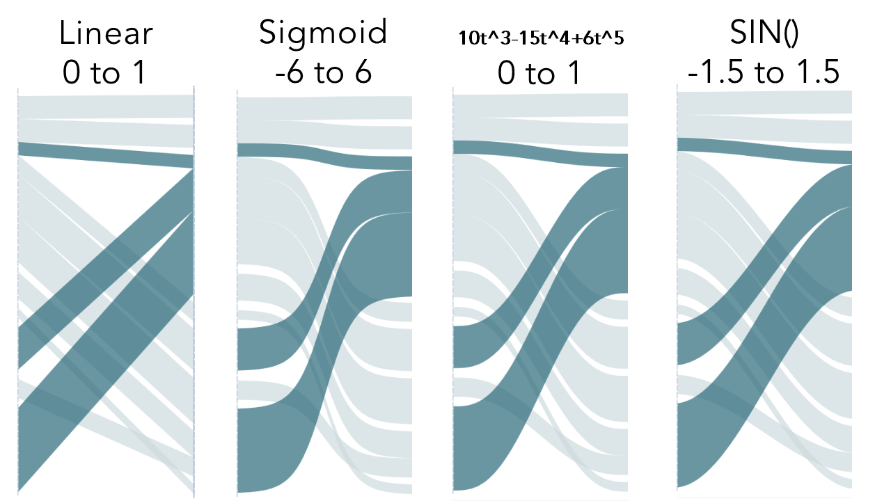
So what’s the problem? The issue is the shape of the line in the Sankey diagrams. When using the sigmoid function, the flow diagrams start out showing the size correctly, but as they curve, the function narrows the line.

This was something I noticed early on, and it was even pointed out on this Sankey website early on when I first published my Energy Redesign. Back then, I did experiment with other functions. I can't locate my early workbooks to see what functions I experimented with, but I know I tried an inverse tangent function and a few others. In the end, I stuck with the Sigmoid function and the rest is history.
However, in January 2018, Chris DeMartini published a blog post Upgrading Your Sankey Diagram. In Chris’s visualization, he allows the user to swap functions to see the flow plotted in different ways. This is really excellent work and it clearly shows the differences in the various functions.
I really like the Sigmoid function for slopegraphs (what I referred to as Sankey-Style Slopegraphs, which are just slopegraphs with the S-shaped lines). However, the SIN function works so much better for the Sankey diagrams. SINE is a built-in function in Tableau, SIN(), and I would guess that more people are familiar with a sine wave than a Sigmoid function. So how much difference does it really make? On the Sankey diagrams it's really noticeable.
Below is an example from Ken Flerlage’s Sankey Template here. This is an excellent template and makes building Sankey diagrams in Tableau very easy. However, notice the curve on the sigmoid function. The middle part of the curve is less than half the thickness of the start and end of the curve. Compare that to the Linear or Sine function.

If I could go back in time, I would have used the SIN function as the default for the Sankeys instead of the Sigmoid function. While it's not perfect, it looks much better and it is pretty easy to implement because it's a built-in function in Tableau. Unfortunately, the genie is out of the bottle and there are now 5 years of blog posts and visualizations that have been built on this technique. So for that, I’m sorry. In an effort to correct this for future work in Tableau (and other platforms that have adopted this technique), I offer this solution.
First, for the Tableau users, here is an updated template based on Ken Flerlage’s template and here is Ken's Excel data template for the multi level sankey. You will notice that I’ve changed the values of T. Instead of going from -6 to +6, they now go from -1.5 to +1.5 (approximately ½ of pie). You can use the dropdown box in this example to see the differences in the curves.
When creating your own visualizations, the process is basically the same and will apply to polygon Sankeys, data densification Sankeys, etc. However, instead of creating T values from -6 to +6 in .25 increments, simply create them from -1.5 to +1.5 in .075 increments to get the 49 points. Why 49 points? When I used the Sigmoid function, this seemed to be a good number to create a nice smooth line, without adding hundreds of points. Feel free to experiment, but 49 seemed to be a good number.
Original Method and Formula:
T values range from -6 to +6 in .25 increments.
The Sigmoid function is applied to T. The result is 49 points ranging from 0 to 1, which is what we want.
Sigmoid Function: 1/(1+EXP(1)^-[T])
New Method and Formula:
T values range from -1.5 to +1.5 in .0625 increments.
The SIN function is applied to T. However, if we simply take the SIN([T]) with that range, then it will return 49 values ranging from -1 to +1. To transform the range, we will add +1 to move the range from 0 to 2 and then divide that by 2. This will give us the desired range of 0 to 1.
SIN Function: (sin([T])+1)/2
I have gone back to my original Sankey blog posts that reference the sigmoid function and I have updated them to point to this blog post. For those of you who have written similar Sankey blog posts, I would encourage you to do the same. If you are interested in the math that is used to draw the lines more accurately, see this post by Sam Calisch on github.
In the end, I am glad I was able to provide such a useful technique to the community and it’s amazing to see all of the things that have been built on top of it. I hope this updated technique will be easier to implement and provide more consistent flow in future Sankey diagrams.
A big thanks to Ken Flerlage for creating this super useful Sankey template and Chris DeMartini for implementing the different easing functions. The revised template below puts this all together in one workbook.


