4/5/2019
How to Recreate a Unit Chart in Tableau Using Data Densification
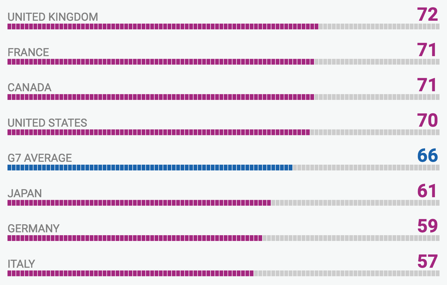
Rodrigo Calloni posted a question on the Tableau forums last week asking how to recreate this chart in Tableau. Mahfooj Khan offered a great solution for this, creating a join to another sheet to add the additional marks needed for this unit chart. The question came up again during the Makeover Monday Viz Review hosted by Eva Murray and Sarah Barlett. In this post, I will offer an alternative solution using data densification. This is not a new technique. I learned this technique from Joe Mako. In fact, back in 2015, Joe was kind enough to do a screen share with me. He quickly mocked up some data, unioned it up using Custom SQL and created a few fields in Tableau. In a matter of minutes he had created a unit chart with a parameter to adjust the unit size. Then he walked me through how it all worked. For anyone who's had the pleasure of Joe walking them through something like this in Tableau, you will understand when I say, it was truly impressive to watch him work through this.
In the end, the goal is to add more marks to the Tableau canvas. This can be tricky, because marks on a canvas are only added in a few ways, usually from data points in the data source, adding rows or columns to the data. Let's start with with something simple.
Copy the two rows of data and header below and paste them into Tableau.
Row
1
100
You now have a single field in Tableau called Row and it only has 2 rows of data, one row with a value of 1 and one row with a value of 100. Once the data loads in Tableau:
Drag Row from Measures up to Dimensions.
Double-click on Row to add it to the Rows.
You will see the 2 rows of data, but also notice the number of marks in the bottom left-hand corner. It will show 2 marks and 2 rows by 1 column.

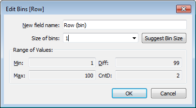
Right-click on Row and create a bin. Set the bin size to 1.

Click the New Worksheet icon to create a new worksheet.
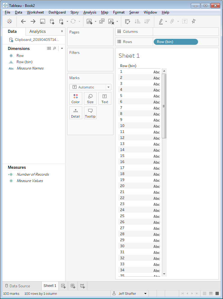
Double-click on Row (bin) to add it to the Rows.
You will see the 100 rows of data, but also notice the number of marks in the bottom left-hand corner. It will show 100 marks and 100 rows by 1 column. You have now created 100 rows and 100 marks from only 2 rows of data. Tableau is padding the data, starting with the lowest number in the range and ending with the highest number. This is important to understand, because we need the bottom and top range in the data.

Right-click on Row (bin) in the Dimensions and select Duplicate.
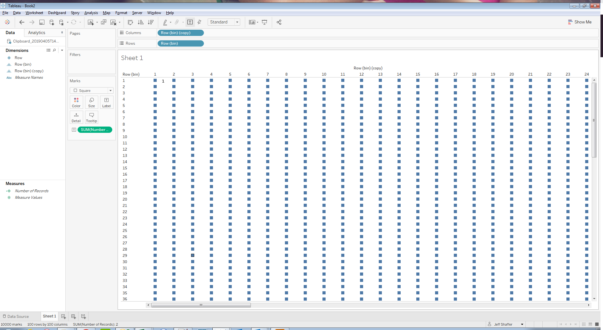
Drag Row (bin) (copy) to the Columns.
Right-click on Row (bin) (copy) and select "Show Missing Values".
Change the dropdown menu in the Marks Card to square.
NOTE: Once you use a bin once on a sheet, it will not default to "Show Missing Values", so will need to change this each time you use the bin for data densification on a new sheet.
There are now 10,000 marks in the view, 100 rows by 100 columns. Again, using only 2 rows of data. To confirm this, drag Number of Records on Label on the Marks Card and you will see that only the first and last point in the grid of squares has a label.

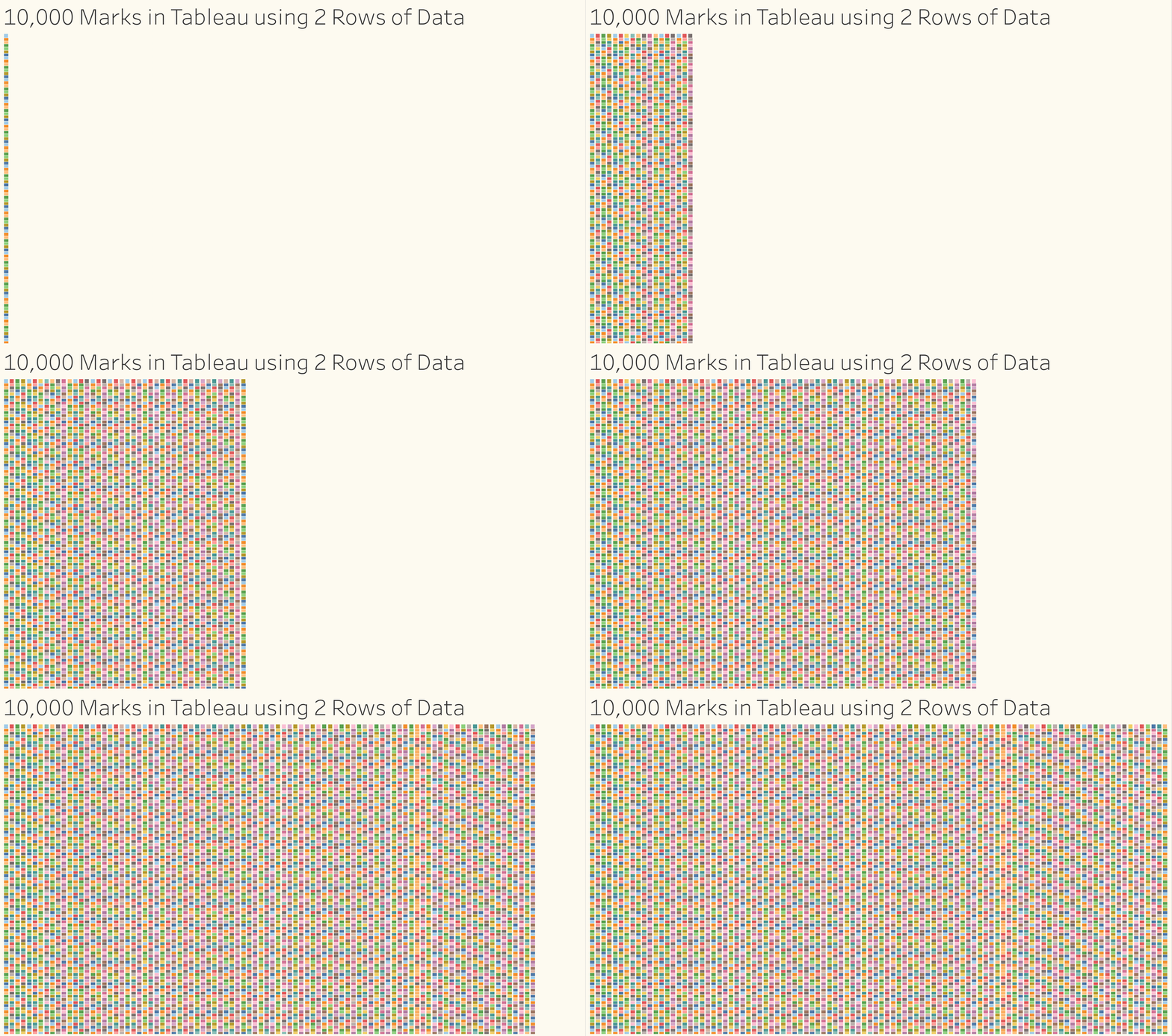
This is a very powerful and useful feature, as it allows us to create marks on the canvas out of thin air! Here are the 10,000 marks animated using these same two rows of data.

Creating a Unit Chart using Data Densification
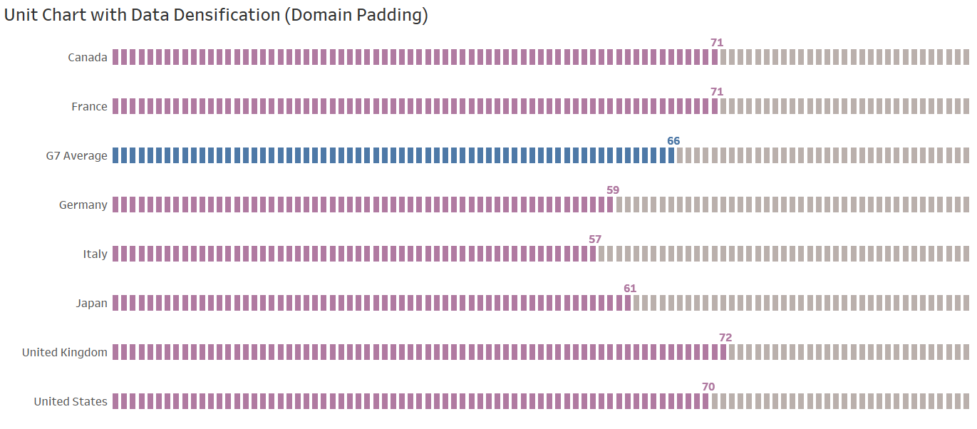
This is the chart that Rodrigo asked about recreating in Tableau. So let's use the same technique to recreate this chart.

Below is the data and headers that you can copy and paste into Tableau, or if you prefer, you can download and import this Excel file into Tableau.
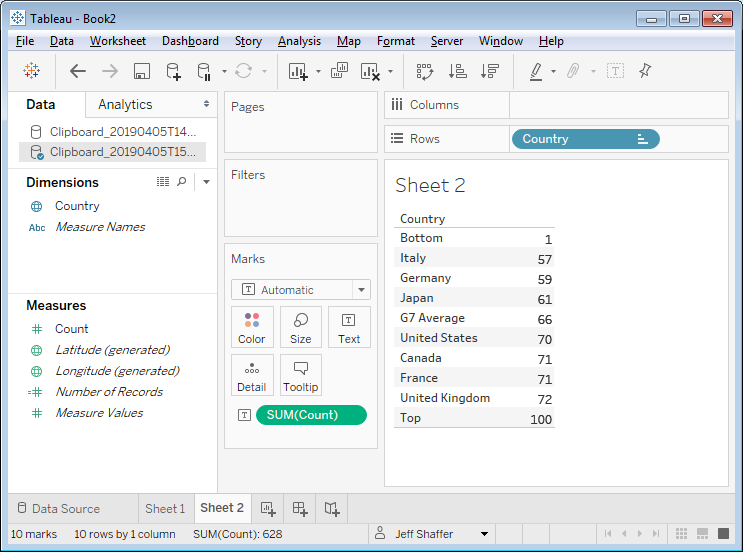
Country Count
United Kingdom 72
France 71
Canada 71
United States 70
G7 Average 66
Japan 61
Germany 59
Italy 57
Bottom 1
Top 100
Follow the same steps as before. Copy the values and paste them into Tableau (or import from the Excel link above). The values are pretty straight forward. There are 8 countries each with a value, but I also added two rows of data. One at the bottom of the range at 1 and one at the top range at 100. This will give me a range of 1 to 100 to bin the field Count.

Right-click on Count and create a bin. Set the bin size to 1.
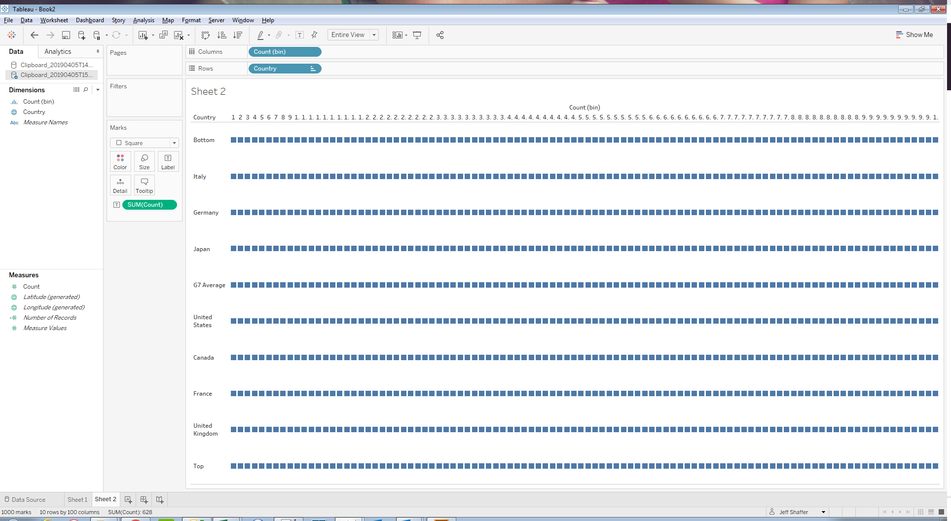
Drag Count (bin) to Columns. You now have 1,000 marks, 100 columns by 10 rows (8 countries and 2 extra rows that I added).
Change the dropdown menu in the Marks Card to square.
Select Entire View from the top menu to force the view into the entire canvas.
You should now have a view that looks like this.

Formatting the Unit Chart
The basic unit chart is complete, but now we need to format it.
Right-click on Bottom in the Country column and select Hide.
Right-click on Top in the Country column and select Hide.
Right-click on the X-Axis at the top and select Remove Header
Coloring and labeling this chart is a bit tricky. Remember, even though you have 800 marks in the view (100 columns by 8 countries), there are still only two rows of data. However, there is one function that will help in this case; the INDEX() function. Create a calculated field for Index.
Calculated Field: Index
Formula: index()
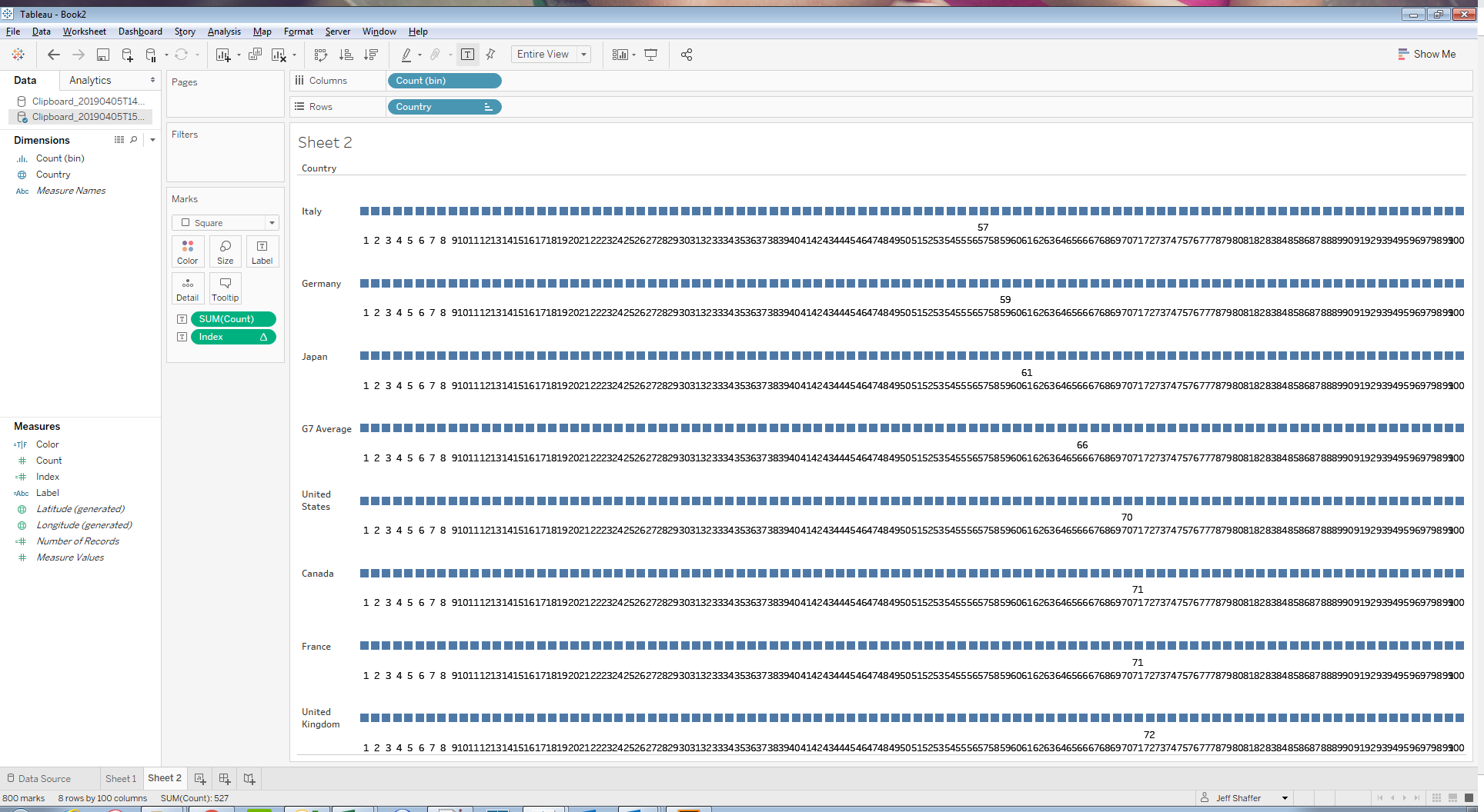
Drag Index to Label and you will see Tableau count from 1 to 100 for each row of data, even though there is only one value for Count in each row. The sum(Count) is NULL in all of the other columns. We will leverage this to format our colors.

Create a calculated field:
Calculated Field: Color
Formula: isnull(RUNNING_SUM(Sum([Count]))) or index() = sum([Count])
The color formula does a check to see if the running sum of the count is NULL or if the index is equal to the sum of the count. This will produce a True/NULL that we can use on color.
Drag color to Color on the Marks Card.
The bars are now colored in True/NULL. You can reformat the colors as desired and in many cases you might be done here. In the original view, the G7 Average is a different color than the rest, so we will need to add Countries to the color.
Drag Country to Detail on the Marks Card.
Click the Detail icon to the left of Country on the Marks Cards and change it from Detail to Color.
Double-click on the color legend and format the NULLs to gray, the Countries to Purple and the G7 Average to blue. You can use your SHIFT key in the color menu to select the entire range and change them at once.
I used a shape of a block instead of a square. You can download my block shape here and add it to your Tableau Repository (typically stored in /My Documents/My Tableau Respository/Shapes/...).
The final chart should look like this.

My Tableau workbook is available to download from Tableau Public.

