12/17/2018
A Dashboard Redesign from Makeover Monday 2018 Week 51
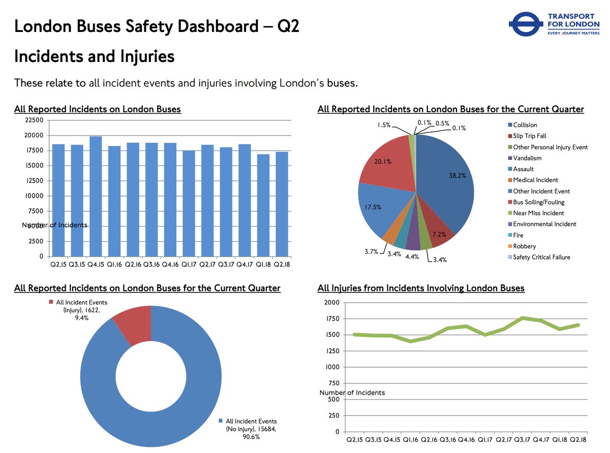
This week’s Makeover Monday caught my attention for several reasons. The first thing that caught my attention is that the visualization this week is a dashboard, and it appears to be a dashboard that is used in the real-world and after all, I wrote a book about dashboards in the real-world. The other thing that was interesting were some of the design choices that were made. Here is the original visualization.
Figure 1 -- Original Dashboard from the Transport of London.
Here are the things I noticed right away (and yes, some of these can be improved):
• This dashboard is a standard four-quadrant dashboard.
• There is a descriptive title, subtitle and chart titles There is good font contrast between these text elements.
• The charts and graphs have adequate whitespace between them.
• The creator avoided rotated text, albeit in an unusual way for the y-axis labels.
• Some of the chart types work well for their intended purpose.
Now let’s examine what doesn’t work well.
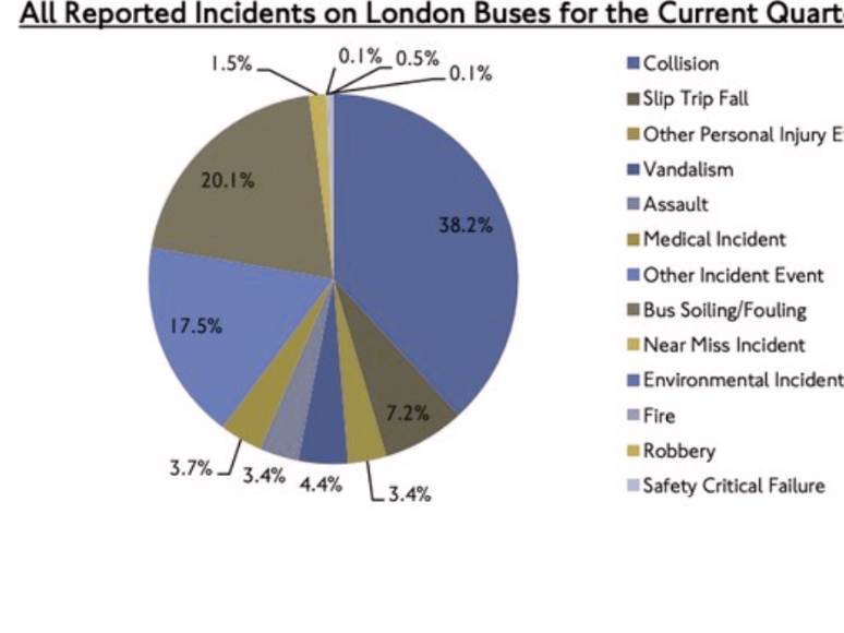
• The obvious one is the pie chart. There are so many slices with so many different colors that making a comparison of anything will be impossible.
• Besides the problems with the pie chart, the color choices are Excel default colors, and for the pie chart, will be problematic for people who are colorblind.
Figure 2 -- Pie Chart with Protanopia simulation for color vision deficiency.
• The y-axis label “Number of Records”, while avoiding rotated text is placed on top of the chart, in one case on top of the y-axis labels.
• The gridlines, even though they are gray, are cluttering the visualization and are especially distracting on the bar chart.
• The comparison of the injuries from incidents is separated from the total incidents. The injuries are shown as a line chart in the bottom right-hand corner, which is a percentage of the blue bars from a different chart, and the represented as a percentage in the donut chart.
Redesign Considerations
Injuries should be one of the most important things on this dashboard, if not the most important thing. It would be better to have this information in the top left-hand corner of the dashboard where the eye will naturally start on a dashboard instead of having it in the bottom right-hand corner. The overall incidents are still important, so we’ll need a chart that shows both the injuries and the incidents.
You’ll notice in the critique above that I did not mention the donut chart. Donut charts are not typically great charts for comparisons, but in this case it’s not comparing anything. The purpose is not to compare one slice of the donut chart to the other slice, it’s simple to give an indication of how many of the overall incidents have injuries for the quarter.
I already discussed the pie chart and the color, so that will be part of the redesign as well.
The Data Set
As I began this redesign, I noticed that the data set provided by MakeoverMonday did not have the fields for most the data on the dashboard. In fact, the only data that was available on the government website was for injuries, so the only chart I was able to recreate from the data was the line chart of injuries and those numbers matched up. The pie chart and donut chart had the data listed in the labels, although the donut chart injuries did not match up with the injuries in the data set or line chart.
The data that I was missing, and wanted to include in the redesign, was the incident data. I utilized a tool that I have used a number of times before, WebPlotDigitizer. Upload an image of a chart to this tool and set the plotting points and it will extract the data into a table or CSV file. I loaded the bar chart, set the y-axis points and then clicked on the top of each bar to set the point. It’s that easy. I was able to extract approximate data in about one minute. There is a file with all of this data available for download here.
Redesign
I used BANs at the top of the dashboard to show the total injuries, non-injuries and total incidents. I also added fatalities, which was not part of the original dashboard, but this seemed like an important thing to monitor. If “Every Journey Matters” then I would certainly expect the agency would want to know when someone died in an incident. Rather than simply making it a number, in this case two deaths in the quarter, I added as much of the details I could from the data set. I concatenated the age, sex, and victim category to show that the two fatalities were an “Adult Female Pedestrian” and “Adult Male Cyclist”. I wanted the fatalities to stand out, so I darkened the red text and added a lighted shaded box around it to draw attention. Therefore, even though the purpose of the dashboard is not fatalities, it still stands out as an important element.
For color, I used a red to show the injuries, a lighter gray for the non-injuries and a dark gray for the total incidents and I kept this consistent throughout the visualization.
The rate of injuries on incidents is steady, just under 10%. I created a stacked bar showing the injuries and non-injuries, which combined are the total incidents. I also added a stacked bar as a divider line under the title. Rather than having just a line, I decided to encode it with some data. One interesting trend in this quarter’s data is that year-over-year; the incidents are down 7%, but the injuries are up 4%. I added a graph to show this comparison as well as a subtitle to call out this trend.
The pie chart of incidents has been replaced with a bar chart. This data is not exact or precise enough, since it adds up to 100% and one of the categories was not labeled in the original pie chart. For purposes of the redesign, I simply make “Environmental Incident” zero percent.
Since a main focus of this redesign is on the injuries, I wanted to show injuries over time and there is monthly data for these on the government website. I originally plotted a bar chart, and then tried a line chart at the suggestion of Steve Wexler. I did not like either. Ultimately, I changed it to an area chart with a line on the top. This shows the trend over time (at the most granular level that we have in the data).
I cleaned up the borders and axis rulers, labels and headers, aligned things to a grid, and added the logo for the government agency and a footer with the data and visualization information. My Tableau Public Visualization is available for download here.
Figure 3 -- Dashboard Redesign.
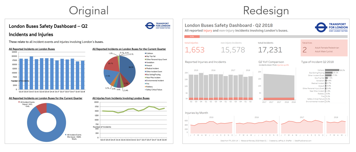
Here are the two dashboards side-by-side as a comparison.
Figure 4 -- Original dashboard and the my redesign.
A special holiday shout out to my friends Andy Kriebel and Eva Murray. My redesign and this blog post took several hours on a Sunday afternoon. Andy and Eva do this every week, sourcing and loading the data, doing their own redesign, writing up a blog post and hosting a review webinar. This takes an enormous amount of time and energy week by week. Even though I don't participate each week (I'm grading hundreds of my own students' assignments throughout the year and frequently doing Makeovers), I really appreciate their work and effort on this project.
I hope you find this redesign and write up useful. If you have any questions feel free to email me at Jeff@DataPlusScience.com