5/13/2020
Five Solutions to Highlight an Entire Table Row in Tableau
This post started as a question from one of my students at the University of Cincinnati. He wrote, "I am required to colour the entire row in a text table instead of just the measure values so that the user can easily spot the different entities (or institutional groups in this case). Is there a way to colour code the entire row so that the user can easily distinguish the different institutions?". When dealing with tables, things that are simple in tools like Excel can be much more difficult in Tableau. In Excel, you can highlight any row you want and with a simple click you can set a highlight color for the entire row. You will see that to do this in Tableau requires some creative solutions. I will present five different solutions in this post, but each of these solutions has its pros and cons.
This turned into a really long blog post, so if you just want the best solution, then you can simply jump down to Solution #5. This solution requires a tricky calculation, but in my opinion, while the other solutions work, Solution #5 seems to be the best solution and the most robust.
First, let's start with the goal. Here's the table that we are trying to create.
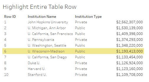
If you've used Tableau for any length of time, you will understand the challenge already. While it's easy to highlight the values themselves (like a highlight table would), it's not easy to highlight the entire row.
If you want to follow along with these instructions then download this file here and import into Tableau. You can also download the Tableau workbook heree.
Note - I will use a parameter in the first four solutions, which we will use to select the row that we want to highlight. In Solution 5, I will use a Set so that we can highlight multiple rows.
Create a parameter for the user to select the row to highlight.
Parameter: Row Select
Data Type: Integer
Allowable Values: List
Add values from Row ID (or Enter the values 1 to 10 in the list box) and click OK
Solution 1 - Create Spacers
We can concatenate all the text fields into one text field, by stringing them together on Text on the Marks Card. Then when the text is highlighted it will highlight that entire row. This requires creating a spacer calculation for between each value to give the appearance of columns. To make this easier and clean, we will use Courier New because it is a monospaced font (each letter is the same width) and it is web safe.
We will create the calculated fields for the spacers using the SPACE() function in Tableau:
Calculated Field: Spacer 1
Formula:
space(50 - len([Institution Name]))
Calculated Field: Spacer 2
Formula:
space(20-len([Institution Type]))
Calculated Field: Spacer 3
Formula:
space(10)
Calculated Field: Row Select Color
Formula:
[Row Select] = [Row ID]
Building the table now is pretty straight forward.
Double-click Row ID to add it to Rows.
Drag Row ID to Text on the Marks Card.
Drag Spacer 1 to Text on the Marks Card.
Drag Institution Name to Text on the Marks Card.
Drag Spacer 2 to Text on the Marks Card.
Drag Institution Type to Text on the Marks Card.
Drag Spacer 3 to Text on the Marks Card.
Drag Expenditures to Text on the Marks Card.
Formatting the text box on Text on the Marks Card is critical. We need to do three things.
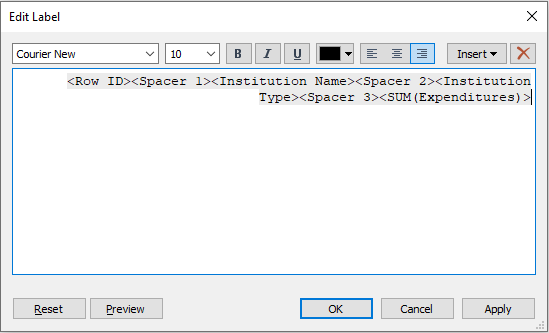
First, put all the fields on one row in the right order. Click on Text on the Marks Card and click the "..." to edit the text. Delete all of the line breaks and spaces and make sure that Sum(Expenditures) is at the end of the list.
Second, right-align the text by clicking the right-aligned button.
Third, select all of the text in the text box and change the font to Courier New.
The Edit label box should look like this (if it does then click OK):
"Fit Width" or manually size the table wider and you will see that you now have a table with the columns and they are properly spaced and aligned.
Drag Row Select Color to Color on the Marks Card.
Double-click the color legend and set the False to White and True to a highlight color. I chose a yellow color with 80% Opacity.
Change the Mark Type in the dropdown box to Gantt.
Double-click in the blank area at the bottom of the Marks Card to type in an inline formula.
Type avg(1) (note - you can put any value in parenthesis).
Drag this new pill AGG(avg(1)) to Size on the Marks Card.
Click Size on the Marks Card and drag the slider all the way to the right.
Right-click on Row ID on the Rows and uncheck "Show Header".
Right-click on the parameter Row Select and select "Show Parameter".
Select 6 in the Row Select parameter dropdown.
You should now have a table that that looks like this.
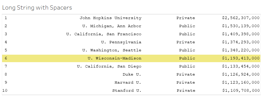
The pros for this solution is that you could have a multi-highlight using a set instead of a parameter and you have control over the spacing between each column. The cons are being forced to use a monospaced font and having to create a calculated spacer field between each column. If you want to change column order then you will need to adjust the spacer calculations.
Solution 2 - Multiple Marks Card
After coming up with a few ways to solve this, I forwarded this little challenge around the office and Kevin Flerlage came back with this solution. Create multiple Marks Cards using dummy values.
We need the same calculated field that we used in Solution 1 for this one.
Calculated Field: Row Select Color
Formula:
[Row Select] = [Row ID]
Create four dummy values on Columns.
Double-click Row ID to add it to Rows.
Repeat this next step for each column you need.
Double-click in the blank area on Columns to type in an inline formula.
Type min(-1) and hit enter.
Double-click in the blank area on Columns to type in an inline formula.
Type min(-1) and hit enter.
Double-click in the blank area on Columns to type in an inline formula.
Type min(-1) and hit enter.
Double-click in the blank area on Columns to type in an inline formula.
Type min(-1) and hit enter.
Marks Card #1
Drag Row ID to Text on the Marks Card.
Marks Card #2
Drag Institutional Name to Text on the Marks Card.
Marks Card #3
Drag Institutional Type to Text on the Marks Card.
Marks Card #4
Drag Expenditures to Text on the Marks Card.
All Marks Card
Drag Row Select Color to Color on the Marks Card.
Double-click the color legend and set the False to White and True to a highlight color. I chose a yellow color with 80% Opacity.
Click on Label on the All Marks Card and set the Alignment to "Left".
For all four columns
Double-click on the X-Axis of each column and set to Fixed from -1 to 0
Right-click on the X-Axis and uncheck "Show Header".
Right-click on Row ID on the Rows and uncheck "Show Header".
Right-click on chart area and select Format to format the Row Divider and Column Divider Borders and zero lines as needed.
You should now have a table that looks something like this:

The pros for this solution is that you can highlight multiple rows using a set instead of a parameter and you have more control over the font choice. The biggest con is that the column width is fixed, so you lose the flexibility and control over the column spacing.
Solution 3 - Multiple Marks Card with Variable Width Columns (sort of)
This one is a variation on Kevin's solution. We do the exact same steps, except we set the dummy values to different values and make them a dual-axis so that we can have some control over the column width. The primary axis is a Gantt Bar mark which creates the highlight and the secondary axis is a square, which is used for control over the label placement and alignment.
We need the same calculated field that we used in Solution 1 and 2 for this one.
Calculated Field: Row Select Color
Formula:
[Row Select] = [Row ID]
Create four dummy values on Columns.
Double-click Row ID to add it to Rows.
Repeat this next step for each column you need.
Double-click in the blank area on Columns to type in an inline formula.
Type min(0) and hit enter.
Double-click in the blank area on Columns to type in an inline formula.
Type min(.6) and hit enter.
Double-click in the blank area on Columns to type in an inline formula.
Type min(0.0) and hit enter.
Double-click in the blank area on Columns to type in an inline formula.
Type min(.9) and hit enter.
Marks Card #1
Drag Row ID to Text on the Marks Card.
Change the mark type in the dropdown box on the Marks Card to Gantt Bar.
Double-click on the area at the bottom of the Marks Card to type and inline formula.
Type sum(2) and hit enter.
Select Size on the Marks Card and drag the slider all the way to the right.
Marks Card #2
Drag Institutional Name to Text on the Marks Card.
Change the mark type in the dropdown box on the Marks Card to Square.
Right-click on this new pill and select "Dual Axis".
Right-click on the secondary X-Axis and select "Syncronize Axis".
Marks Card #3
Drag Institutional Type to Text on the Marks Card.
Double-click on the area at the bottom of the Marks Card to type and inline formula.
Type sum(1) and hit enter.
Select Size on the Marks Card and drag the slider all the way to the right.
Marks Card #4
Drag Expenditures to Text on the Marks Card.
Change the mark type in the dropdown box on the Marks Card to Square.
Click on text on the Marks Card and set the Alignment to Left.
Right-click on this new pill and select "Dual Axis".
Right-click on the secondary X-Axis and select "Syncronize Axis".
All Marks Card
Drag Row Select Color to Color on the Marks Card.
Double-click the color legend and set the False to White and True to a highlight color. I chose a yellow color with 80% Opacity.
Additional Formatting
Double-click on the X-Axis min(0) and set to Fixed from 0 to 2
Double-click on the X-Axis min(0.0) and set to Fixed from 0 to 1.5
Right-click on the X-Axis and uncheck "Show Header".
Right-click on Row ID on the Rows and uncheck "Show Header".
Right-click on chart area and select Format to format the Row Divider and Column Divider Borders as needed.
You should now have a table that looks something like this:

The pros for this solution is that you can highlight multiple rows using a set instead of a parameter and you have more control over the font choice. The con is that you will have to adjust the dummy value, the fixed axis range and the text alignment to control the spacing.
Solution 4 - Row Banding with Parameter (Single Row Highlight - sort of)
This is an easy one and a fun trick, but it will only work when you need to highlight a single row, or when you can group the highlighted rows together. This is because we are going to leverage Row Banding in the format pane, which will alternate rows or groups of rows when applying the row banding. It's also the easiest to build because it just requires just one calculated field for the row banding order.
In this solution we will not use the calculated field on color that we used in the other solutions. In this solution we need a different calculation to group the rows together. Any Row ID that is less than the parameter will be 1, if it's equal to the parameter then 2 and if it's greater than the parameter then it will be a 3.
Calculated Field: Row Band Order
Formula:
if [Row ID] < [Row Select] then 1
elseif [Row ID] = [Row Select] then 2
else 3
end
Right-click the new calculated field Row Band Order and select "Convert to Dimension" (or drag the pill from Measures to Dimensions).
Building the table for this solution is the easiest, because it's the standard table layout in this solution.
Double-click Row Band Order to add it to Rows.
Double-click Row ID to add it to Rows. (Note - this should be discrete)
Double-click Institution Name to add it to Rows.
Double-click Institution Type to add it to Rows.
Double-click Expenditures to add it to Text.
Select Format from the top menu and Shading to open the Format Shading pane.
Change the Row Banding Pane and Header to the desired highlight color.
Move the Row Banding Level slider all the way to the left.
Right-click on Row Band Order on the Rows and uncheck "Show Header".
The pros for this solution is that it's very easy to implement because you set it up in a typical table format. The con is that you can only select one row at a time. And the biggest drawback? Try selecting row 1. Unfortunately, there is no way to control how the row banding starts. So, this requires one more trick if you need to highlight the first row. Note - This trick is manual and only highlights the first row correctly. Therefore, another con for this solution, while it would work great for a static visualization, it's not a dynamic solution that would allow the user to pick a row or set of rows.
To highlight the first row, you simply add totals to the top of your table and then the row banding will start on the totals line instead of the first row of the data.
Select "Analysis" from the top menu and select "Totals" then select "Show Column Grand Totals".
Select "Analysis" from the top menu and select "Totals" then select "Column Totals to Top".
Select "Format" from the top menu and select "Font" to open the Format Font pane and select the "Sheet" tab.
Change the Total Pane and Header font color for the sheet to match the background color (ex. white) to make them disappear.
Again, not a great solution unless you have a static visualization, but it was worth mentioning. Let's move on to Solution 5, which is my favorite solution.
Solution 5 - Row Banding with Set (Multiple Row Highlight)
We need to solve two problems from Solution 4. First, we will add a dummy row in the data with Row ID = 0. By doing this, we can have complete control over the Row Banding and we can start the highlight in Row 1 if we need to or another other row as needed. This is pretty easy. We can simply add the row to the data set, join it up with another file to create a dummy row (using Tableau Desktop or Prep or custom SQL) or we can bring a dummy row in with our data. Regardless of the method, we simply need a dummy record with blank values and Row ID = 0.
The bigger issue that we need to solve is being able to highlight multiple rows, for example, we want to highlight any rows that are included in a set. To do this, we need to create a set with the rows we want and a calculated field that is a bit tricky.
If you want to follow along with these instructions then download this file here.
Import the data in with the dummy record. In this case our 10 records now have 11 rows with the first record in the table being Row ID = 0.
Right-click on Row ID and select "Create" and select "Set". This will create a set for Row IDs. You should see Row IDs from 0 to 10. Select a few of them at random (other than 0).
Now we create a new calculated field. This one is a bit tricky, but in a nutshell, we are simply grouping the rows together, alternating between not highlighting and highlighting. Here's the logic.
If it's the dummy row, then we set it to 0 (the first group of IDs).
If the previous row is not in the set and the current row is in the set then we increment to the next number (starting the counter for the highlighted rows).
If the previous row is in the set and the current row is not in the set then we increment to the next number (starting the counter for the non-highlighted rows).
Finally, if none of those are true, then we use the value from the previous row.
Whew, that's a bunch of checks, but basically, we are just trying to group up the highlighted rows and the non-highlighted rows down the table, starting with a non-highlighted row (the dummy row).
Calculated Field: Color Banding SET
Formula:
if min([Row ID])=0 then min([Row ID])
elseif zn(lookup(avg(int([Set 1])),-1)) = 0 and zn(lookup(avg(int([Set 1])),0)) = 1 then min([Row ID])
elseif zn(lookup(avg(int([Set 1])),-1)) = 1 and zn(lookup(avg(int([Set 1])),0)) = 0 then min([Row ID])
else PREVIOUS_VALUE(1)
end
Right-click the new calculated field Color Banding Set and select "Convert to Dimension" (or drag the pill from Measures to Dimensions).
Drag Color Banding Set to Rows.
Drag Row ID to Rows.
Drag Institution Name to Rows.
Drag Institution Type to Rows.
Double-click Expenditures to add it to Text.
Right-click on Color Banding Set on Rows and select "Compute Using" and select "Table Down".
Select "Format" from the top menu and select "Shading" to open the Shading format pane and select the "Sheet" tab.
Change the Row Banding Pane and Header for the sheet to the desired highlight color.
Move the Row Banding Level slider all the way to the left.
Right-click on Color Banding Set on the Rows and uncheck "Show Header".
Right-click on the zero on the dummy row and select "Edit Alias". Type in a space and hit enter.
Right-click on the NULLs on the dummy row and select "Edit Alias". Type in a space and hit enter.
You should now a table that looks like this.
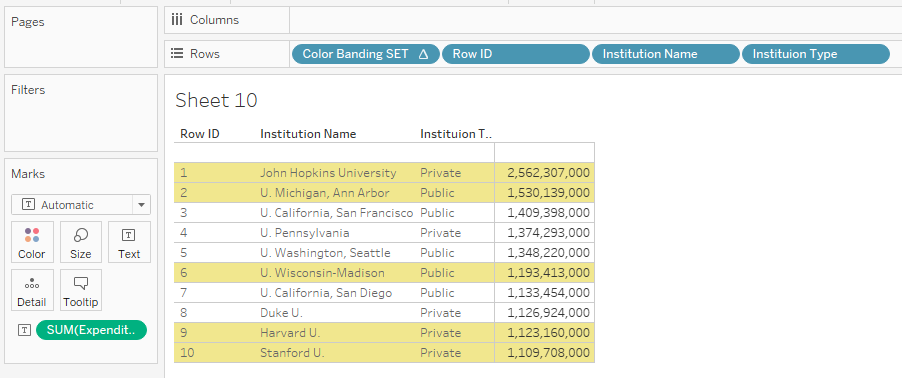
The pros for this solution is that it's pretty easy to implement because you set it up in a typical table format and there's only a single calculation. You can also highlight multiple rows using a set, so the user could have control of what's in or out of the set to highlight. The only drawbacks to this approach are 1.) you need to add a dummy record to the data and 2.) there will be blank row on the top of the table. I don't think either of these are a big deal, so this should be fairly easy to implement.
Since we have a dummy row and an empty row in our table, let's leverage this to highlight all the rows. We can alias the zero in the dummy row to "All" and make a slight adjustment to the Color Banding Set calculation.
Right-click on Color Banding SET and select "Edit".
Calculated Field: Color Banding SET
Formula:
if min([Row ID]) = 0 and min([Set 1]) = TRUE then 0
elseif zn(lookup(avg(int([Set 1])),first())) = 1 then 1
elseif min([Row ID])=0 then min([Row ID])
elseif zn(lookup(avg(int([Set 1])),-1)) = 0 and zn(lookup(avg(int([Set 1])),0)) = 1 then min([Row ID])
elseif zn(lookup(avg(int([Set 1])),-1)) = 1 and zn(lookup(avg(int([Set 1])),0)) = 0 then min([Row ID])
else PREVIOUS_VALUE(1)
end
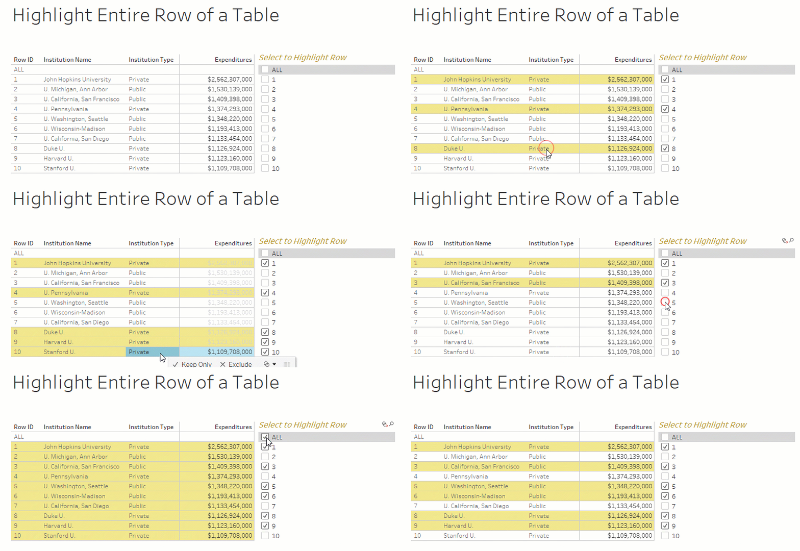
Finally, if you combine this solution with the power of the new Tableau 2020.2 feature Set Control, the user will be able to quickly and easily change the set to highlight whatever rows in the table they wish to highlight. Be sure to check out this blog post on Tableau 2020.2 Set Controls by Kevin Flerlage to see the various ways you can use this new feature.
For example:
Right-click on Set 1 and select "Show Set". This will give the user the ability to change the Set values.
Follow Kevin's instructions for creating a worksheet Set Action to Add and Clear All of the values.
Now the user can click on any row of the table to add it to the set, which will highlight the rows. And by clearing the selection, the user can clear the highlighting for the entire table. This works in combination to the Show Set controls. This can be a very powerful feature.

Below is a Tableau Public Visualization with all of these examples and few more variations. Feel free to download the Tableau workbook to explore these solutions in further detail.
