7/9/2014
Using Improved Data Connectivity in Tableau 8.2 to Build Sankey Diagrams


NOTE: New blog post 5/9/2019 explaining new method and formula posted here using SIN() instead of Sigmoid function.

Sankey diagram are now even easier with Tableau 8.2. It's been a few months since my original post on building sankey diagrams in Tableau, but I continue to get regular emails with examples and questions. Today someone emailed me with an interesting question regarding building sankey diagrams in Tableau.

The question was:
"The procedure you describe on how to do Sankey diagram requires the step to do data transformation in Excel. Is there a way to do that data transformation in Tableau directly? The reason is that of scalability. If there are 10 Sankey visualizations, and when there’s new data, you don’t want to manually update the data and do the data transformation all over again in Excel."
So the challenge is to take data for the sankey and apply the transformation without using the Excel Macro or SQL code that I've posted previously. So can Tableau do this directly?
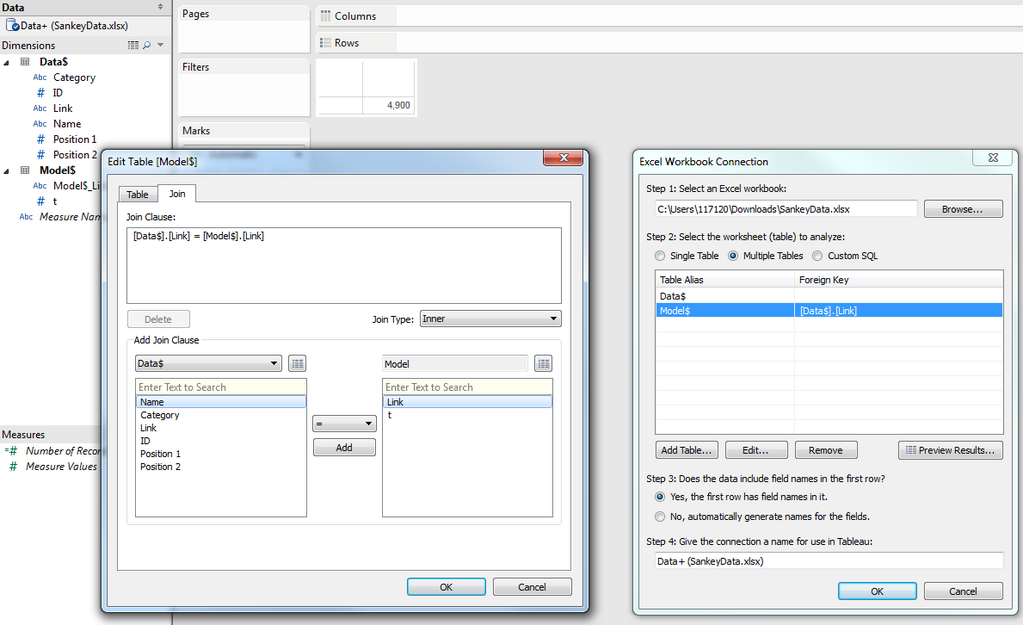
The answer is yes. By using the new and improved data connectivity it is possible to shape the data for the sankey diagram without needing to prepare it in Excel or SQL ahead of time.

The new data connectivity interface allows the user to import two Excel sheets from the same Workbook and apply various joins. The first worksheet has the Sankey Data (100 rows from my Energy Sankey, 1 row for each 1%). The second worksheet in the workbook is the Sankey Model. This would be the same for every Sankey. It simply contains 49 rows with the value of t going from -6 to 6 in .25 increments. I added a field in both worksheets called "Link" and just populated the word "link" in both sheets. Using the default inner join this creates 4,900 rows. This is because the "Link" field in both worksheets inner joins the 100 rows with the 49 rows to create the 4,900 rows that are needed to plot the sankey. This eliminates the data shaping that was previously needed. Once this is loaded in Tableau the formulas are basically the same as my previous instructions here .

If you would like to follow along you can download the data file here.

NOTE - this solution requires using Tableau 8.2 (see 8.1 solution below)

   From the initial Tableau screen click "Connect to data".
   Select "Microsoft Excel" and choose the file listed above to load into Tableau
   There should be two worksheets listed, "Data" and "Model".
   Drag "Data" to the data window.
   Drag "Model" to the data window

      You will notice that by default the two worksheets are inner joined:


   Click "Go to Worksheet" and then follow directions to create the sankey diagram (updated directions below).

To create this visualization I use the Sigmoid Function: S(t )=1/(1+e (-t ))
(more information here.) In Tableau I use the function EXP(1) for e.

We will use the following fields:
ID, Name, Curve and t

To get the shape of the line I plot 49 points, which was simply used to get enough points to plot the shape of the curves.
t = a value between -6 and 6 in .25 increments (which is 49 values)

Step 1: Create some calculated fields

   Calculated Field Name: Sigmoid Function
   Formula: 1/(1+EXP(1)^-[t])

   Calculated Field Name: Curve
   Formula:

      [Position 1] + (([Position 2]-[Position 1])*[Sigmoid Function])

Step 2: Build the Viz

   Move t to Columns
   Right click and change the field to a dimension
   Move Curve to Rows
   Right click and change the field to a dimension
   Move ID to Details
   Move Name to Details
   Set Marks to Line
   Edit X-Axis to Fixed Start and End if you need room for labels)
   Edit Y-Axis and Reverse Scale
   Uncheck "Show Header" on Y-Axis and X-Axis
   Move Name to Color
   Edit color, transparency and size as desired


      You should now have a visualization that looks something like My Energy Bill Redesign here.


UPDATE 7/10/2014: Thanks to Tableau Zen Master Mark Jackson for providing this screen shot for doing the inner join without the new Tableau 8.2 interface.


I hope you find this helpful. If you have any questions feel free to email me at Jeff@DataPlusScience.com


Jeffrey A. Shaffer

Follow on Twitter @HighVizAbility