7/25/2019
Map Zoom with Radial Distance and Increasing Mark Size in Tableau
Back in October 2018, I posted this map highlighter on Twitter. A month later, Sarah Battersby posted this on Twitter and suggested adding a radial function to it. In this blog post, I will demonstrate how to do this and more. Specifically, how to create a map that will zoom in, filter and show a radial distance, control the radial distance, format the radial distance and the points and increase the mark size as it zooms in. This combines several techniques from many different people as well as a few tips and tricks.

In my original version, I leveraged Tableau Set Actions to move a shape around the map based on which point was in the set on a hover action. This is pretty straight forward. Using a dual-axis, the center point is enlarged and transparent to show a highlight circle around the point. Using the Radial Map zoom that is built into Tableau, the size of the shape can be set to a certain radius, for example 3 miles.

It's a simple technique, but using this technique does not zoom the map in when you select a point or filter the points inside of the circle, and you can not adjust the size of the circle on the fly. However, using Set Actions, Parameter Actions and a few calculations we can do all of this and more.
Building a Simple Map
To start, first create a map of points using latitude and longitude. You can download a sample dataset here to follow along. This dataset has some points in Cincinnati, Ohio which we will map using Latitude and Longitude in the dataset. Load the dataset into Tableau.
Load the dataset into Tableau.
Double-click Latitude to add it to Rows.
Double-click Longitude to add it to Columns.
Drag Incident No to the Details on the Marks Card
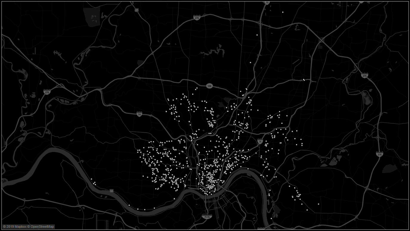
That was easy. Format the map as desired. I changed the map style to Dark, removed Land Cover from the Map Layers and added Streets and Highways, Building Footprints and Neighborhoods. I adjusted the size of the marks down (which we will discuss shortly) and changed the color of the marks to white. You should now have a visualization that looks something like the image below.

The next step is to build the zoom feature. We want to be able to click on any point to zoom and filter the map. We will use Set Actions to identify the point, a Parameter Action to set the center Latitude and Longitude and a calculated field to determine points within a certain radius (we will use a Parameter to set the distance in miles) of the selected point.
Parameter: Miles
Data Type: Float
Current Value: 3
Allowable Values: List
Enter the values of .1, .25, .5, 1, 3, 5, and 10
Parameter: Target Latitude
Data Type: Float
Current Value: [empty]
Parameter: Target Longitude
Data Type: Float
Current Value: [empty]
Duplicate Latitude and rename it Latitude Dimension
Drag Latitude Dimension from Measures up to Dimensions
Right-click on Latitude Dimension and select Create and Set
Name the Set Latitude Set and click OK
Calculated Field: Latitude Set #
Formula:
IF [Latitude Set]
THEN 1
ELSE 0
END
Calculated Field: Lat/Long Radial Miles
Formula:
IF { fixed : sum([Latitude Set #]) = 0} or [Category] = 'circle' then TRUE
ELSEIF (ACOS(COS(RADIANS(90-[Target Latitude])) * COS(RADIANS(90-[Latitude])) +
SIN(RADIANS(90-[Target Latitude])) * SIN(RADIANS(90-[Latitude])) *COS(RADIANS([Target Longitude]-[Longitude]))) * 3958.756) >= [Miles]
THEN FALSE
ELSE TRUE
END
We now have the Parameters, Set and Calculated Fields, so it's time to build the viz.
Drag Lat/Long Radial Miles to Filters and select TRUE
Drag Latitude Dimension to Details on the Marks Card
Drag Latitude Set to Color on the Marks Card
Right-click on Miles and select Show Parameter Control
Drag Category to Filters and select Points(this is just temporary and will be explained more below). Right-click on the Category Filter and select Add to Context.
Next, we need to create a few Worksheet Actions (or Dashboard Actions is using a Dashboard).
Select Worksheet and Actions and select Add Action
Select Change Set Values
Under Target Set change None to Latitude Set
Change the Clearing the selection to Remove all values from set and click OK
Select Add Action
Select Change Parameter
Change Target Parameter to Target Latitude
Change Value Field to AVG(Latitude) and Aggregation to Average and click OK
Select Add Action
Select Change Parameter
Change Target Parameter to Target Longitude
Change Value Field to AVG(Longitude) and Aggregation to Average and click OK
The visualization should now work. When you click on a point, it will filter out points that are not within the radius set by the Miles parameter. However, you will notice that the points are impossible to see. First, the points are very small so when it's zoomed in they are difficult to see. Second, once you select a point on the original map to add it to the Set, the other points are in a highlight mode that is the same color as the map making them impossible to see. So let's see if we can fix these two issues.
Sizing Marks on Map Zoom
This Tableau Tip is not new. Elnisa Marques wrote up a great blog post How to make the size of the marks on a map change dynamically which outlines a very simple solution to this problem.
Calculated Field: Size
Formula: Total(sum([Number of Records]))
Drag Size to Size on the Marks Card
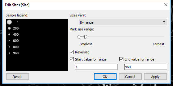
Double-click on the Size legend to edit the Size
Set the Sizes Vary to By Range
Select Reversed
Select Start Value for Range and set to 1
Select End Value for Range
Drag the Slider out on the Largest end to make the Size bigger for the smaller values of Size.

Now we need to deal with the selection and non-selection color. The mark color is assigned with the Set value (In or Out of the Set). However, even with the IN Set assigned to Red and the OUT of Set assigned to white, the points are still very difficult to see. This is because Tableau highlights the point selected on the mouse click (the point now IN the Set) and mutes the marks not selected (now OUT of the Set). There is no formatting option for selected marks vs. non-selected marks, but there is a little Tableau trick that we can leverage; the worksheet pane color.
This is a trick that I use for all sorts of map formatting. It's the same trick that I used to change the background color of the map in Tableau which I discuss here and here. In those posts, we remove the Base Layer of the map and change the worksheet pane color to change the color of the map. We are are going to do the same thing on this map, but this time we are NOT going to remove the Base Layer of the map.
Right-click on the map and select Format
Click the third icon (paint can) to selct Format Shading
Change the Default Pane color to the desired color. For example, click More and enter the HTML color #fff583 to use a yellow highlighter color. Notice that even though the Out of Set color is set to white, once a point is selected the non-selected points are now the color set in the Worksheet Pane color.
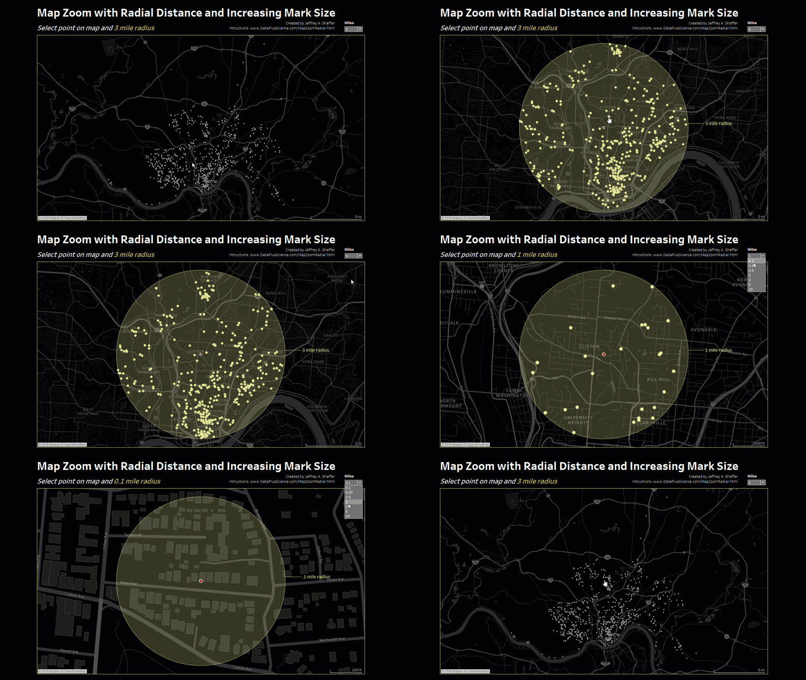
When selecting a point now from the original screen, the map will zoom in to the area defined by the radius set in miles, the non-selected points will show in a highlighted color and the marks will increase in size as the number of marks in the view decreases.
Adding a Circle Radius to the Map
We will again leverage the work of others in the community to build on what we've done. Emily Chen from the Information Lab wrote up a great blog post on How to Draw a Circle in Tableau and this technique was leveraged in a Workout Wednesday challenge here.
As a quick description of this technique, we use 360 points to a draw a circle around a midpoint using two calculated fields. We already have the field for the midpoint, our parameters Target Latitude and Target Longitude. We also have the radius for the calculation, which is the parameter Miles. We just need the 360 points and two more calculated fields for the new Latitude and Longitude.
To add 360 points, I simply appended them to the data (the download file link at the beginning of this post). You could do this any number of ways with your data, using a Join/Union, Tableau Prep or Alteryx, or doing it on the backend in a database, for example SQL. For purposes of this demo it has already been done for you. I added a column to the data called 360 Points. The value is 0 for all the marks on the map and then 1 to 360, with no values for Latitude, Longitude or Incident No for the 360 points used for the circle. I also added a column in the data called Category, which simply lists "points" for the map points and "circle" for the 360 points.
Calculated Field: Latitude with Circle
Formula: IF [360 Points] > 0
THEN DEGREES( ASIN(SIN(RADIANS([Target Latitude])) * COS(([Miles])/3958.756) + COS(RADIANS([Target Latitude])) * SIN(([Miles])/3958.756) * COS(RADIANS([360 Points]))) )
ELSE [Latitude]
END
Calculated Field: Longitude with Circle
Formula: IF [360 Points] > 0
THEN DEGREES(RADIANS( [Target Longitude] ) + ATAN2(COS(([Miles])/3958.756) - SIN(RADIANS( [Target Latitude] )) * SIN(RADIANS( [Latitude with Circle] )), SIN(RADIANS([360 Points]))*SIN(([Miles])/3958.756) * COS(RADIANS( [Target Latitude] ))) )-90
ELSE[Longitude]
END
Calculated Field: Path
Formula: IF { fixed : sum([Latitude Set #]) = 0}
THEN NULL
ELSE [360 Points]
END
Right-click on Latitude with Circle and set Geographic Role to Latitude
Right-click on Longitude with Circle and set Geographic Role to Longitude
Drag Path from Measures to Dimensions
Drag Longitude with Circle to Columns on top of Longitudeto replace Longitude
Drag Latitude with Circle to Rows on top of Latitude to replace Latitude
Duplicate Longitude with Circle on Columns by dragging Longitude with Circle to Columns again and placing next to Longitude with Circle or using the CTRL key and dragging Longitude with Circle next to itself.
Remove all four pills on the first Marks Card for Longitude with Circle.
Change the dropdown on the same Marks Card to Polygon
Drag Path to Path on the same Marks Card
Drag Category to Details on the same Marks Card
Select Color on the same Marks Card and set the Opacity for the Polygon color to 25%
Remove Category from the Filter (this was just a temporary filter to create the points only in the previous viz).
Right-click on the second AVG(Longitude with Circles) on Columns and select Dual Axis.
Note: The Set Actions will not automatically adjust for the swap from Latitude and Longitude
to Latitude with Circle and Longitude with Circle. Therefore, we need to repeat the Set Action steps to fix this.
Select Worksheet and Actions and select the first parameter
Select Edit
Change Value Field to AVG(Latitude with Circles) and Aggregation to Average and click OK
Select the second parameter
Select Edit
Change Value Field to AVG(Longitude with Circles) and Aggregation to Average and click OK
You should now have a visualization that looks and works like the image below.

Below is a Tableau Public Visualization putting these pieces together.
