3/16/2019
How to Build an Overlapping Bar Chart in Tableau
There continues to be strong interest in my recent visualization, Bar Hopping: Theme and Variations on a Bar Chart. This week on LinkedIn, Steve Adams saw the post and asked about building another variation of a bar chart in Tableau. He was struggling with trying to reproduce overlapping bars. Normally, I would suggest we avoid these types of visualizations. Overlapping bars can make the comparisons harder to see and a bar with a target line would be a much better choice. However, this visualization is apparently a requirement to be compliant with the International Business Communication Standards (IBCS), so it is necessary for Steve to be able to reproduce this in Tableau.
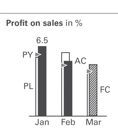
Here is an example of the visualization that he wanted to reproduce.

Step 1: Data Structure
The data set here is pretty easy. However, the structure of the data is important. You will notice there is a type field that shows the actual and budget and then a separate field for the Profit %.
Here is a look at the data. You can download the data here to follow along with these instructions.
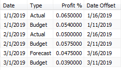
If your data is structured with each value as a separate field then you will need to pivot the data to this format.
Step 2: Build the Viz
Steve mentioned in his post on LinkedIn that plotting the triangle wasn't necessary, so we'll deal with that later. For now we'll just filter the triangle data out.
Drag Type to Filter, uncheck Triangle and click OK.
The trick for this solution is to build a calculated field to offset the date based on the type.
Calculated Field: Date Offset
Formula:
if [Type] = 'Actual' or [Type] = 'Forecast' then [Date] + 15
else [Date] + 10
end
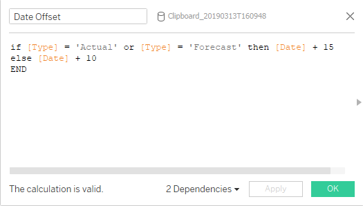
Notice that the date is set at the 1st of the month in the data. This formula offsets the date based on the type. If it's the Actual or Forecast, the bar in the front, then it adds 15 to the date, and for the bar in the back it only adds 12.
Right-click and drag Date Offset to Columns and select the very top option, Date Offset (Continuous). This will place an exact date as a continuous date (Green pill date) on the x-axis.
Double-click Profit % or drag it to Rows.
Change the Mark Type to Bar in the drop down menu on the Marks Card.
Drag Type to Color.
Double-click the color legend to change the colors of the bar chart. Dark gray for Actual (#5c6068), light gray (#d3d3d3) for Forecast and white for Budget (#ffffff).
On the color legend, drag Forecast above Budget to bring the Forecast bar on top of the Budget bar.
Select Color on the Marks Card and set the border color to black.
Select Size on the Marks Card and select Fixed and enter a value of 8 or 10 (or desired width) for the "Width in Axis Units".
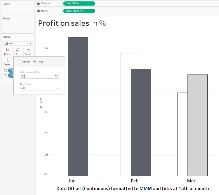
Double-click on the x-axis and select the Tick Marks menu. Change the Major Tick Marks to Fixed in 1 "Months" units. You can use the date to center the date.
Right-click on Date Offset on the Columns and select Format. Change the Date format under Scale to Custom and enter mmm. This will change the format of the date to "Jan". Format the font as desired.
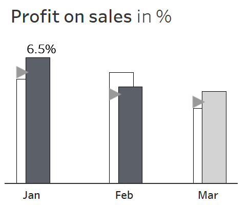
You should now have a bar chart that looks something like this

Step 2: Build the Viz
Now that we've built the viz, let's finish by adding the triangle. To do this, create two more fields. One for the Profit % without the triangle data and that is only the Profit % for the triangle.
Calculated Field: Profit % without Triangle
Formula:
if [Type] = 'Triangle' then NULL else [Profit %] END
Calculated Field: Profit % for Triangle
Formula:
if [Type] = 'Triangle' then [Profit %] else NULL end
Now we have two fields, one that have the Profit % for the Actual, Budget and Forecast and another field for the Profit % for Triangle.
Remove Type from Filters
Remove Profit % from Rows
Double-click Profit % without Triangle or drag it to Rows.
Select Size on the Marks Card and select Fixed and enter a value of 8 or 10 (or desired width) for the "Width in Axis Units".
On the color legend, drag Forecast above Budget to bring the Forecast bar on top of the Budget bar.
Double-click Profit % for Triangle or drag it to Rows.
Change the Mark Type to Shape in the drop down menu on the Last Marks Card (the one for Profit % for Triangle.
Click Shape on the same Marks Card and select the filled in triangle that is pointing to the right.
Click Size on the same Marks Card and make the size bigger to match the original.
Remove Type from the same Marks Card that is on Color.
Right-click on Profit % for Triangle on the Rows and select Dual Axis.
Right-click on the secondary y-axis and select Syronize Axis.
Right-click on the secondary y-axis and uncheck Show Header.
Right-click on the Null Indicator in the bottom right-hand corner and select Hide Indicator.
Double-click the color legend for Triangle and change the color to a gray to match the color of the triangle shape.
The final chart should look like this. Feel free to download my Tableau Workbook below.
