4/22/2020
Data Densification Using Domain Completion and Domain Padding
One of the more complicated topics in Tableau is Data Densification. I think the concepts are much more difficult than the actual implementation in Tableau, because in many cases it is very easy to turn on data densification. As with many things in Tableau, we build on the works of others, so before I start I want to acknowledge two people who pioneered these techniques early on and have been instrumental to me in my Tableau learning. The OZM (Original Zen Masters from the very first class of Tableau Zen Masters) Joe Mako and Jonathan Drummey. I have learned so much about Tableau from these two guys so a big thank you to both of them.
First, let's start with a few definitions. These come from Joe and are discussed in depth in this video on Data Densification here.
Definitions
Data Densification - Umbrella term that encompasses all situations where Tableau adds Marks for Dimension value combinations.
Domain Completion - Marks are added for potential Dimension value combinations
Domain Padding - Marks are added for potential values in the range of a Range Aware pill
Sparse Data - Data where not all potential combination of Dimension values exist in the data returned from the data source.
Range Aware Pill - A Dimension pill with a field data type of either Date, Date Time, or Bin. NOTE - The exception is a Date Time set to Exact Date.
Opposing Shelves - The Rows and Columns shelves are Opposing Shelves
To turn on Data Densification:
Domain Completion - Initiated with 2 or more Dimensional pills
Domain Padding - Initiated with Show Missing Values from a Range Aware pill
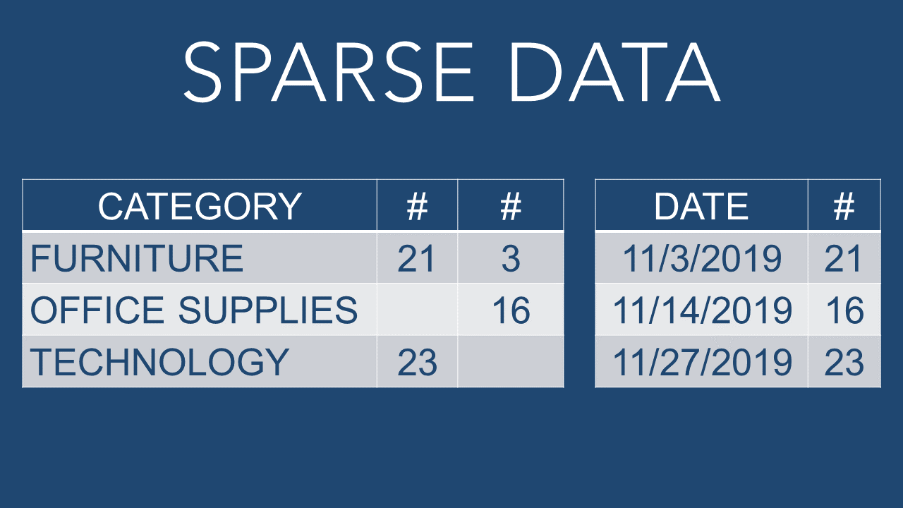
Let's start with some Sparse Data. Below are two examples of sparse data. The first is showing categories, but there are measures missing for some of them. The second example is showing a date wtih a value, but notice that there are dates missing; we only have data for three non-consecutive days in November 2019. These are examples of sparse data.
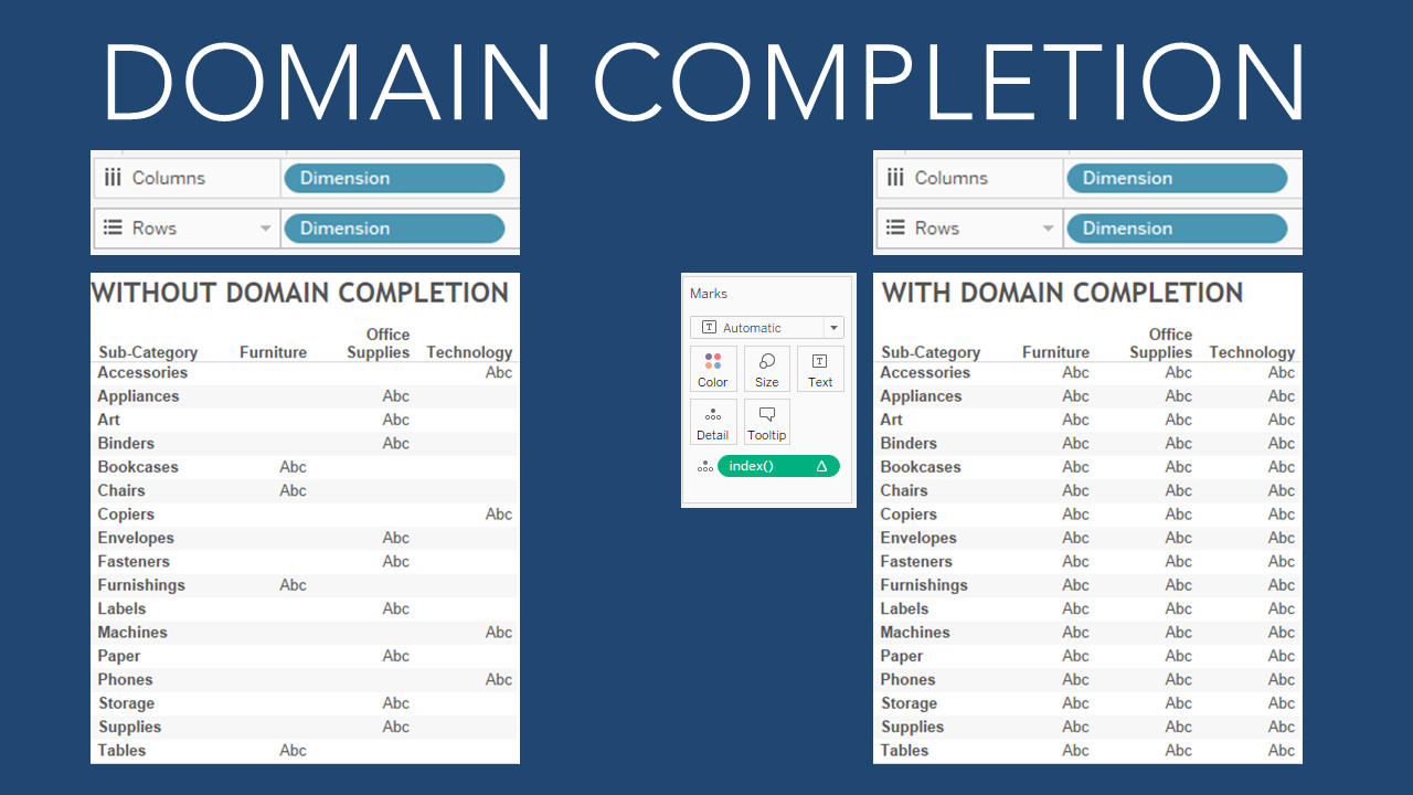
In the first example below, the categories have missing values, we can use Domain Completion to fill in these values. To do this, we can use a calculation such as INDEX() to turn on Data Densification. Notice the "abc" only shows where there are values, but after adding the INDEX we see "abc" in every cell.
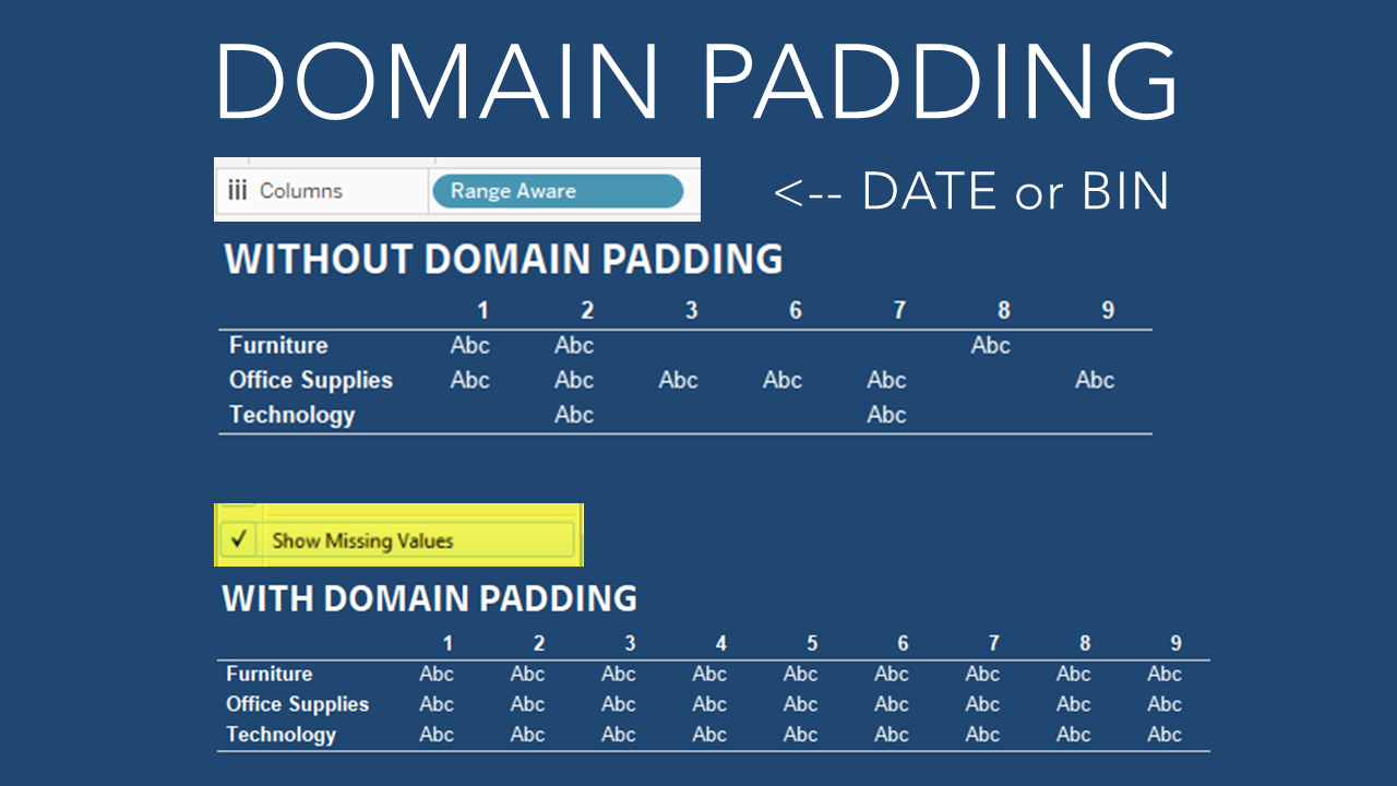
In the second example below, there are days of the month, DAY(Order Date), on Columns. This is a Range Aware Pill (A Dimension pill with a field data type of either Date, Date Time, or Bin). We can use Domain Padding to fill in these values. To do this, right-click on the dimension pill and select "Show Missing Values".
That was easy, right? As I mentioned at the start of this, I think the concepts are harder to grasp than the actual execution of these steps. A simple calculation, or one-click of an option, can turn on data densification.
To demonstrate this technique in a more practical way, I am going to use an example by Ken Flerlage that he wrote about in his blog post on Creating a Data Scaffold in Tableau here (Incidentally, this is another technique pioneered by Joe Mako). Ken uses this technique to fill in values. This comes from a Tableau forum question where someone is looking to fill in 0% when there is no data in the highlight table.
Note - I encourage everyone to read Ken's blog post, because, while I am going to present a much easier solution to this specific example, there are many instances where a scaffolding technique can be very useful.
If you would like to follow along, then here are the steps to build a quick highlight table using the Superstore data.
Double-click Order Date to add it to Columns.
Right-Click on Order Date and change it to Month(Order Date) by selecting the first Month in the list.
Remove Year(Order Date) from the Columns (drag it up off the canvas).
Double-click Customer Name to add it to Rows.
Double-click Profit Ratio to add it to Text on the Marks Card.
Drag Profit Ratio to Color on the Marks Card.
Select the drop down menu on the Marks Card and select "Square" to change the view to a highlight table.
Drag Order Date to Filters and select Years to filter only 2019.
Double-click the color legend and select "Orange-Blue-White Divering" from the dropdown menu and click OK.
You should now have a view that looks like the highlight table below. Notice the missing data in this table.
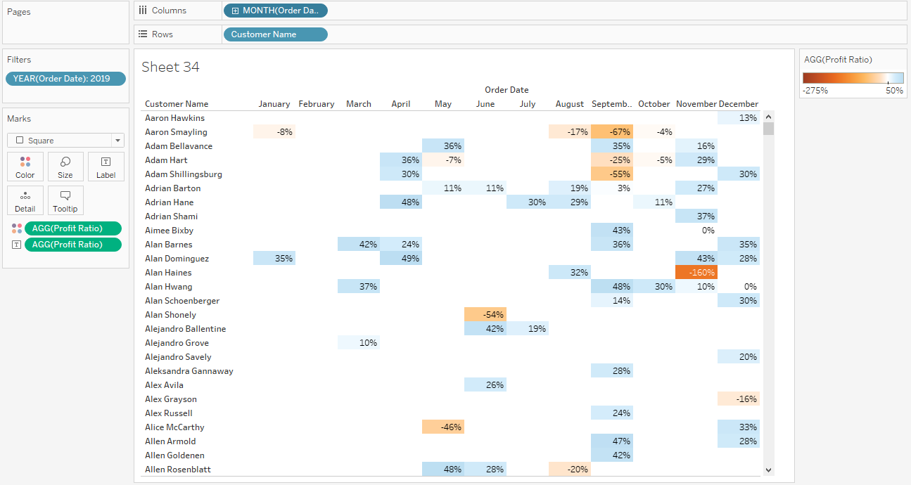
This is a great example because it has two opposing dimensions on the Columns and Rows and one of them is a range aware pill. That means that we can use either Domain Completion or Domain Padding to fill in the missing values in this highlight table, without using Date Scaffolding. Remember, the goal is to fill in "0%" for all the empty values where there is no data.
Let's start with domain padding, which we can do in two simple steps.
First, right-click on the Range Aware Pill, in this case that is the MONTH(Order Date), and select "Show Missing Values". This has turned on data densification. If you didn't change the color to "Orange-Blue-White Diverging" then you would see that the highlight table has filled in color in all of the empty squares. Also, if you remove all the pills from the Marks Card and set the Mark Type in the dropdown box to "Text", you will notice that Tableau is filling in "abc" for all of the empty marks similar to the example above). There is one more simple step, which is to assign a value for the missing data.
To assign a specific value, for example the "0%" that we want to show up in the highlight table, we simply right-click on the measure that is in the table (in this case Profit Ratio on the Marks Card Text) and select Format. Under the formatting menu, set the Special Values (eg NULL) text to 0% (or whatever value or text you want to show up in the empty cells, text such as "NONE" or "NULL" will work too). With the color set to "Orange-Blue-White Diverging" the 0% will be white and the values that are not empty will show a value with color. You should now have a highlight table like the one below.
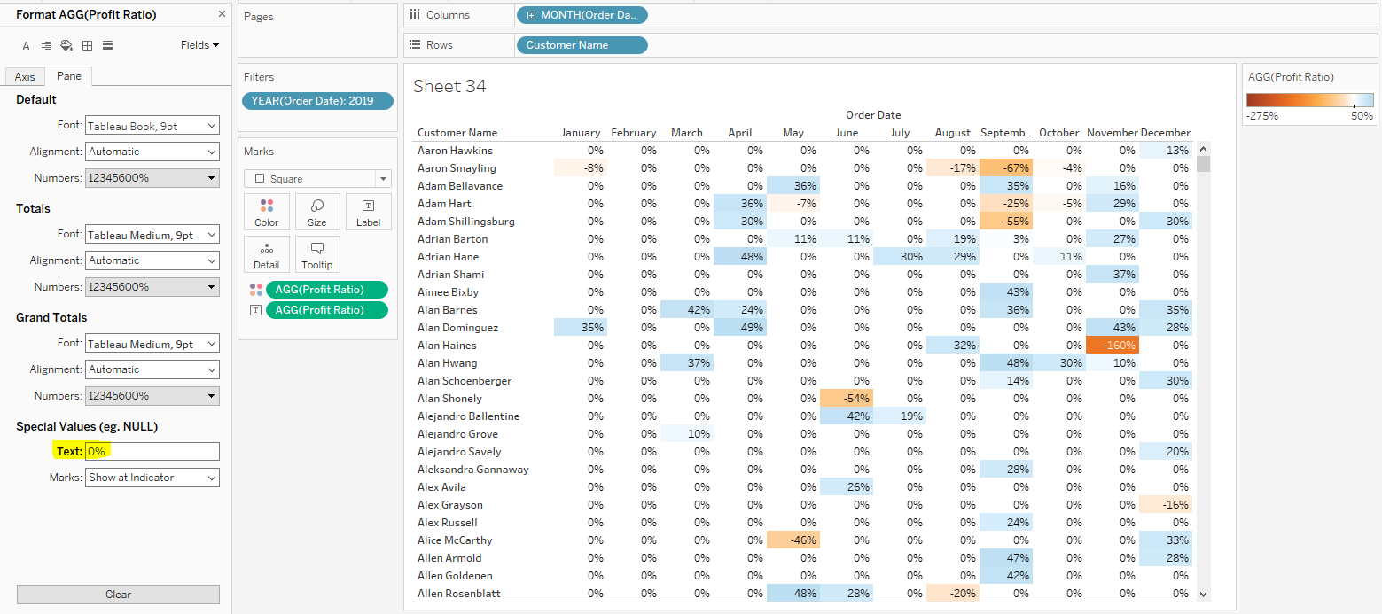
In two very simple steps we now have the table format we were looking for. Now let's do the same thing using Domain Completion. You will have to undo the steps you just did to turn on Domain Padding, so hit the back button twice to undo them.
Solving with Domain Completion is also a two-step process, but the formatting step is exactly the same. So the only difference is how to turn on Data Densification. To do that, double-click the white area at the bottom of the Marks Card. This will allow you to enter an in-line formula. Simply type Index() and hit enter. Alternatively, you could create a new calculated field using the INDEX() function and add that to Details on the Marks Card. In either case, this will turn on Domain Completion.
Now repeat the formatting step, simply right-click on the measure that is in the table (Profit Ratio on the Marks Card Text) and select Format. Under the formatting menu, set the Special Values (eg NULL) text to 0% (or whatever value or text you want to show up in the empty cells). You should now have a highlight table like the one below, and the same formatting result as before.
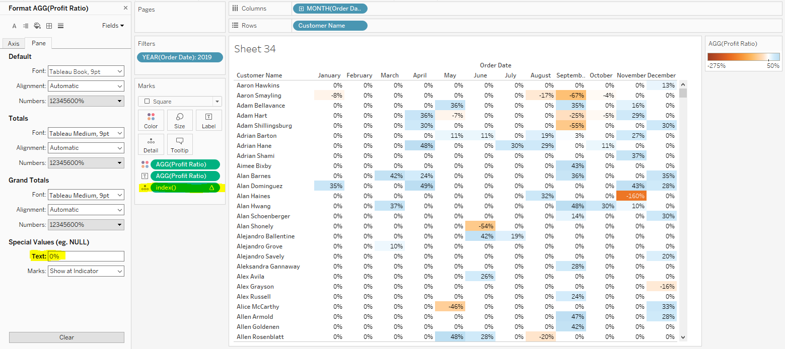
As I mentioned early, this is a great example because we can turn on Data Densification with either Domain Padding (using the Range Aware Pill) or Domain Completion (using the INDEX() function with the opposing shelves). Both solve the problem and create the desired result.
Below is a Tableau Public Visualization with the slides and these examples.