8/11/2020
How to Create Hat Graphs in Tableau
Back in August 2019, Jessia K. Witt wrote an article entitled Introducing Hat Graphs. The hat graph was created as an alternative to paired bar charts. In this article, she discusses their potential usefullness and the results of five empirical studies. The hat graphs in the article were made with R. In this blog post, I will demonstrate how to create hat graphs in Tableau.

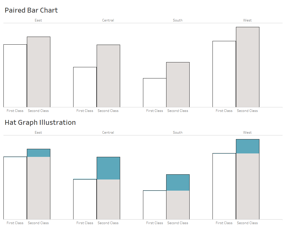
First, let's discuss how to read a hat graph. In the example below there is a paired bar chart comparing the quantity being shipped through First Class shipping vs. Second Class shipping in four regions. In each region the second class shipping is higher than the first class shipping. In the Hat Graph Illustration below, the difference between the two bars is highlighted by coloring the difference (in blue). The "hat" is created with a line across the top of the first bar and then a bar graphing the difference between the first and second bar.

For this post I will use the Sample Superstore dataset in Tableau.
Step 1: Create a Paired Bar Chart
Double-click Quantity to put it on Rows or drag it Rows.
Double-click Region to put it on Columns or drag it Columns.
Double-click Ship Mode to put it on Columns or drag it Columns.
Drag Ship Mode to Filters and select First Class and Second Class by unchecking Same Day and Standard Class.
Select Analysis from the top menu, then select Totals and then select Add All Subtotals.
Select one of the Total Bars. A small tooltip box should popup with "Automatic" shown with a dropdown arrow. Click the dropdown arrow and select Hide. This will hide the Total bars and reset your axis.
Right-click on the Total label on the X-Axis and select Format.
In the Format Pane on the left-hand side, delete the word "Total" from th Totals Label.
In the Format Pane on the left-hand side, click the fourth icon at the top for Borders and set the Column Divider to "None".
In the Format Pane on the left-hand side, click the fifth icon at the top for Lines and select the Rows tab and set the Grid Lines to "None".
Click Size on the Marks Card and adjust the size slider to maximize the size of the bars.
Drag Ship Mode to Color on the Marks Card to change the color of the bars as needed (optional).
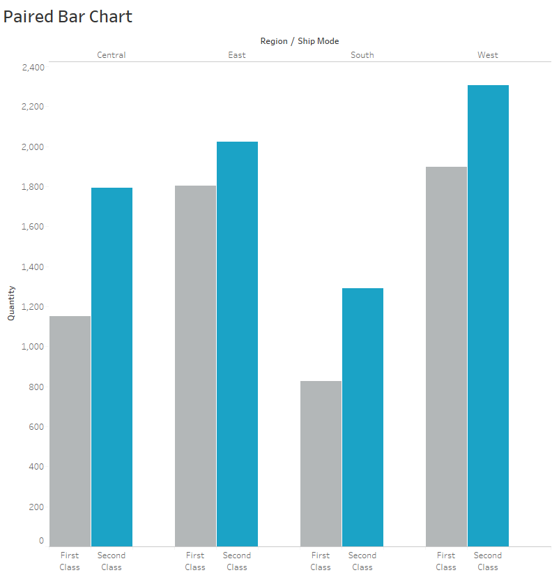
You should now have a paired bar chart that looks something like this.

Step 2: Create the Hat Graph
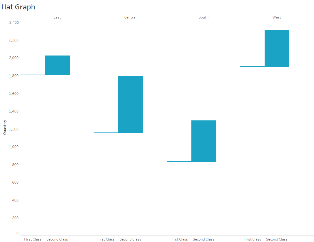
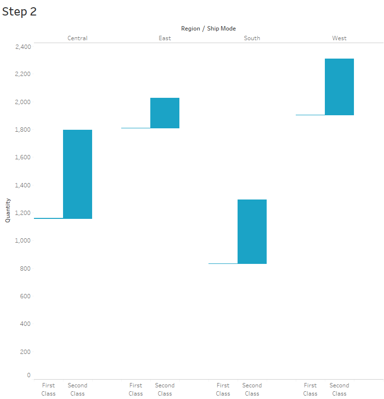
There are two parts to the hat graph. First, we need to convert the first bar into a line placed at the top of the first bar. Second, we replace the second bar with a partial bar starting at that same position and graphing the difference between the first and second bar. In Tableau, we will do this with the Gantt mark and a calculated field.
Calculated Field: Difference in Quanity
Formula: -SUM([Quantity]) + LOOKUP(SUM([Quantity]),-1)
On the Marks Card, change the Mark Type to Gantt
Drag Difference in Quanity to Size.
Remove Ship Mode from Color on the Marks Card if you used color.
Click Color on the Marks Card and set the color to the desired color. I used hex color #1ba3c6.
Set the Border Color to the same color.
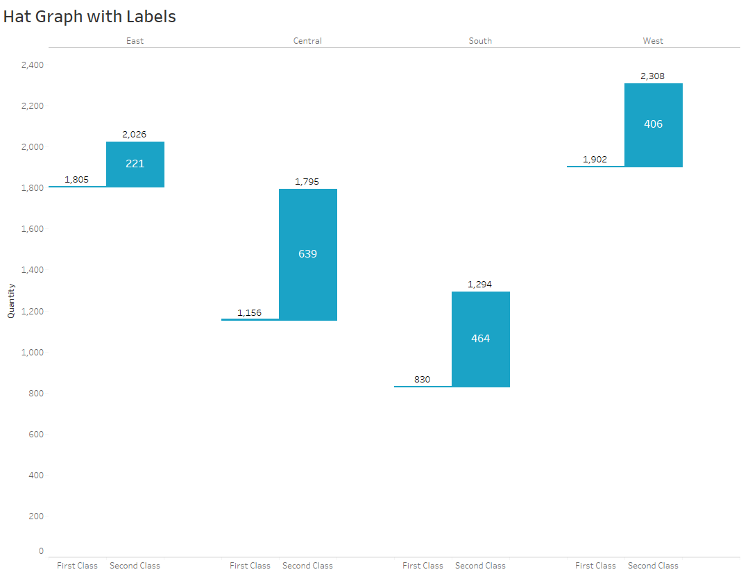
You should now have a Hat Graph that looks like this.

Adding Labels
Adding labels to a hat graph might be useful. First, let's add a label on the difference value. To do this, we will create another calculated field for the Difference Label.
Calculated Field: Difference Label
Formula: SUM([Quantity]) - LOOKUP(SUM([Quantity]),-1)
Drag Difference Label to Label.
Select Label on th Marks Card and format the text to be horizontal and vertical center. Adjust the font as needed.
The hat graph with a single label looks like this.

You can leverage a dual axis to add additional labels for the total of each category.
Drag Quantity to the Rows.
Right-click Quantity on the Rows and select Dual Axis.
Right-click on the secondary y-axis and select Syncronize.
On the dropdown box in the Marks Card, change the Mark type to Bar.
Drag Quantity to Labels on the Marks Card.
Select Label on th Marks Card and format the text to be horizontal center and vertical top. Adjust the font as needed.
Select Color on th Marks Card and set Opacity to 0% and Border to None.
The hat graph with dual axis labels looks like this. Now you can see the totals for both categories as well as the difference value.

Hat Graph Use Case
The author of the original article points out several strengths of the hat graph. First, hat graphs use "two of the strongest Gestalt principles of grouping - connectedness and proximity." Second, "hat graphs also improve comparison across conditions because they make the difference between conditions an object itself, rather than the space between two objects as is the case with the bar graph." Third, a hat graph does not need to be plotted with the axis starting at zero as a bar chart would, since it is not using length from a zero baseline.
The author also points out several limitations. She raises the concern about the best way to ad error bars. The bigger issue that she raised is the number of categories. She writes, "A critical limitation is that hat graphs are limited to 2 x N designs for which comparisons across pairs are the critical comparisons. It is unclear how to expand hat graphs to allow comparison across three or more conditions. Many reported studies involve designs with factors that have two levels, so the use of hat graphs can certainly be advantageous even if they are not generalizable to all research scenarios."
There are a number of ways to show differences between values, for example, a connected dot plot (a.k.a. barbell chart, dumbell chart, gap chart), slopegraph or small multiples slopegraph, tadpole chart and comet chart. While these can all be useful for certain use cases, I think the hat graphs is worth considering as another tool in the toolbox.
Below is a Tableau Public Visualization that you can download to explore these options more.
